


Information
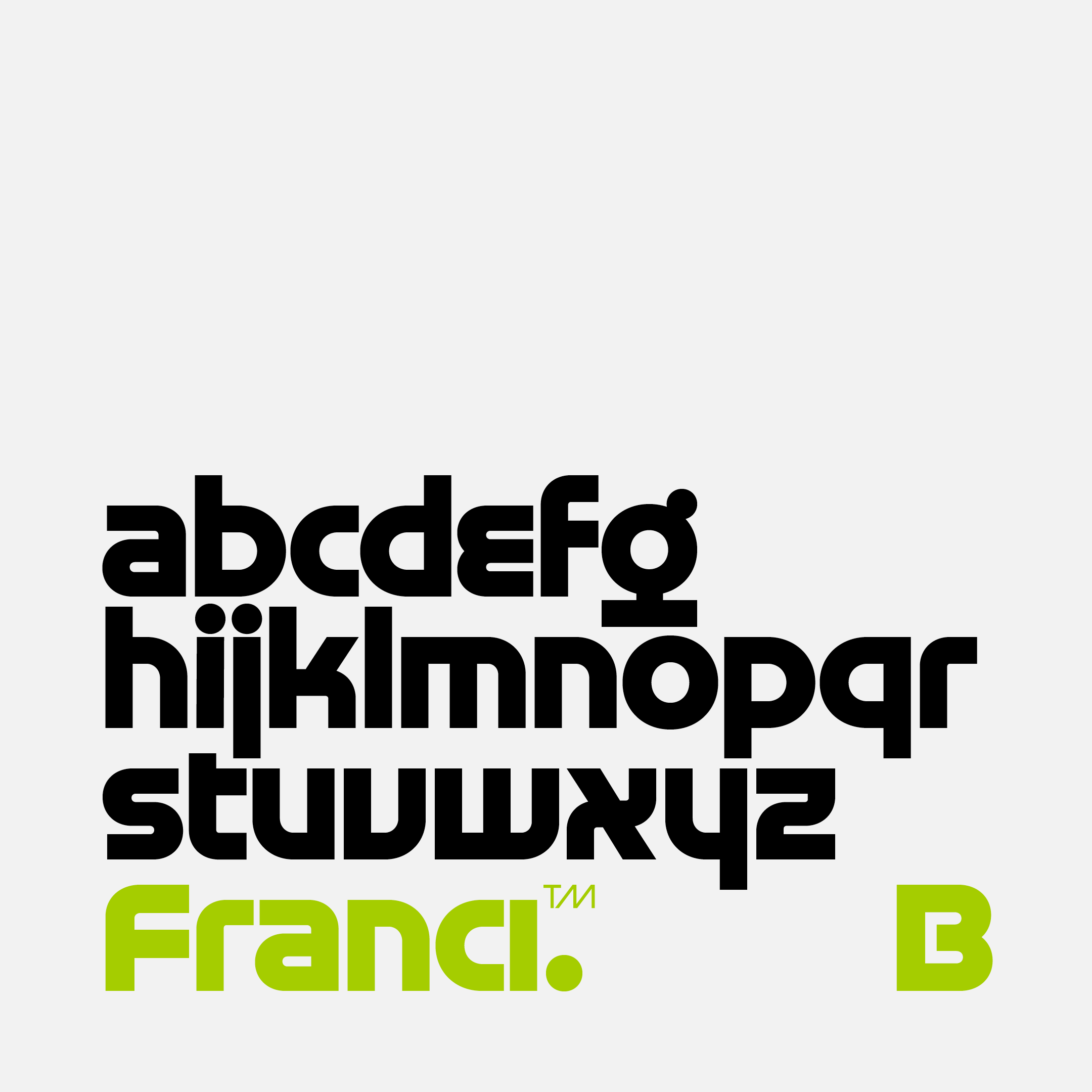
Franci subtly captures the essence of the geometric aesthetic. This typeface, characterized by its elemental simplicity, strikes a harmonious balance between boldness and subtle precision. Franci is a sequel to the Ladislav typeface, a humble homage to the typography of Ladislav Sutnar. Elaborating further on its potential, it moves forward in time visually, touching the typography of Herb Lubalin and admiring the constructed typefaces of Aldo Novarese. In styles ranging from Light to Black, Franci is exhibited in two families, A and B, where the alternation of most characters results in a completely different aesthetic impression. Yet together they form a harmonious whole and are ideal for combined typography. In an era of constantly evolving design, Franci appears to be a simple but distinctive typeface that handles a variety of uses effortlessly. Its geometric precision, clean lines, and uniform shapes give it a timeless appeal. Franci serves as a precise tool for communicating messages with a subtle sense of humor. This typeface celebrates the beauty of simplicity in typography and demonstrates how even subtle elements can have a significant impact on visual communication.
- Number of fonts in a family: 6
- Release date: 2023
- Current version: 1.151
- Available formats: OTF, TTF, WOFF, WOFF2
- Design: Tomáš Brousil
- Afar
- Afrikaans
- Albanian
- Aromanian
- Aymara
- Azeri (Latin)
- Basque
- Bemba
- Bislama
- Bosnian
- Breton
- Catalan
- Chamorro
- Cheyenne
- Chichewa
- Chuukese
- Cofán
- Cornish
- Croatian
- Czech
- Danish
- Dutch
- English
- Esperanto
- Estonian
- Faroese
- Fijian
- Finnish
- French
- Frisian
- Friulian
- Galician
- Ganda
- German
- Gikuyu
- Greenlandic
- Guaraní
- Gwich’in
- Haitian
- Hawaiian
- Hungarian
- Icelandic
- Ido
- Indonesian
- Interlingua
- Irish Gaelic
- Italian
- Javanese
- Kashubian
- Kinyarwanda
- Kiribati
- Kirundi
- Kituba
- Kurdish (Latin)
- Ladin
- Latvian
- Lithuanian
- Luxemburgish
- Malagasy
- Malay
- Maltese
- Manx
- Māori
- Marshallese
- Montenegrin
- Náhuatl
- Nauruan
- Navajo
- Ndebele (Northern)
- Ndebele (Southern)
- Norfuk
- Norn
- Norwegian (Bokmål)
- Occitan
- Palauan
- Papiamento
- Pinyin
- Polish
- Portuguese
- Quechua
- Rhaeto-Romanic
- Romaji
- Romanian
- Sámi (Inari)
- Sámi (Lule)
- Sámi (Northern)
- Sámi (Southern)
- Samoan
- Sango
- Sardinian
- Scottish Gaelic
- Seychelles Creole
- Shona
- Silesian
- Slovak
- Slovene
- Somali (Latin)
- Sotho
- Spanish
- Swahili
- Swati
- Swedish
- Tagalog (Filipino)
- Tahitian
- Tetum
- Tok Pisin
- Tokelauan
- Tongan
- Tsonga
- Tswana
- Turkish
- Tuvalu
- Veps
- Welsh
- Wolof
- Xhosa
- Zulu
Styles

Specimen
Franci B Light
from 59 EUR
Franci B Regular
from 59 EUR
Franci B Semibold
from 59 EUR
Franci B Bold
from 59 EUR
Franci B Black
from 59 EUR
Franci B Striped
from 59 EUR
OpenType features
TOLSESTER