Praha
Agency: Studio Najbrt
Client: City of Prague
Realization: 2025

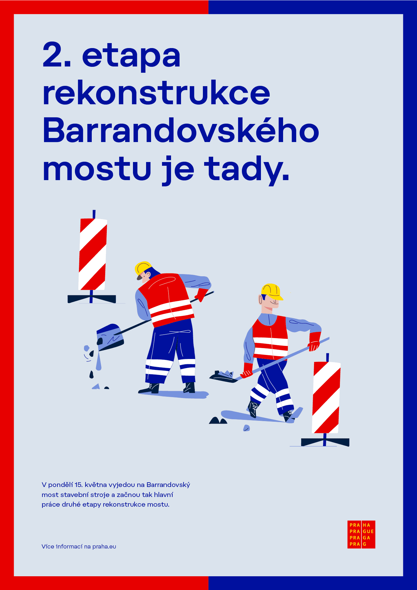
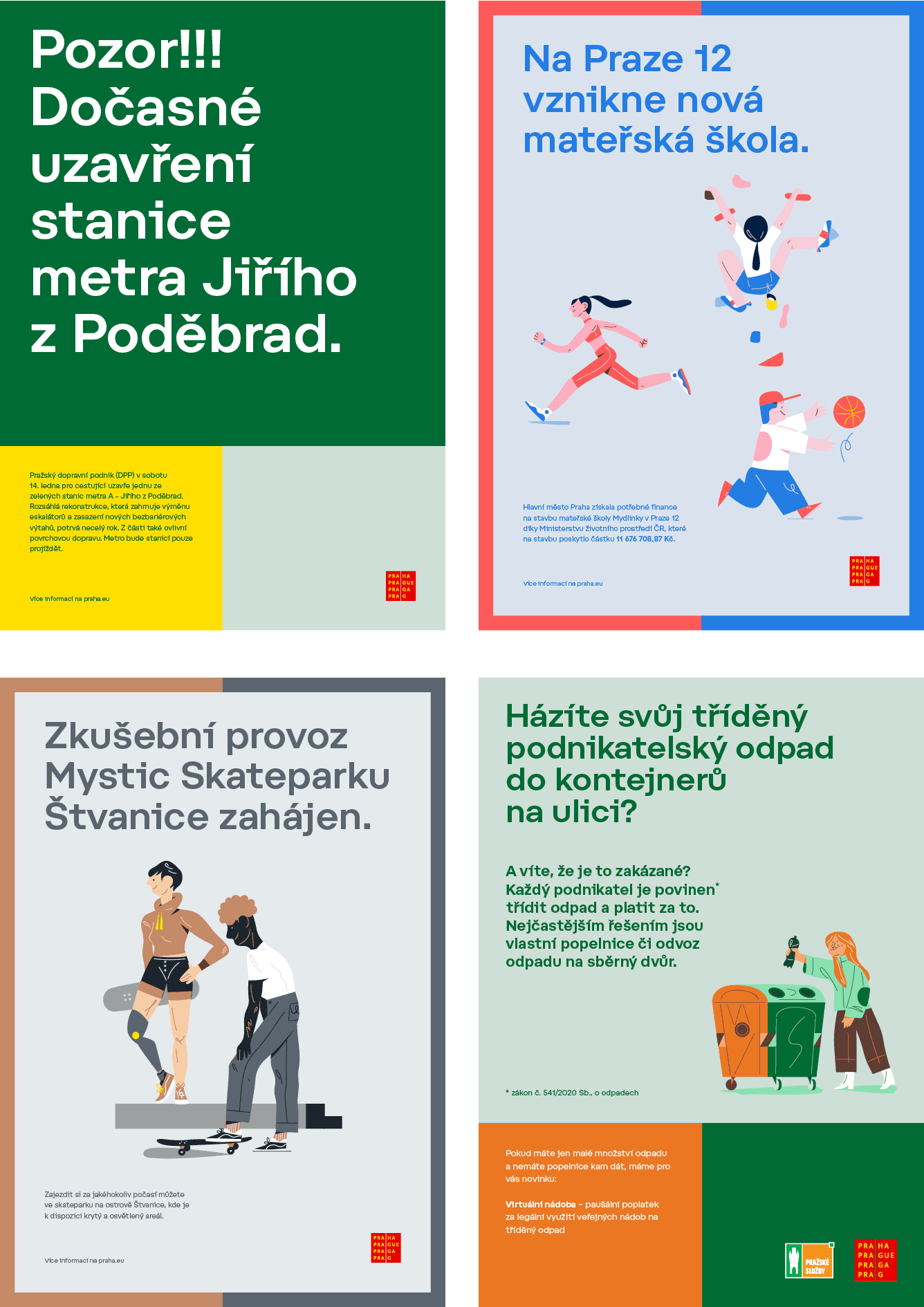
The revised visual identity of the capital city of Prague, built around a subtly refined logo, introduces a comprehensive set of guidelines that reflect the city’s contemporary communication needs. The design manual includes a sophisticated system for creating communication materials, based on format structures, the use of photography and illustration, pictograms, and, above all, a custom typeface.
Praha is a modern geometric grotesque with generous proportions and subtly technical details that give it a distinctive character. Elements of the city’s square logotype are reflected throughout the typeface in dots, accents, and bullet symbols. The family is intentionally limited to essential weights with corresponding italics.


The weight of the Display style has been carefully calibrated to perform optimally in short headlines. Ascenders are shortened to the height of capitals, while lowercase accents and descenders are also reduced in length. This prevents optical collisions and allows for tighter line spacing without compromising legibility.