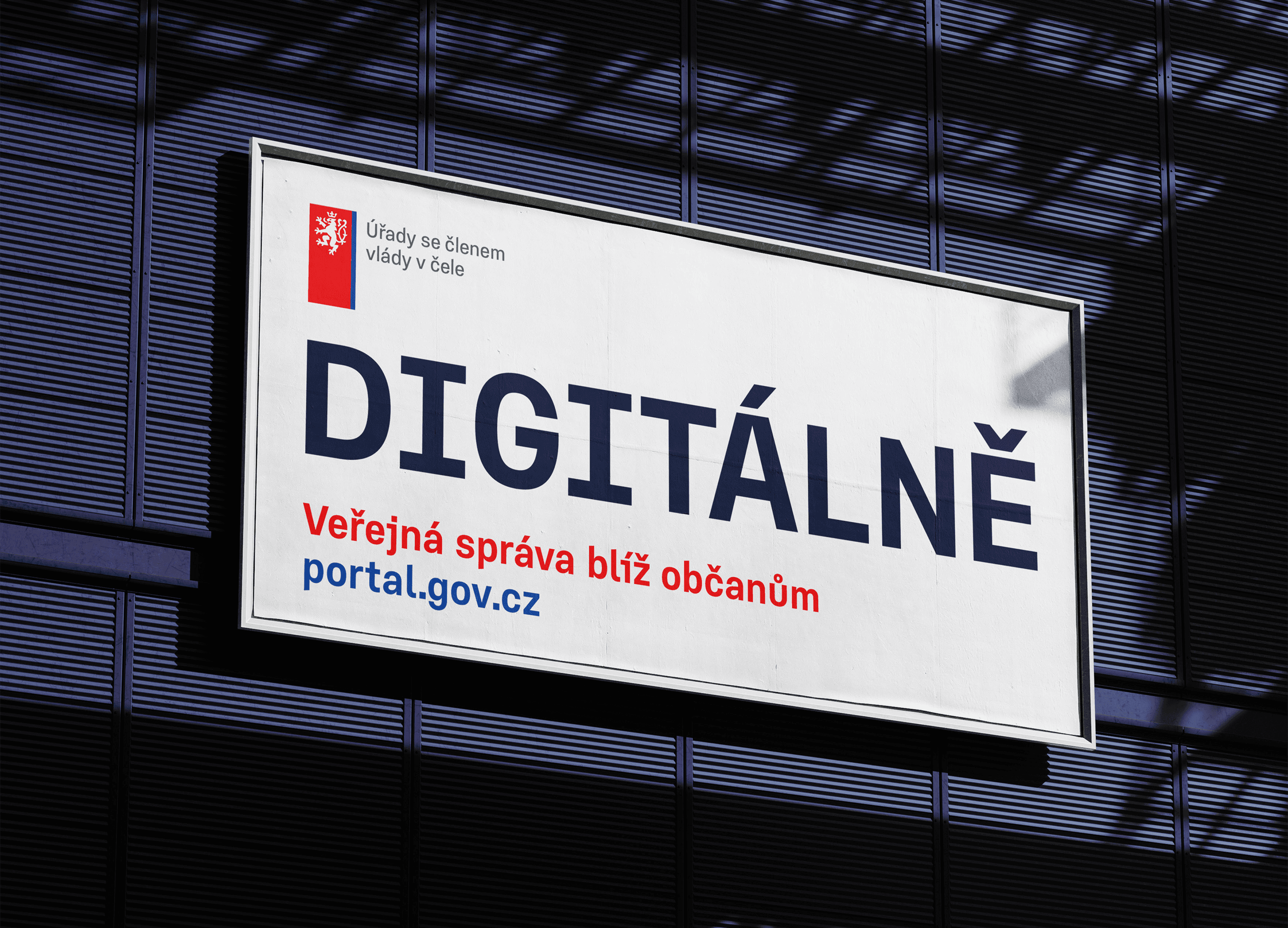
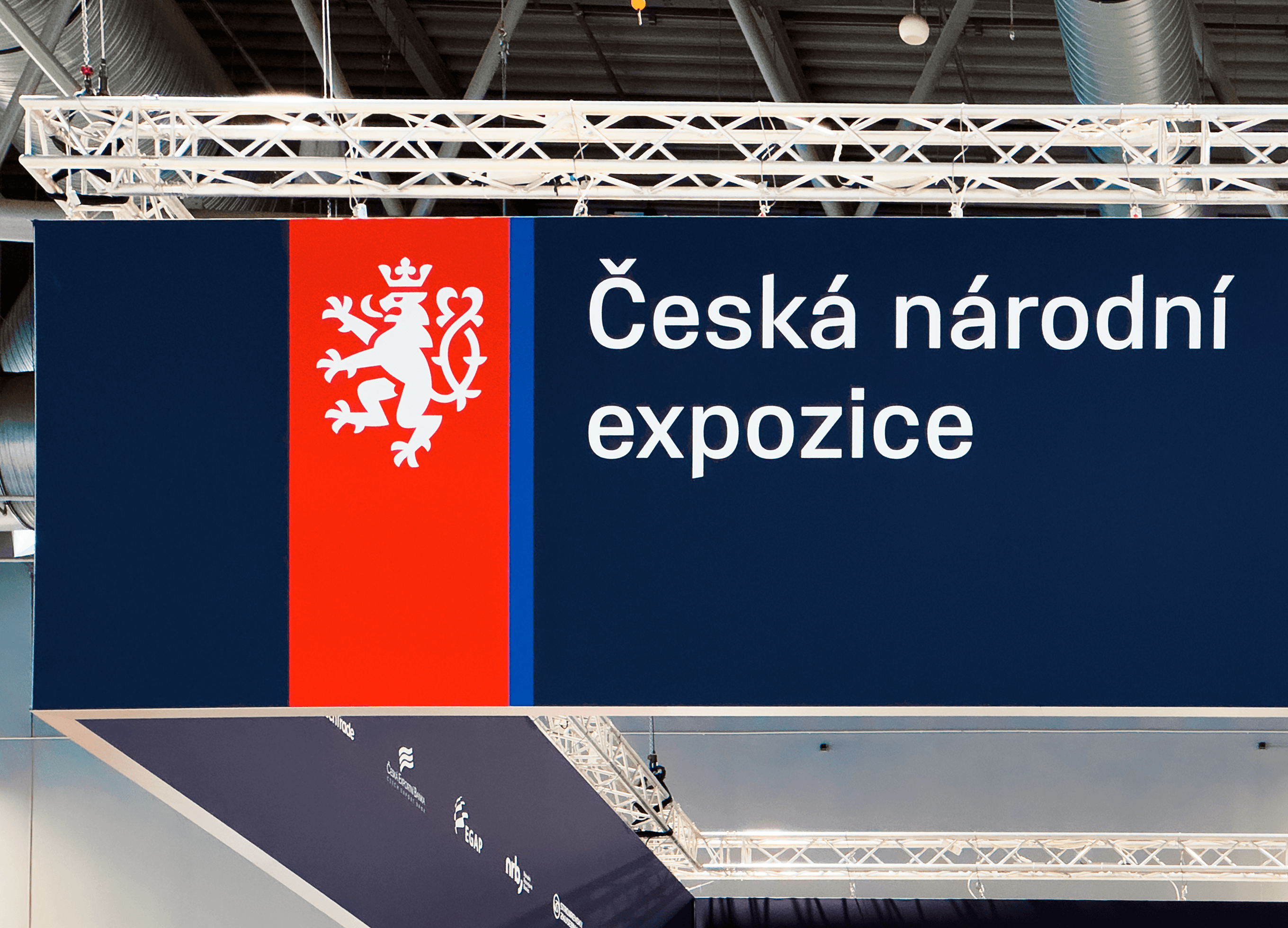
Czechia Sans
Agency: Studio Najbrt
Client: Government of the Czech Republic
Realization: 2025

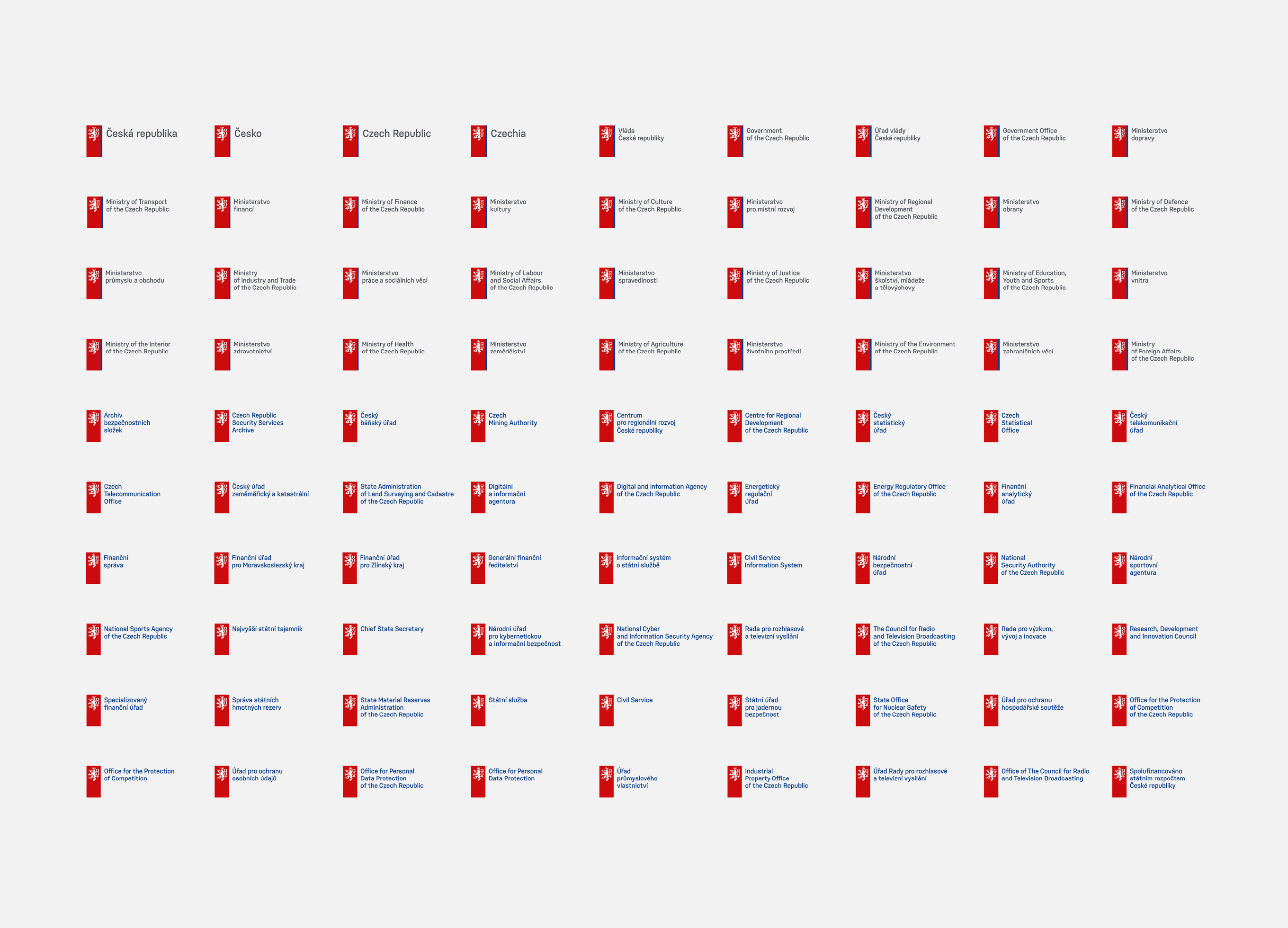
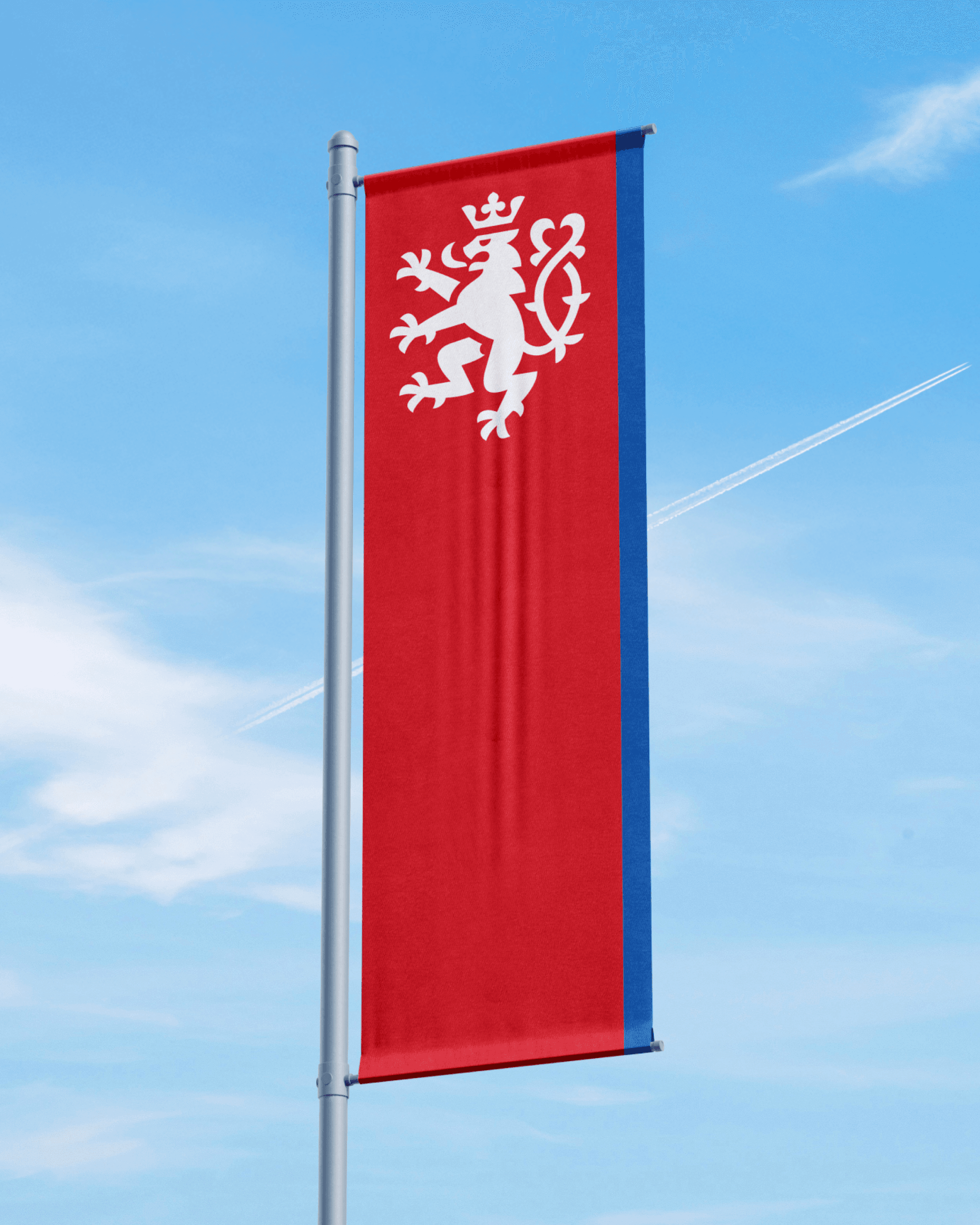
The unified visual identity of the Czech Republic introduces modern standards and a comprehensive set of rules for communication across state administration and government ministries. At its core are a logotype derived from the national coat of arms and the custom typeface Czechia Sans.

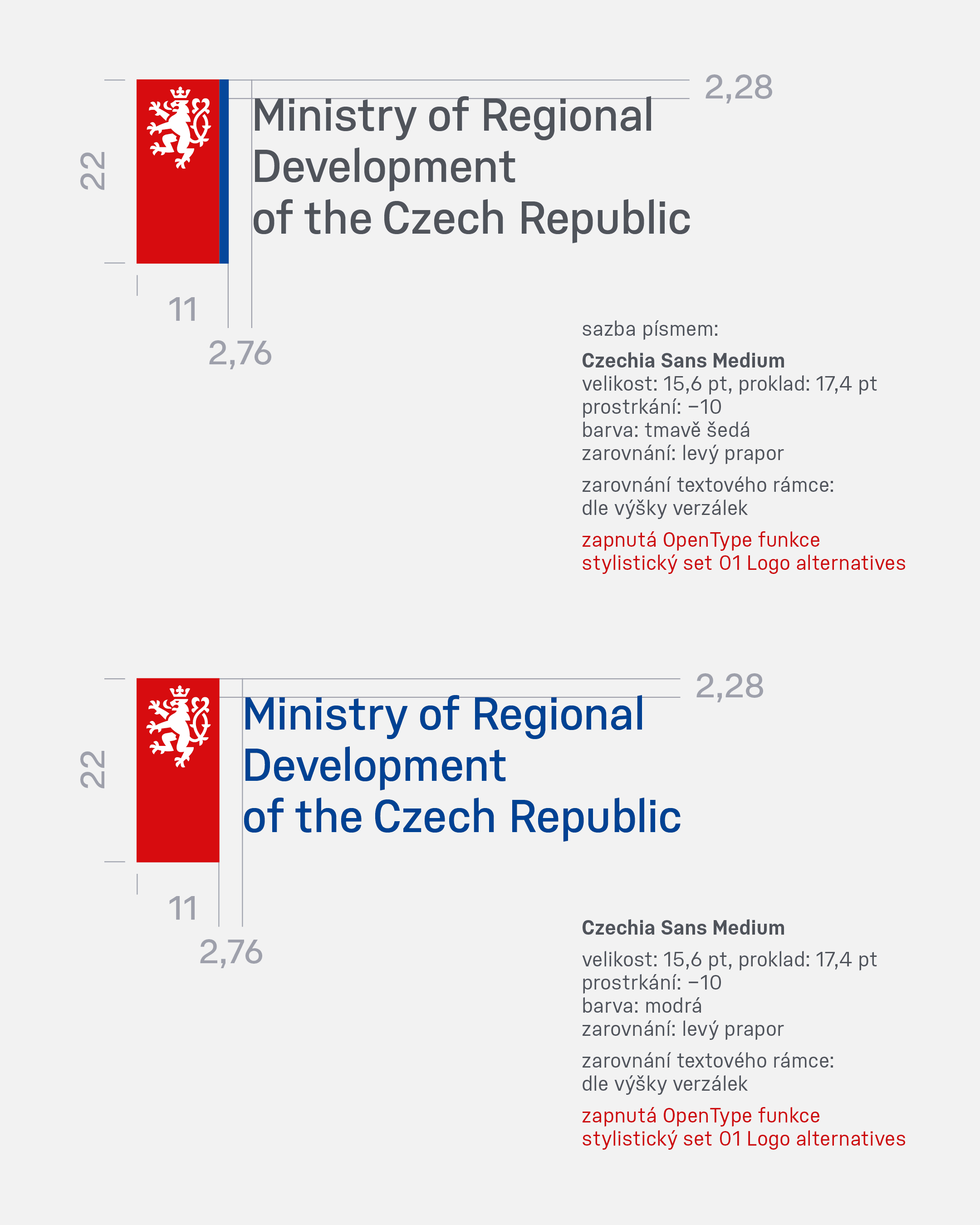
Czechia Sans is a geometric sans serif based on a rectangular construction, with open forms and strictly horizontal stroke terminals. It is defined by a monolinear stroke, differentiated width proportions, formal consistency, and a high degree of detail uniformity. These characteristics ensure excellent legibility across various media and both traditional and contemporary display technologies.


The terminals of ascenders and descenders are finished with a distinctive wedge shape, referencing the symbolism of the national flag. To more clearly differentiate potentially confusable characters (Ilij1), both unilateral and bilateral flat serifs are employed. This improves readability in longer texts and enhances accessibility for visually impaired readers.

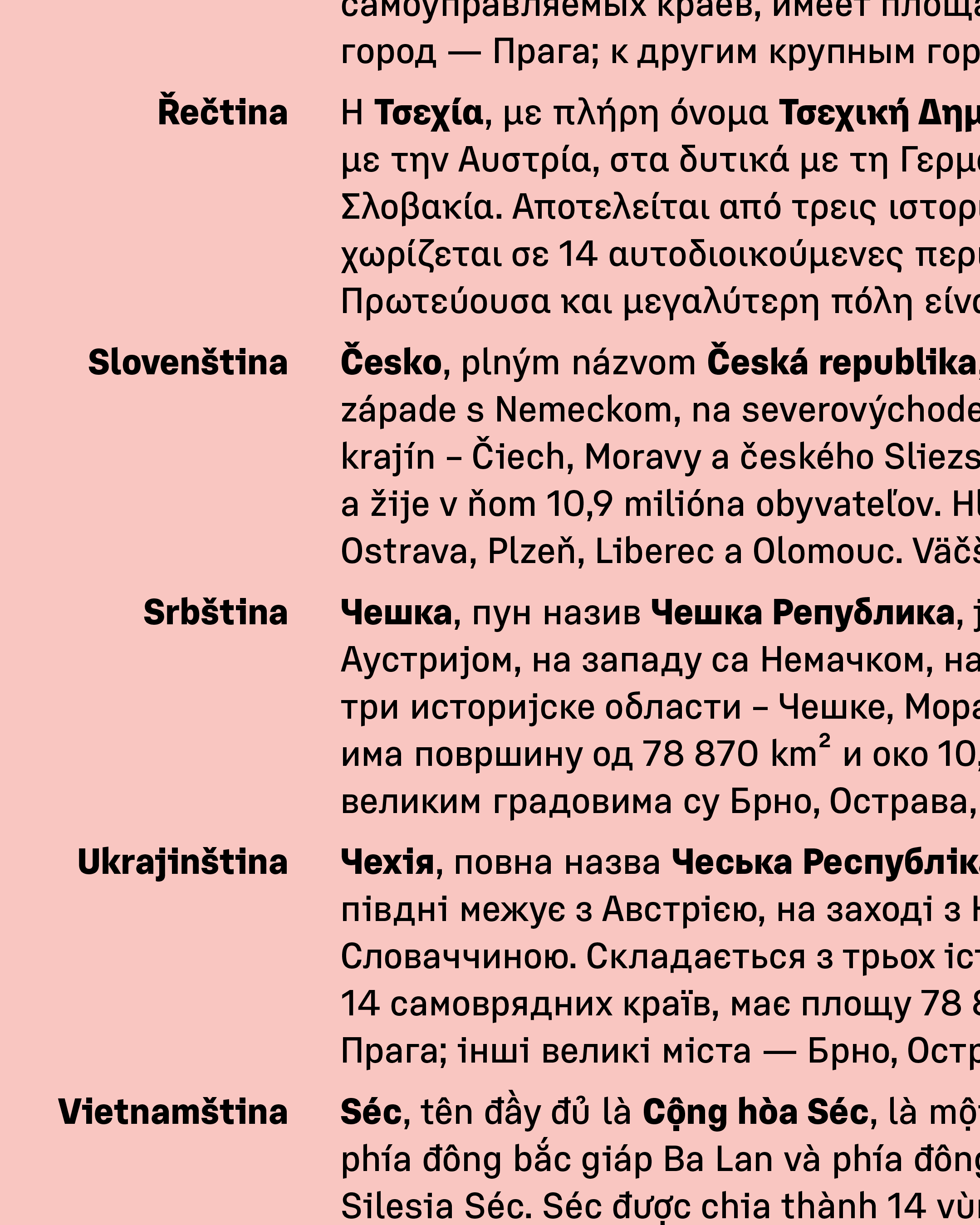
To support national minorities, the typeface includes, in addition to an extended Latin character set, Cyrillic and Greek scripts. Standard features include tabular figures, superior and inferior numerals, fractions, case-sensitive forms, arrows, and a wide range of supplementary symbols. The family is designed in weights from Regular to Black, including corresponding italics.