Katarine

Information

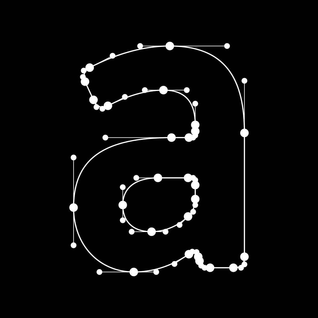
This robust typeface, with its solid character construction and open forms, was originally designed as an uppercase typeface intended for poster typesetting and small-format printing. It was subsequently expanded to include lowercase letters and additional weights, resulting in a complete family including italics.
Several drawing principles were applied in creating the characters. The uppercase letters are based on an oval shape and are therefore lighter in the upper parts; the lowercase letters are drawn more from a square shape and sit better on the baseline. The numerals are almost geometric. All these principles contradict one another, creating a very pleasant tension in the text. Although the typeface has no special adjustments to the x-height and is slightly narrow, it excels in readability even at small sizes. Yet, its characteristic design, hidden in the details, is better suited to poster sizes.

  • Number of fonts in a family: 10
  • Release date: 2004
  • Current version: 1.001
  • Available formats: OTF, TTF, WOFF, WOFF2
  • Design: Tomáš Brousil
108 languages
  • Afar
  • Afrikaans
  • Albanian
  • Aromanian
  • Aymara
  • Basque
  • Bemba
  • Bislama
  • Bosnian
  • Breton
  • Catalan
  • Chamorro
  • Chichewa
  • Chuukese
  • Cofán
  • Croatian
  • Czech
  • Danish
  • Dutch
  • English
  • Esperanto
  • Estonian
  • Faroese
  • Fijian
  • Finnish
  • French
  • Frisian
  • Friulian
  • Galician
  • Ganda
  • German
  • Gikuyu
  • Greenlandic
  • Gwich’in
  • Haitian
  • Hawaiian
  • Hungarian
  • Icelandic
  • Ido
  • Indonesian
  • Interlingua
  • Irish Gaelic
  • Italian
  • Javanese
  • Kashubian
  • Kinyarwanda
  • Kiribati
  • Kirundi
  • Kituba
  • Kurdish (Latin)
  • Ladin
  • Latvian
  • Lithuanian
  • Luxemburgish
  • Malay
  • Maltese
  • Manx
  • Māori
  • Montenegrin
  • Náhuatl
  • Nauruan
  • Ndebele (Northern)
  • Ndebele (Southern)
  • Norfuk
  • Norn
  • Norwegian (Bokmål)
  • Occitan
  • Palauan
  • Papiamento
  • Polish
  • Portuguese
  • Quechua
  • Rhaeto-Romanic
  • Romaji
  • Sámi (Inari)
  • Sámi (Lule)
  • Sámi (Northern)
  • Sámi (Southern)
  • Samoan
  • Sango
  • Sardinian
  • Scottish Gaelic
  • Seychelles Creole
  • Shona
  • Silesian
  • Slovak
  • Slovene
  • Somali (Latin)
  • Sotho
  • Spanish
  • Swahili
  • Swati
  • Swedish
  • Tagalog (Filipino)
  • Tahitian
  • Tetum
  • Tok Pisin
  • Tokelauan
  • Tongan
  • Tsonga
  • Tswana
  • Turkish
  • Tuvalu
  • Veps
  • Welsh
  • Wolof
  • Xhosa
  • Zulu

Styles

Light 
Light Italic 
Regular 
Italic 
Medium 
Medium Italic 
SemiBold 
SemiBold Italic 
Bold 
Bold Italic

Specimen

Katarine Light

from 59 EUR

Antirealistic

Katarine Light Italic

from 59 EUR

Typographer

Katarine Regular

from 59 EUR

Menopause

Katarine Italic

from 59 EUR

Unsynthetic

Katarine Medium

from 59 EUR

Sweetshop

Katarine Medium Italic

from 59 EUR

Christopher

Katarine SemiBold

from 59 EUR

Incapacity

Katarine SemiBold Italic

from 59 EUR

Repayment

Katarine Bold

from 59 EUR

Bipersonal

Katarine Bold Italic

from 59 EUR

Stylization

Katarine SemiBold

from 59 EUR

A letter cast from a mixture of lead and tin is alive. Smeared with soot and oil, it leaves a trace of its painful fate on the snow-white sheet. Each subsequent impression records a fragment of its sorrowful journey back to the fiery furnace from which it emerged in pristine whiteness. The tragic trace of the cosmic cycle is imprinted among thousands of other inevitable moments. A character freshly cast from the typeface has clear, sharp features; its imprints no longer do. Every pressed grain of pigment finds its place among millions of matted plant fibers. The image is nothing but a large, black, smudged tear.

Katarine Medium

from 59 EUR

Gutenberg began developing his printing press around 1436, when he entered into a partnership with Andreas Dritzehn, who had experience teaching gem-cutting, and Andreas Heilmann, the owner of a paper mill. Documentary evidence of his work appeared later, in 1439, during a legal dispute in which witness testimonies mentioned Gutenberg’s movable type, an inventory of metals such as lead, and tools used to create type molds. Drawing on his background as a trained goldsmith, Gutenberg applied his knowledge of metalworking to the development of printing technology. He was the first to produce movable type from an alloy of lead, tin, and antimony, a combination that proved highly suitable for creating durable type capable of producing consistent, high-quality prints. To manufacture these metal types efficiently, he developed an innovative matrix system that allowed individual letters to be cast quickly and precisely according to a standardized form. His type case is believed to have contained approximately 290 separate compartments, many of which were needed for special characters, ligatures, punctuation marks, and other typographic elements. Gutenberg is also associated with the introduction of oil-based printing ink, which was more stable and long-lasting than earlier water-based inks. For printing surfaces he used both paper and vellum, a fine-quality parchment. In the Gutenberg Bible he experimented with limited colour printing for certain page headings, although this feature appears only in some surviving copies. A later publication, the Mainz Psalter of 1453, likely designed by Gutenberg but printed by his successors Johann Fust and Peter Schöffer, included elaborate initials printed in red and blue.

OpenType features

Tändzin Gjamccho

Glyphs

Katarine in use