Ladislav

Information

Ladislav Sutnar (1897–1976) devoted his entire life to the visualization of information in everyday life as well as in public space, and to visual literacy in general. First in Czechoslovakia, and from 1939 also in New York City, where he joined other prominent émigrés such as El Lissitzky, Herbert Bayer, and László Moholy-Nagy. Over time, Sutnar worked on book and magazine design, posters, advertising graphics, product catalogs, visual identity, and wayfinding systems. He also designed wooden toys and puppets, worked in scenography, created drinking glassware and porcelain, and devoted a significant part of his work to exhibition design and fine art painting. His insights into design and visual flow were recorded in several professional publications, which rank among the most important texts on graphic design.
Sutnar was a pioneer of modern graphic and information design, but he also engaged in type design. In 1958, he drew part of an alphabet and a set of numerals for house signage in the Bronx, and later developed a similar concept for a wayfinding system at the Brooklyn School. It is no surprise that his designs incorporate all the typical features of his work: simplicity, clarity, directness, and strong visual impact.
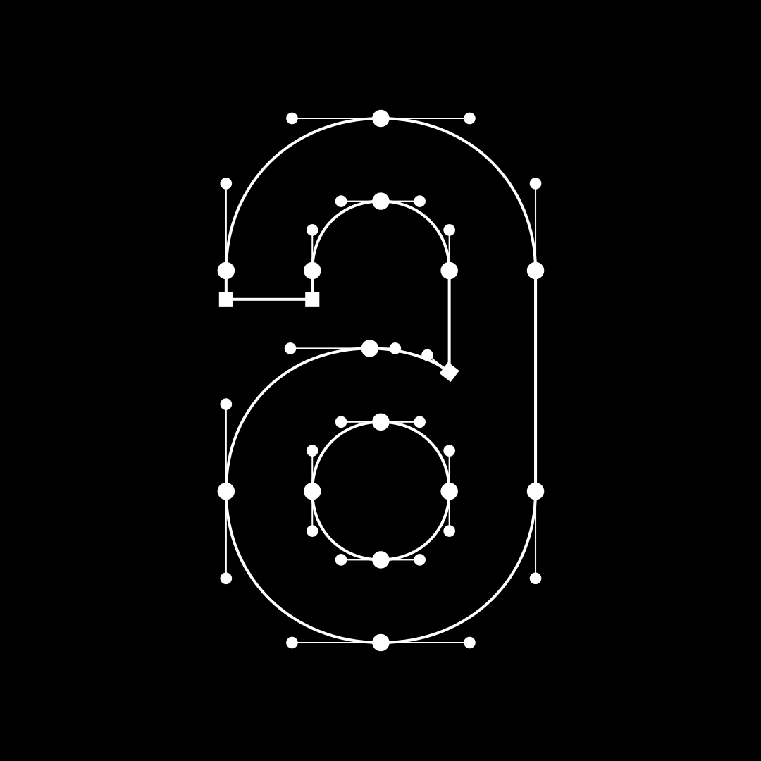
The typeface Ladislav revitalizes Sutnar’s legacy, although it does not directly replicate any of his original type designs. It preserves their technical character and underlying principles of letter construction — a simple modular system built from connected basic geometric segments. This approach shapes all-around forms of both lowercase and uppercase letters, as well as the morphology of most numerals.

  • Number of fonts in a family: 12
  • Release date: 2013
  • Current version: 1.151
  • Available formats: OTF, TTF, WOFF, WOFF2
  • Variable file: Available upon request with the purchase of the complete type family.
  • Design: Tomáš Brousil
108 languages
  • Afar
  • Afrikaans
  • Albanian
  • Aromanian
  • Aymara
  • Basque
  • Bemba
  • Bislama
  • Bosnian
  • Breton
  • Catalan
  • Chamorro
  • Chichewa
  • Chuukese
  • Cofán
  • Croatian
  • Czech
  • Dutch
  • English
  • Esperanto
  • Estonian
  • Faroese
  • Fijian
  • Finnish
  • French
  • Frisian
  • Friulian
  • Galician
  • Ganda
  • German
  • Gikuyu
  • Greenlandic
  • Gwich’in
  • Haitian
  • Hawaiian
  • Hungarian
  • Icelandic
  • Ido
  • Indonesian
  • Interlingua
  • Irish Gaelic
  • Italian
  • Javanese
  • Kashubian
  • Kinyarwanda
  • Kiribati
  • Kirundi
  • Kituba
  • Kurdish (Latin)
  • Ladin
  • Latvian
  • Lithuanian
  • Luxemburgish
  • Malay
  • Maltese
  • Manx
  • Māori
  • Montenegrin
  • Náhuatl
  • Nauruan
  • Ndebele (Northern)
  • Ndebele (Southern)
  • Norfuk
  • Norn
  • Norwegian (Bokmål)
  • Occitan
  • Palauan
  • Papiamento
  • Polish
  • Portuguese
  • Quechua
  • Rhaeto-Romanic
  • Romaji
  • Romanian
  • Sámi (Inari)
  • Sámi (Lule)
  • Sámi (Northern)
  • Sámi (Southern)
  • Samoan
  • Sango
  • Sardinian
  • Scottish Gaelic
  • Seychelles Creole
  • Shona
  • Silesian
  • Slovak
  • Slovene
  • Somali (Latin)
  • Sotho
  • Spanish
  • Swahili
  • Swati
  • Swedish
  • Tagalog (Filipino)
  • Tahitian
  • Tetum
  • Tok Pisin
  • Tokelauan
  • Tongan
  • Tsonga
  • Tswana
  • Turkish
  • Tuvalu
  • Veps
  • Welsh
  • Wolof
  • Xhosa
  • Zulu

Styles

Light 
Light Reversed 
Light Italic 
Regular 
Reversed 
Italic 
SemiBold 
SemiBold Reversed 
SemiBold Italic 
Bold 
Bold Reversed 
Bold Italic

Specimen

Ladislav Light

from 39 EUR

Livingness

Ladislav Light Italic

from 39 EUR

Sentiment

Ladislav Light Reversed

from 39 EUR

Enjoyment

Ladislav Regular

from 39 EUR

Recapture

Ladislav Italic

from 39 EUR

Sacrarium

Ladislav Reversed

from 39 EUR

Unmelting

Ladislav SemiBold

from 39 EUR

Clapboard

Ladislav SemiBold Italic

from 39 EUR

Humanics

Ladislav SemiBold Reversed

from 39 EUR

Ignoration

Ladislav Bold

from 39 EUR

Automate

Ladislav Bold Italic

from 39 EUR

Diagnosis

Ladislav Bold Reversed

from 39 EUR

Teamaker

Ladislav Bold

from 39 EUR

⟶ SUTNAR WAS AMONG THE EARLIEST DESIGNERS TO WORK SYSTEMATICALLY IN THE FIELD NOW KNOWN AS INFORMATION DESIGN. ⟶

Ladislav SemiBold

from 39 EUR

Ladislav Sutnar was not officially credited for introducing the use of parentheses around the American telephone area code in the Bell System during the late 1950s and early 1960s, even though this typographic solution significantly improved access to both everyday and emergency services.

Ladislav SemiBold Italic

from 39 EUR

The absence of formal recognition may be explained by the fact that graphic designers were often considered invisible contributors, whose work was expected to function efficiently without drawing attention to its authorship. Sutnar himself used parentheses in his own projects as a means of emphasizing and clearly separating important information.

Ladislav SemiBold

from 39 EUR

Ladislav Sutnar was born on 9 November 1897 in Plzeň, in the region of Bohemia. He studied painting at the School of Applied Arts in Prague, architecture at Charles University, and mathematics at the Czech Technical University. After completing his studies, he worked in a variety of artistic fields, including the design of wooden toys, puppets, costumes, and stage sets. He was also active in exhibition design, teaching, and the creation of magazines, books, porcelain objects, and textiles. Between 1923 and 1936, he taught at the State School of Graphic Arts in Prague. During this period in Europe, he became recognized for his work in typography and exhibition design. While living in Prague, Sutnar was also a member of the Artěl Cooperative, an association of designers that included figures such as Vlastislav Hofman and Rudolf Stockar. The cooperative brought together Czechoslovak designers who produced furniture and decorative objects inspired by the principles of the Wiener Werkstätte, which emphasized the accessibility of art in everyday life. Their work included ceramics, textiles, carpets, furniture, and metal objects intended to improve the visual quality of daily environments. The cooperative ceased its activities in 1924. In 1927, Sutnar became head of publication design for a major publishing house in Prague. The following year he participated in the international Pressa exhibition, where he was responsible for the design of the Czechoslovak pavilion, collaborating with Augustin Tschinkel. In 1932, he was appointed director of the State School of Graphic Arts. He continued working in exhibition design and received a gold medal at the Barcelona Exhibition in 1929. In addition to these activities, Sutnar worked as art director for a publishing company and served as editor of an architectural magazine. In 1939, Sutnar travelled to the United States to design the Czechoslovak exhibition at the New York World’s Fair. When the project was cancelled, he decided to remain in New York, while his family stayed in Prague during the period of Nazi occupation. From 1941 to 1960, he worked as art director for F. W. Dodge’s Sweet’s Catalog Service, where he collaborated with Knud Lönberg-Holm and contributed significantly to the development of information design. The company produced catalogues for trade and manufacturing industries, and Sutnar introduced typographic and visual elements that enabled users to navigate large amounts of technical information more easily. He employed structured grids, tabs, symbols, and icons to create clear visual organization. Together with Lönberg-Holm, he published New Patterns in Product Information in 1944, presenting an approach based on clarity, simplicity, and functional design.

OpenType features

Geothermal

Glyphs

Ladislav in use