


Information
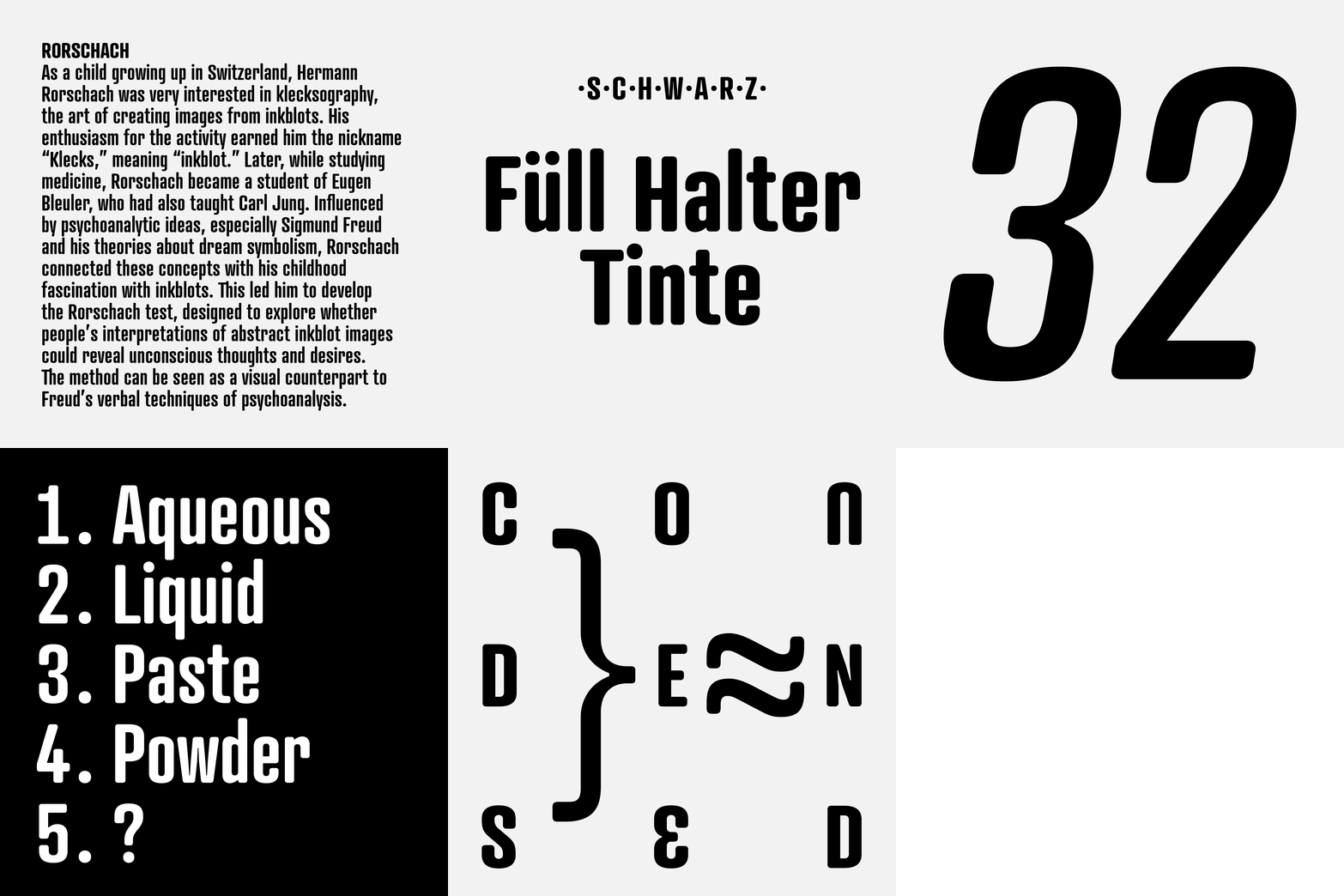
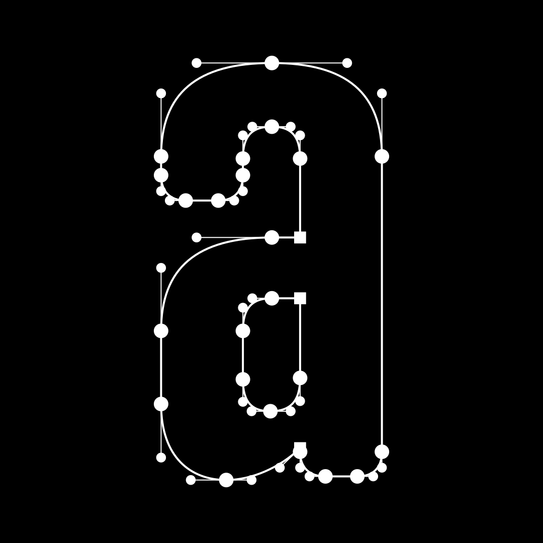
The Atrament typeface family was originally designed in 2003 as a corporate typeface family for the Suitcase Type Foundry. Its primary inspiration is the cover of the almanac Devetsil – Revolutionary Dictionary (1922), designed by Karel Teige. The typeface on this cover is a narrow sans-serif with rounded stroke terminals. Atrament is significantly wider than its model, and its characters are better balanced, reflecting the development of semi-condensed sans-serif typefaces throughout the 1960s. The horizontal strokes of both lowercase and uppercase letters are less emphasized than the vertical strokes. Noteworthy are the inktraps - unusually small spaces in the corners of letters with diagonal strokes, which are intended to prevent ink smudging and the blurring of letterforms. This detail is one of the typeface’s main characteristics. The overall impression of the italic is very close to the strictly vertical, parallel character of the regular weight.
Thanks to its narrow proportions, Atrament is the ideal choice whenever space needs to be saved. It is not particularly suitable for setting long texts, but it is ideal for headlines and captions and is perfectly suited for situations where text needs to make a big impression in a small space.
- Number of fonts in a family: 10
- Release date: 2003
- Current version: 1.002
- Available formats: OTF, TTF, WOFF, WOFF2
- Design: Tomáš Brousil
- Afar
- Afrikaans
- Albanian
- Aromanian
- Aymara
- Basque
- Bemba
- Bislama
- Bosnian
- Breton
- Catalan
- Chamorro
- Chichewa
- Chuukese
- Cofán
- Croatian
- Czech
- Danish
- Dutch
- English
- Esperanto
- Estonian
- Faroese
- Fijian
- Finnish
- French
- Frisian
- Friulian
- Galician
- Ganda
- German
- Gikuyu
- Greenlandic
- Gwich’in
- Haitian
- Hawaiian
- Hungarian
- Icelandic
- Ido
- Indonesian
- Interlingua
- Irish Gaelic
- Italian
- Javanese
- Kashubian
- Kinyarwanda
- Kiribati
- Kirundi
- Kituba
- Kurdish (Latin)
- Ladin
- Latvian
- Lithuanian
- Luxemburgish
- Malay
- Maltese
- Manx
- Māori
- Montenegrin
- Náhuatl
- Nauruan
- Ndebele (Northern)
- Ndebele (Southern)
- Norfuk
- Norn
- Norwegian (Bokmål)
- Occitan
- Palauan
- Papiamento
- Polish
- Portuguese
- Quechua
- Rhaeto-Romanic
- Romaji
- Sámi (Inari)
- Sámi (Lule)
- Sámi (Northern)
- Sámi (Southern)
- Samoan
- Sango
- Sardinian
- Scottish Gaelic
- Seychelles Creole
- Shona
- Silesian
- Slovak
- Slovene
- Somali (Latin)
- Sotho
- Spanish
- Swahili
- Swati
- Swedish
- Tagalog (Filipino)
- Tahitian
- Tetum
- Tok Pisin
- Tokelauan
- Tongan
- Tsonga
- Tswana
- Turkish
- Tuvalu
- Veps
- Welsh
- Wolof
- Xhosa
- Zulu
Styles
Specimen
Atrament Light
from 59 EUR
Atrament Light Italic
from 59 EUR
Atrament Regular
from 59 EUR
Atrament Italic
from 59 EUR
Atrament Medium
from 59 EUR
Atrament Medium Italic
from 59 EUR
Atrament SemiBold
from 59 EUR
Atrament SemiBold Italic
from 59 EUR
Atrament Bold
from 59 EUR
Atrament Bold Italic
from 59 EUR
Atrament Medium
from 59 EUR
Atrament Medium Italic
from 59 EUR
Atrament Medium
from 59 EUR
OpenType features
SACRAMENTÓ