About
Founded in Prague by type designer Tomáš Brousil in 2003, Suitcase Type Foundry creates retail and custom typefaces. Its work reflects a long-term interest in considered type design, technical precision, and carefully crafted type systems.
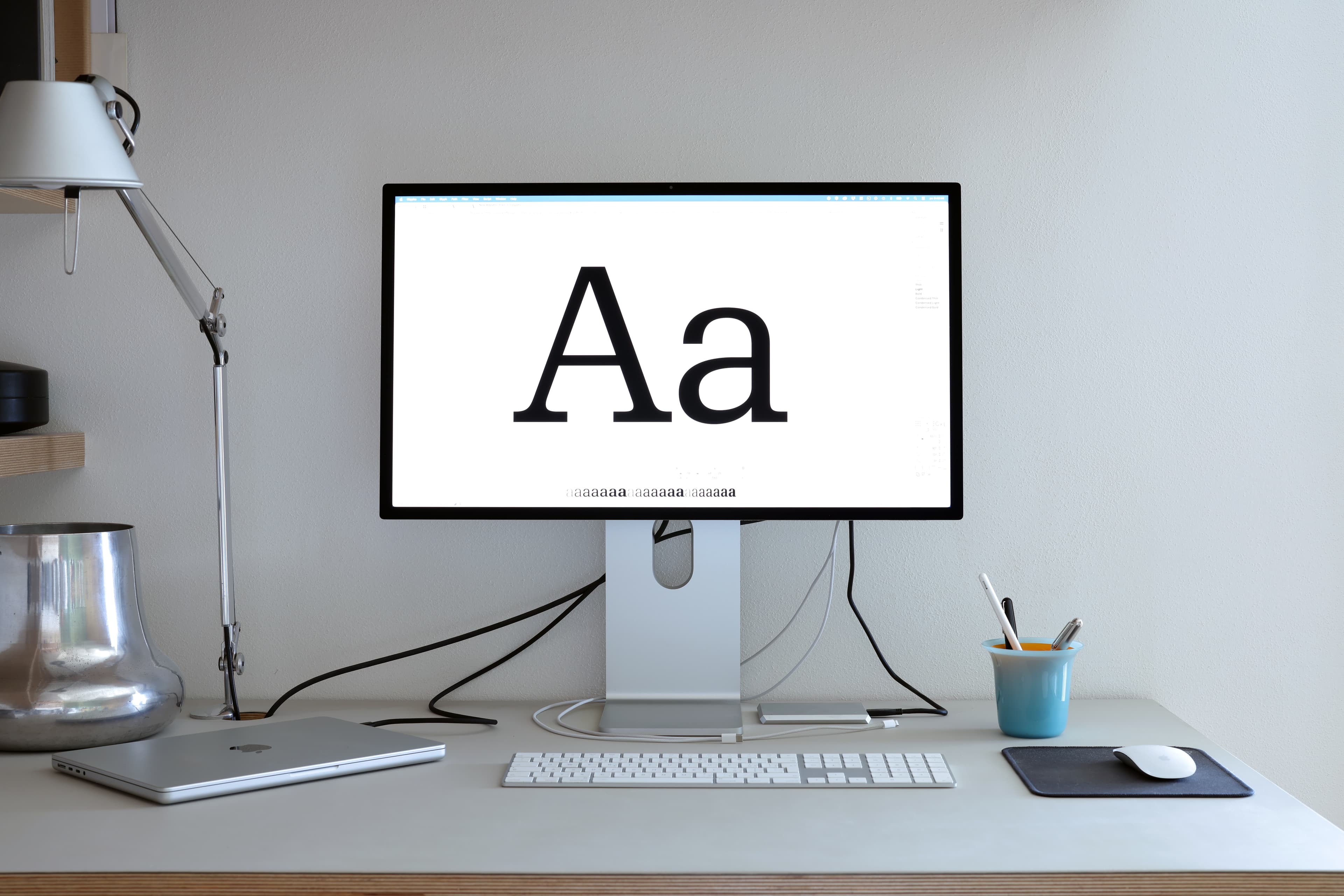
Do we really need more typefaces?
This question has accompanied Suitcase Type Foundry from the beginning. There are already more typefaces than anyone could use in a lifetime, and new ones appear every day. The reason to design another cannot simply be novelty. It has to offer a different way of solving a problem, extend the possibilities of use, or bring an existing idea into a form better suited to the present.
Suitcase Type Foundry was established in Prague in 2003 by Tomáš Brousil and has remained a one-person foundry ever since. The same person develops the concept, draws the characters, builds the families, prepares the font data, tests the results and decides how the typefaces are presented. This is not self-sufficiency for its own sake, but a way of keeping design, production and real use connected and consistent throughout the process.
A typeface begins with an idea, but that is only the first layer. The initial stage — searching for proportions, rhythm and the construction of key characters — is the most open and intuitive. Everything that follows is systematic. A few characteristic forms must develop into a complete alphabet, the alphabet into a coherent family, and the family must work reliably in conditions that cannot all be anticipated while drawing.
For that reason, Suitcase treats type design and type development as one discipline. Drawing is inseparable from spacing, kerning, language support, OpenType features, interpolation, file production and testing. Much of this work remains almost invisible in the finished typeface, but it determines whether the design holds up beyond a specimen image and performs reliably in practice.
Function does not mean neutrality, and character does not have to compromise usability. Some Suitcase families are restrained, others more emphatic, but each needs a clear internal logic. The aim is not to impose a recognisable house style on every project, but to find the form appropriate to the brief and develop it with enough consistency and range to become a genuinely useful typographic system.
This is why many Suitcase typefaces grow as families rather than isolated styles. Their scope is not determined by a fixed formula, but by the needs of the concept. Weights, widths, optical sizes, companion families or variable axes are added when they serve a purpose. The Tabac Collection, for example, developed over ten years, from the original diploma project in 2009 to the release of the Tabac Big families in 2019. Its scale was not an exercise in quantity, but the result of building a broad system for editorial typography.
Retail and custom work are two parts of the same practice. Retail families allow ideas to develop beyond the limits of a single commission and prepare them for different contexts. Custom projects begin with a specific environment, technical conditions or visual identity, and often reveal requirements that would otherwise remain theoretical. The two areas continually inform each other.
History is present in this work, but not as a catalogue of styles to reproduce. Earlier typefaces, printing technologies and lettering traditions matter because they reveal principles: how forms respond to technology, how proportions affect reading, and how a distinct voice can emerge from limited means. A historical source becomes relevant only when it can be understood and transformed for contemporary use.
Technology changes continuously; the fundamental questions much less. Does the typeface have a reason to exist? Are the relationships between its parts coherent? Does it work across sizes, languages and media? Can designers use it without avoidable limitations? New formats and tools may offer better answers, but they are never ends in themselves.
Suitcase does not pursue originality as an effect. Innovation is useful when it grows from necessity. A typeface can be new without appearing unprecedented, and familiar without being derivative. What matters is that its decisions are specific, deliberate and internally consistent.
The result should not require the user to admire the amount of work behind it. A well-designed typeface becomes part of the structure of communication. It may define the character of a visual identity or remain almost unnoticed in continuous text, but in both cases it should help the content speak with greater clarity and precision.
That remains the reason to design more typefaces.
Suitcase Type Foundry was established in Prague in 2003 by Tomáš Brousil and has remained a one-person foundry ever since. The same person develops the concept, draws the characters, builds the families, prepares the font data, tests the results and decides how the typefaces are presented. This is not self-sufficiency for its own sake, but a way of keeping design, production and real use connected and consistent throughout the process.
A typeface begins with an idea, but that is only the first layer. The initial stage — searching for proportions, rhythm and the construction of key characters — is the most open and intuitive. Everything that follows is systematic. A few characteristic forms must develop into a complete alphabet, the alphabet into a coherent family, and the family must work reliably in conditions that cannot all be anticipated while drawing.
For that reason, Suitcase treats type design and type development as one discipline. Drawing is inseparable from spacing, kerning, language support, OpenType features, interpolation, file production and testing. Much of this work remains almost invisible in the finished typeface, but it determines whether the design holds up beyond a specimen image and performs reliably in practice.
Function does not mean neutrality, and character does not have to compromise usability. Some Suitcase families are restrained, others more emphatic, but each needs a clear internal logic. The aim is not to impose a recognisable house style on every project, but to find the form appropriate to the brief and develop it with enough consistency and range to become a genuinely useful typographic system.
This is why many Suitcase typefaces grow as families rather than isolated styles. Their scope is not determined by a fixed formula, but by the needs of the concept. Weights, widths, optical sizes, companion families or variable axes are added when they serve a purpose. The Tabac Collection, for example, developed over ten years, from the original diploma project in 2009 to the release of the Tabac Big families in 2019. Its scale was not an exercise in quantity, but the result of building a broad system for editorial typography.
Retail and custom work are two parts of the same practice. Retail families allow ideas to develop beyond the limits of a single commission and prepare them for different contexts. Custom projects begin with a specific environment, technical conditions or visual identity, and often reveal requirements that would otherwise remain theoretical. The two areas continually inform each other.
History is present in this work, but not as a catalogue of styles to reproduce. Earlier typefaces, printing technologies and lettering traditions matter because they reveal principles: how forms respond to technology, how proportions affect reading, and how a distinct voice can emerge from limited means. A historical source becomes relevant only when it can be understood and transformed for contemporary use.
Technology changes continuously; the fundamental questions much less. Does the typeface have a reason to exist? Are the relationships between its parts coherent? Does it work across sizes, languages and media? Can designers use it without avoidable limitations? New formats and tools may offer better answers, but they are never ends in themselves.
Suitcase does not pursue originality as an effect. Innovation is useful when it grows from necessity. A typeface can be new without appearing unprecedented, and familiar without being derivative. What matters is that its decisions are specific, deliberate and internally consistent.
The result should not require the user to admire the amount of work behind it. A well-designed typeface becomes part of the structure of communication. It may define the character of a visual identity or remain almost unnoticed in continuous text, but in both cases it should help the content speak with greater clarity and precision.
That remains the reason to design more typefaces.
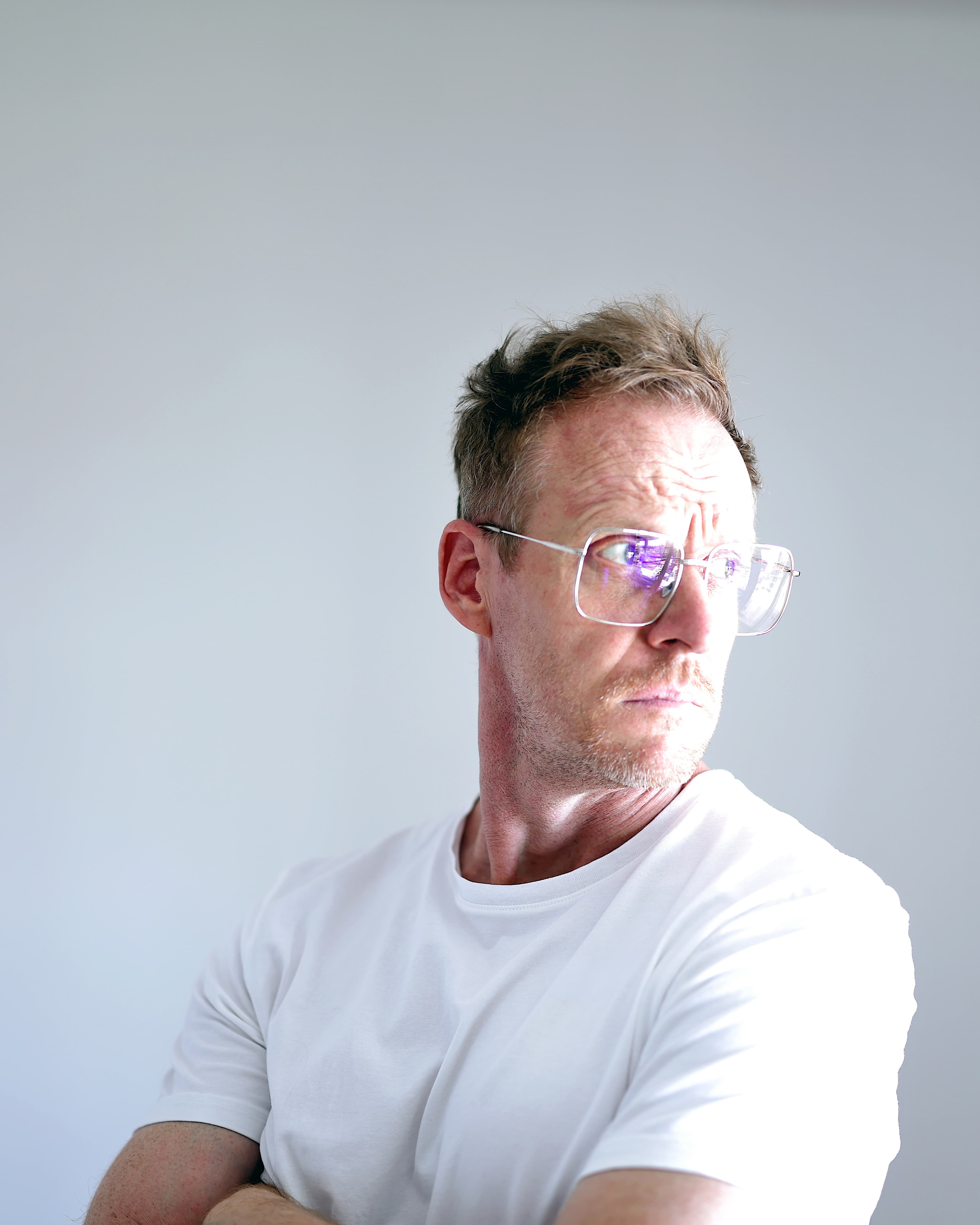
Tomáš Brousil began his career as an aircraft mechanic before turning to graphic design, where he gradually discovered that typography is the foundation of visual communication. He studied type design and typography at the Academy of Arts, Architecture and Design in Prague (Umprum), where he later taught the subject for more than ten years. He also co-founded Briefcase Type Foundry, a separate foundry established to publish typefaces by other designers and revive overlooked works from Czech typographic history. He initiated and published Typo9010, a publication documenting Czech digital type design between 1990 and 2010. His work has been recognised by the Type Directors Club, European Design Awards or Czech Grand Design.