
Editorial
Purista. More Purista
“I’ve been feeling hungry for a stylish, edgy sans who enjoys evenings out on the town and long mornings of crisp conversation. In other words, I’ve been craving a font who likes to party but who can also help out with the dishes. Purista is open-minded (with broad language support), brimming with style, sophistication, functionality, and an exciting range of weights.”
Ellen Lupton, Typographica, Our Favorite Typefaces of 2007
22 October 2026
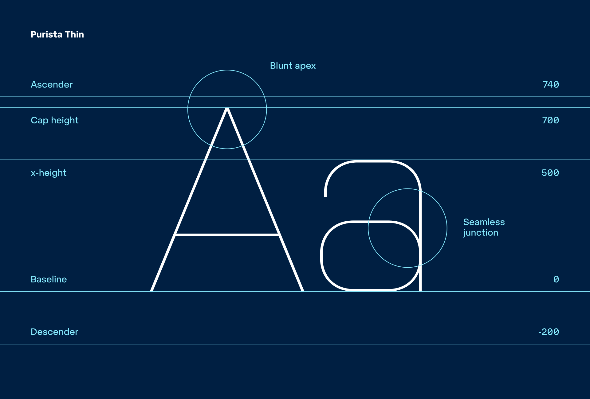
Despite its simplicity (or perhaps because of it), Purista was very warmly received when it was first released. Its popularity continues to this day, and it is enormously inspiring to see the many different ways in which it continues to be used. Twenty years after its creation, it seems like the perfect opportunity to consider how it could offer even more.
Geometry and Technical Aesthetics
Geometrically constructed sans serif typefaces are among the most distinctive expressions of modernist typography. Their development was shaped not only by the search for a new visual language, but also by social change, industrialisation, and the growing importance of technology. Simple geometric forms, systematic construction, and a reduction of decorative elements came to represent rationality, precision, and progress.
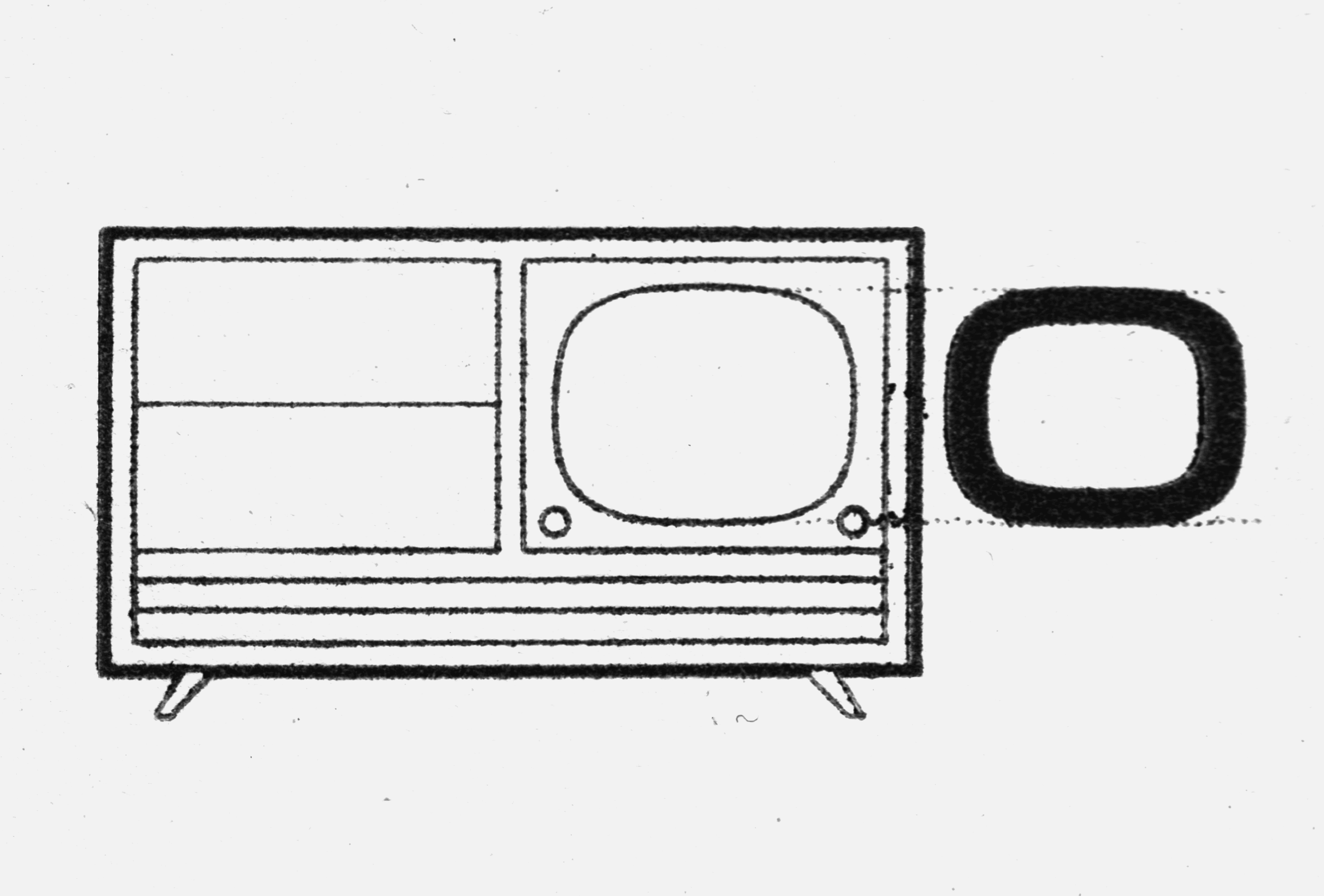
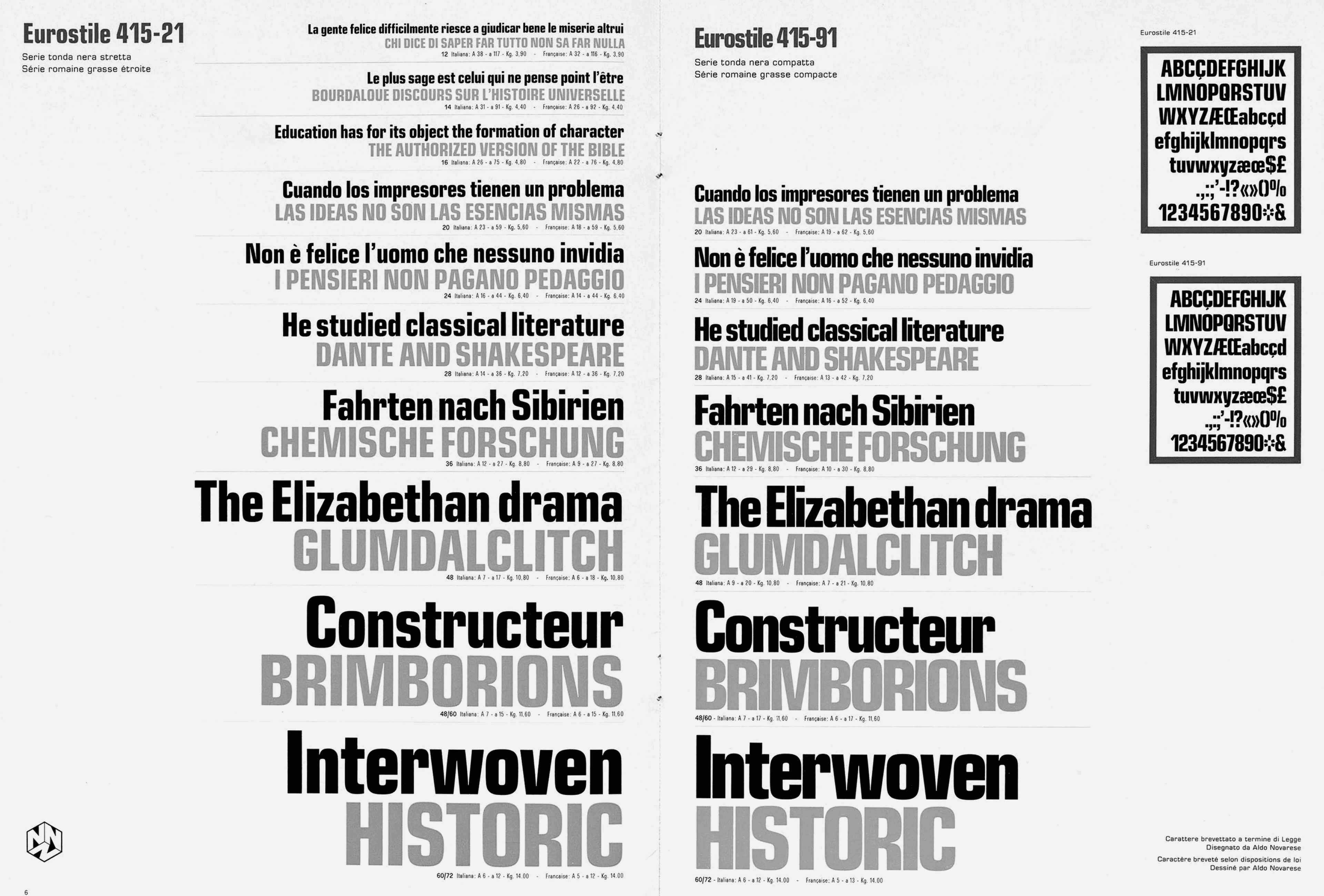
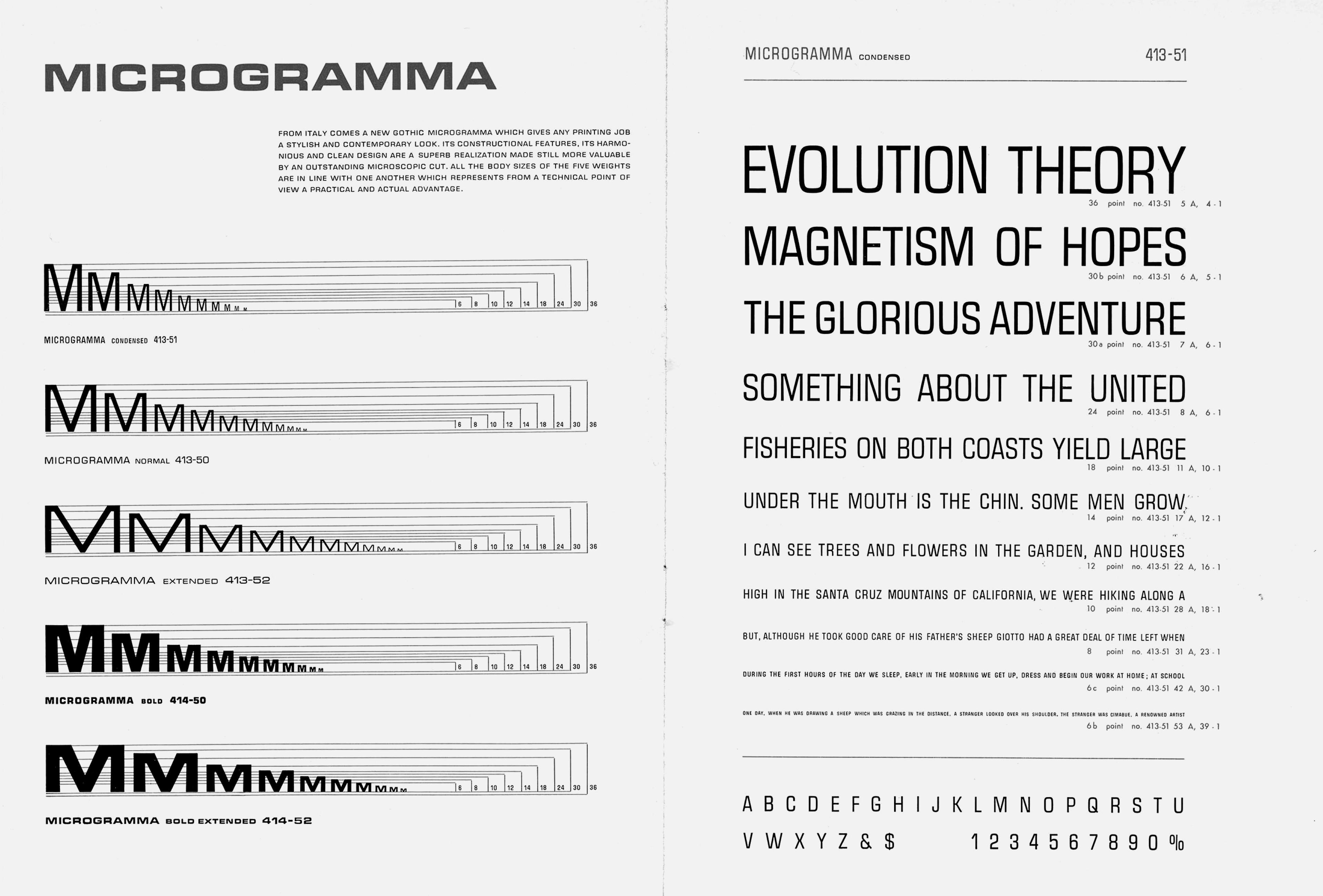
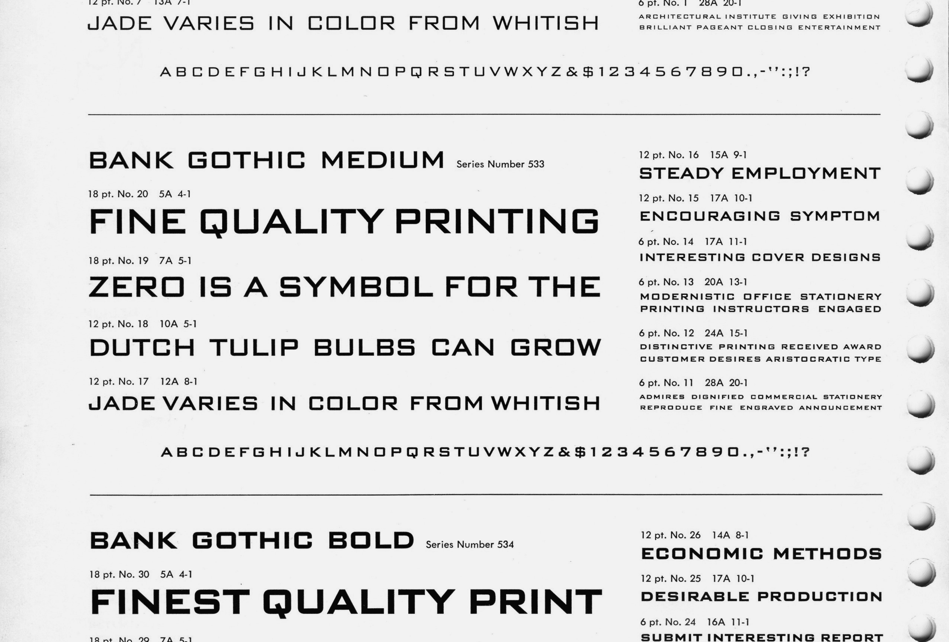
Eurostile in Aldo Novarese: Alfa-Beta. Lo studio e il disegno del carattere. 1964
While some geometric typefaces were based on elementary forms such as circles and straight lines, others developed a distinctly technical aesthetic built around angular construction, rectangular proportions, and mechanically inspired details. This approach, represented by typefaces such as Bank Gothic, Microgramma and Eurostile, became an important part of visual culture.
Over time, their characteristic forms acquired a broader meaning that extended beyond their original typographic context. They became associated with industry, technology, transportation, and modern architecture. Although their formal language emerged from a particular historical period, it has remained remarkably relevant.
Over time, their characteristic forms acquired a broader meaning that extended beyond their original typographic context. They became associated with industry, technology, transportation, and modern architecture. Although their formal language emerged from a particular historical period, it has remained remarkably relevant.
Lineage
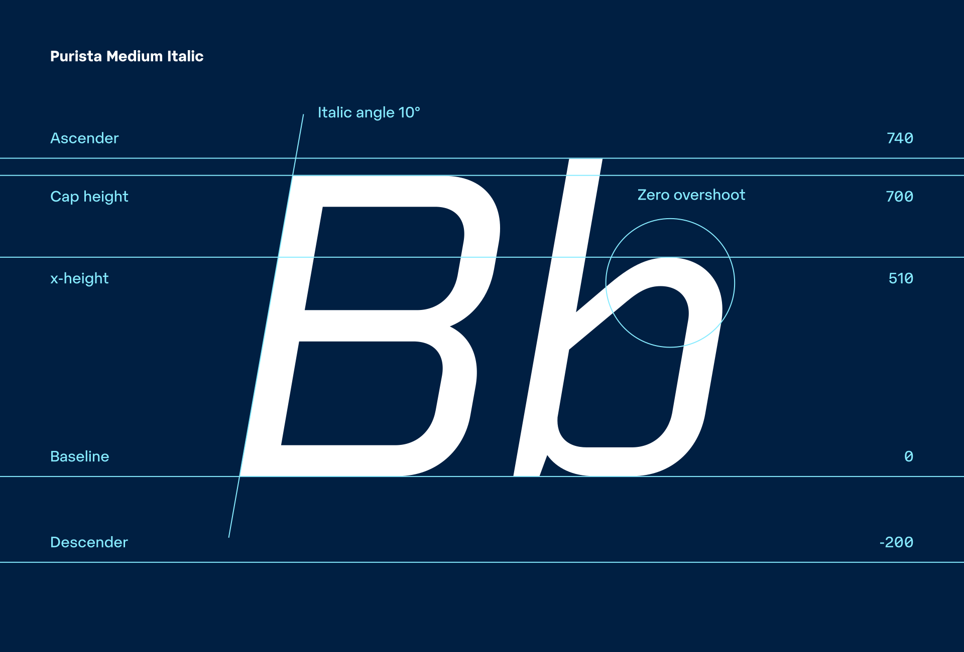
Purista was released in 2007 as a contemporary interpretation of the tradition of geometric and technical sans serifs. The aim was to design a typeface with a strong structural logic that retained a distinctly technical aesthetic while functioning as a fully developed tool for graphic communication.
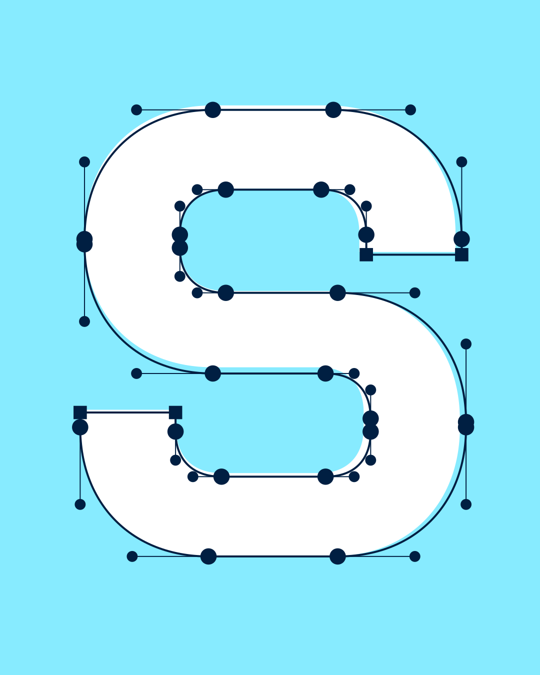
The design is based on a rigorous geometrisation of letterforms. Individual characters are constructed according to simple principles, a regular rhythm, and a limited vocabulary of forms. The result is a visually coherent system whose character emerges primarily from the structure of the alphabet itself rather than from additional decorative elements.
The design is based on a rigorous geometrisation of letterforms. Individual characters are constructed according to simple principles, a regular rhythm, and a limited vocabulary of forms. The result is a visually coherent system whose character emerges primarily from the structure of the alphabet itself rather than from additional decorative elements.
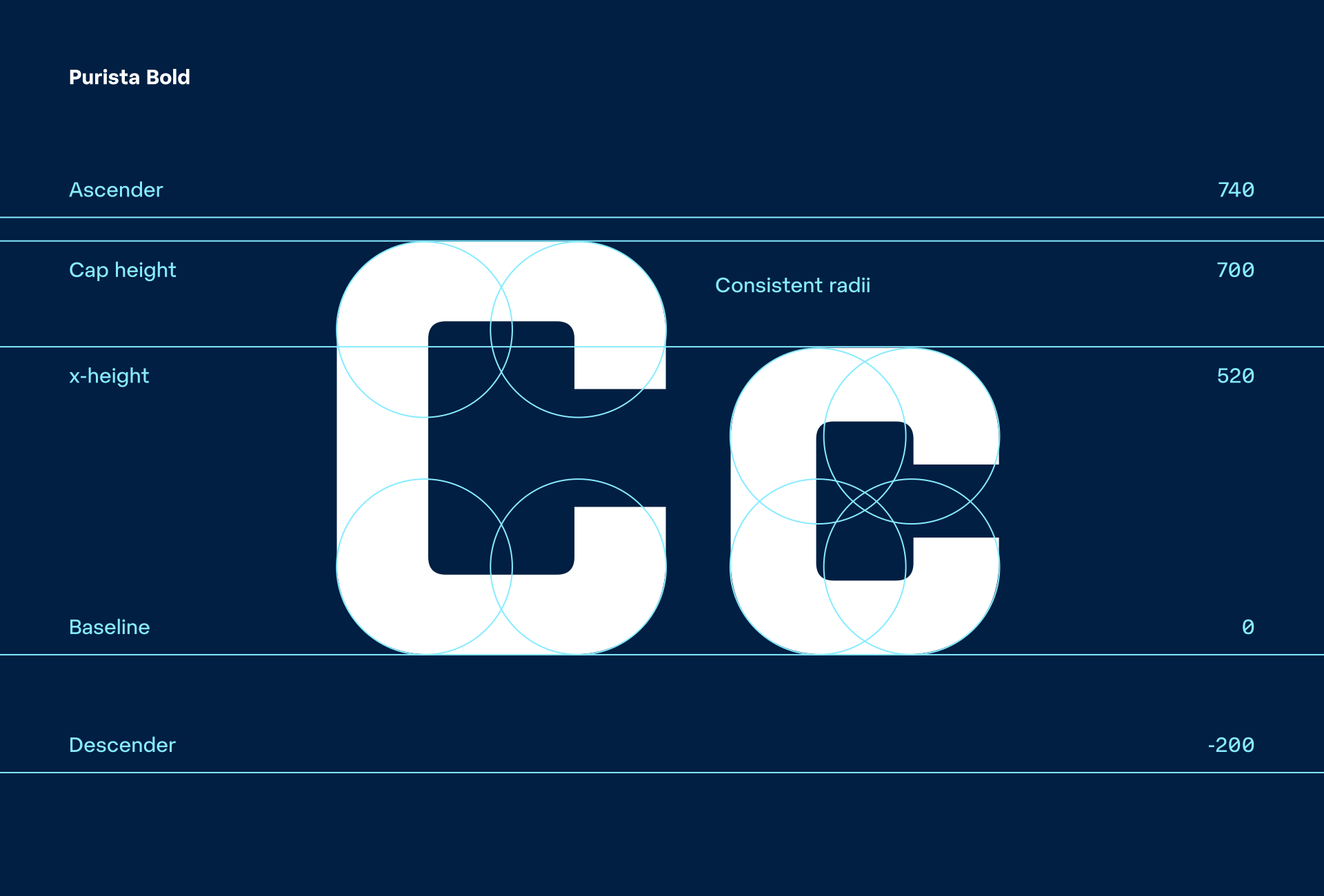
Geometric regularity in typography, however, can never be absolute. Individual characters have different proportions, structural requirements, and optical properties. For the alphabet to appear balanced, its seemingly simple system has to adapt to the demands of legibility and visual rhythm.
This relationship between geometric construction and optical correction is one of the fundamental principles behind Purista. The typeface retains mechanical precision as a means of expression without becoming a mere demonstration of geometric rules.
This relationship between geometric construction and optical correction is one of the fundamental principles behind Purista. The typeface retains mechanical precision as a means of expression without becoming a mere demonstration of geometric rules.

If Aldo Novarese demonstrated the modernity of Eurostile’s geometric construction through the curved television screen set into a wooden cabinet, Purista’s strictly rounded-rectangular O could hardly find a more emblematic contemporary parallel than the familiar shape of a mobile phone.
Purista 2.0
Two decades on, Purista has undergone a complete revision. This is not simply an expansion of the original family with additional styles, but a complete redrawing of the typeface. The original construction principles and character have been retained, while individual forms, proportions, and details have been reconsidered and refined with two additional decades of experience in type design.
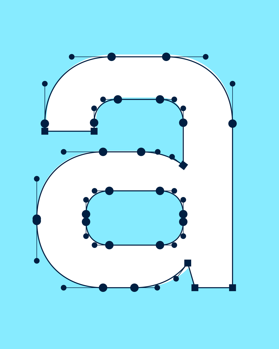
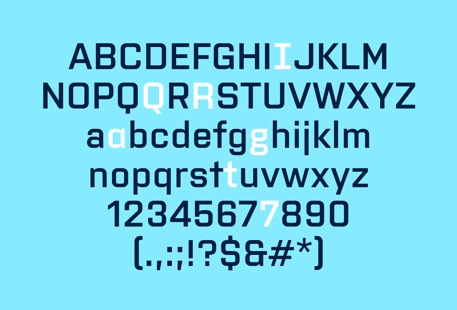
The new version also expands the possibilities within the design itself. Stylistic sets offer alternative forms for selected characters, including a serifed I, a Q with a diagonal tail, an R with a straight leg, a single-storey a, a double-storey g, an alternative t, and a serifed 7. These alternatives make it possible to adjust the character of the setting without departing from Purista’s underlying construction system.
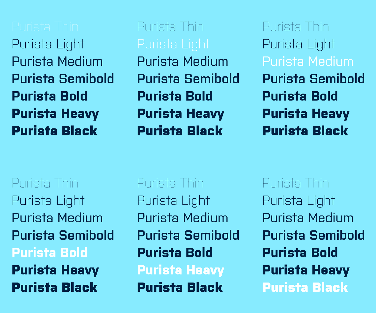
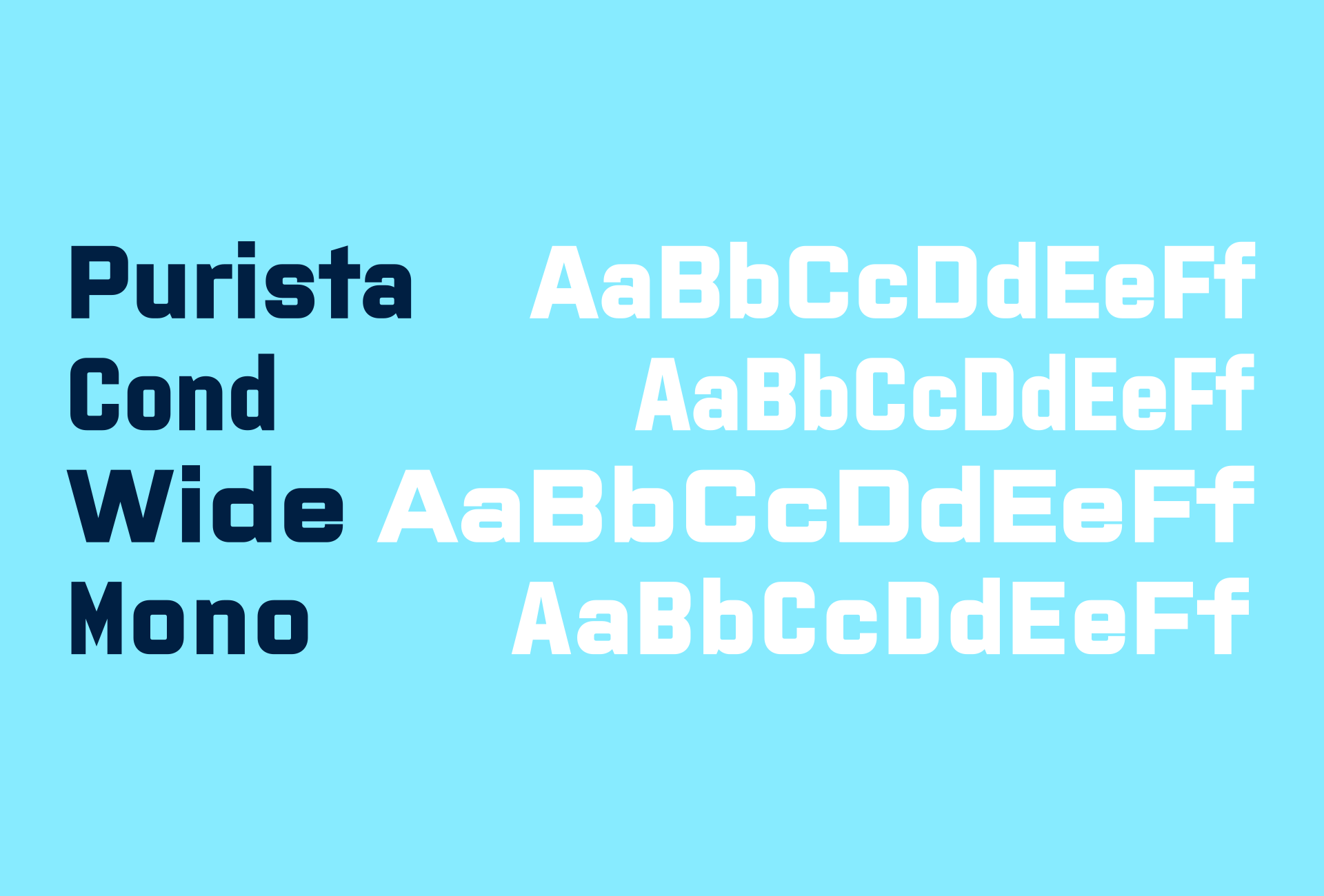
The original five weights have been extended with the previously missing Heavy and Black, while the core family is now complemented by the proportionally distinct Cond and Wide, as well as the monospaced Mono. Each of these four families is available in a range from Thin to Black.
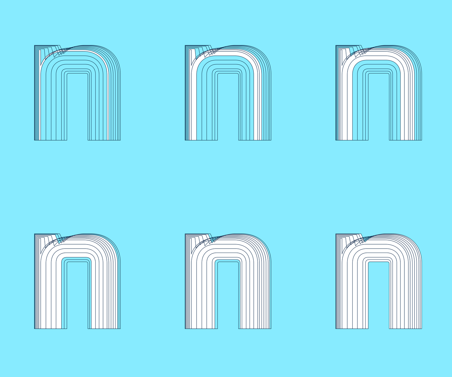
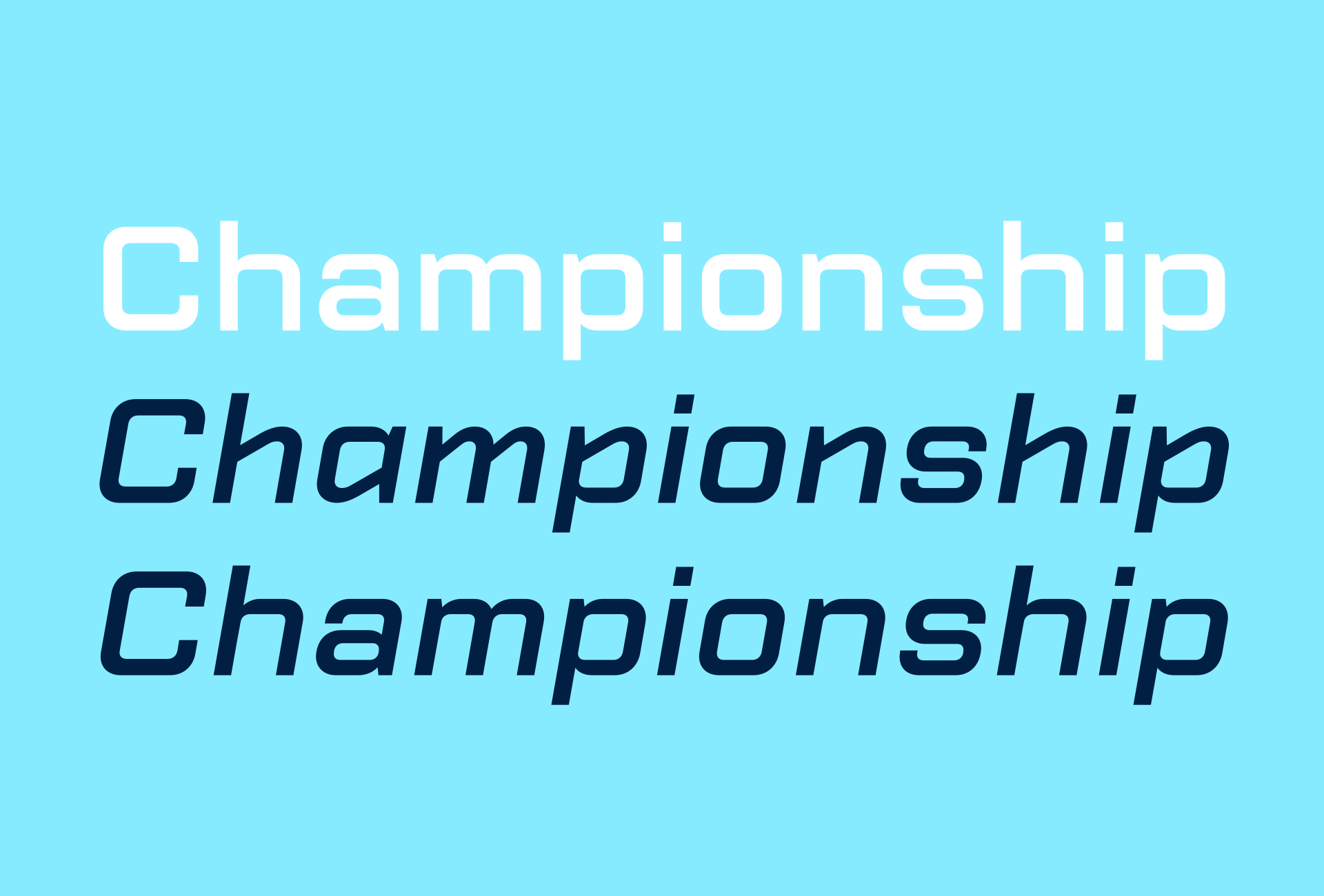
The system of slanted styles has also been substantially expanded. Alongside Italic, which introduces alternative forms for selected characters, there is an Oblique that retains the forms of the upright and simply sets them at an angle. Both variants are available across all weights in each family, allowing a choice between the more distinctive drawing of the Italic and the more restrained, structurally related forms of the Oblique.
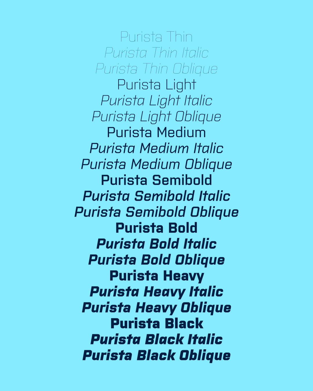
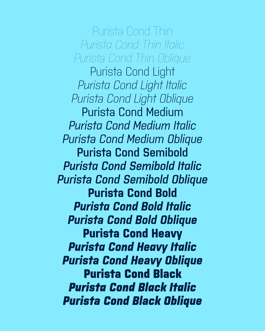
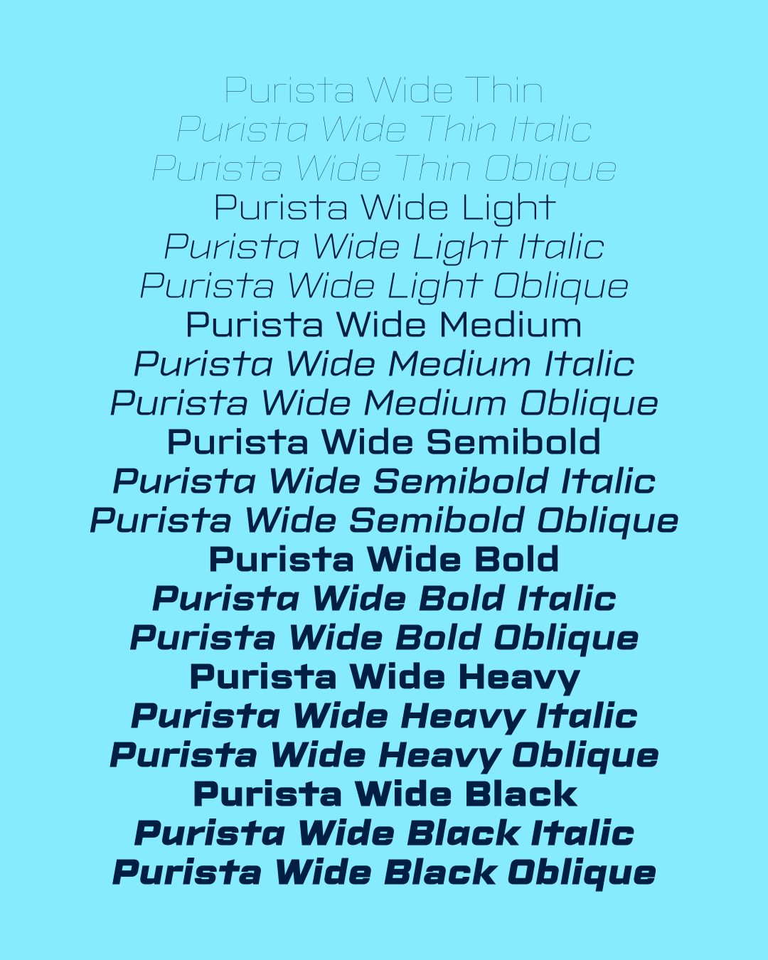
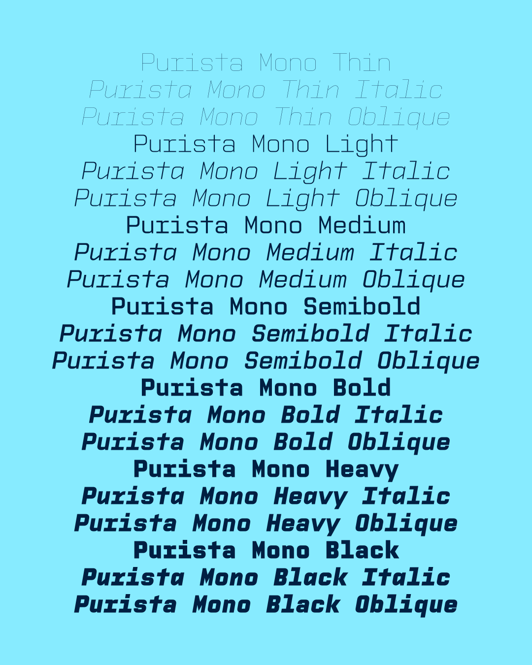
Twenty years on, Purista has therefore not simply gained more styles; it has evolved into a substantially broader typographic system. Its original language, rooted in industrial lettering and technical aesthetics, remains the foundation of the entire family.