Editorial
Crabath™ Collection
When browsing new titles in bookstores, I pay close attention to how typefaces behave on the page. I realized that although serif families such as Tabac or RePublic perform very well, they were originally designed primarily for magazines and newspapers, and the catalog lacked a typeface created specifically for demanding, long-form book typesetting. Even though such a project makes little economic sense, I decided to develop a comprehensive type system capable of handling everything from cover titles and main text to small notes and scholarly apparatus.
7 September 2026
Searching for a Local Reference
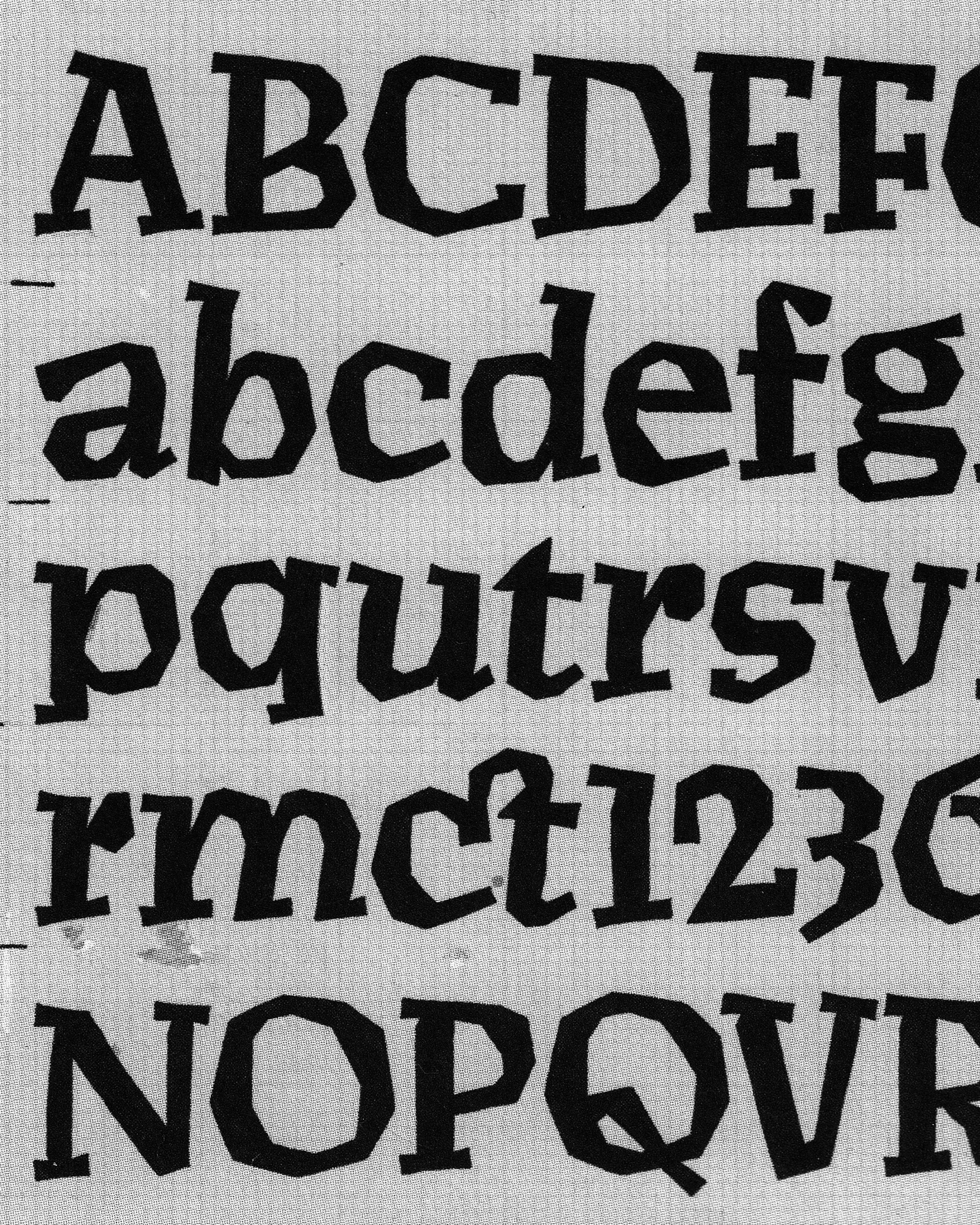
Vojtěch Preissig, serif type design, 1913, New York. The brutalist quality of the broken curves is a distinctive feature that Preissig masterfully incorporated into his Antikva.
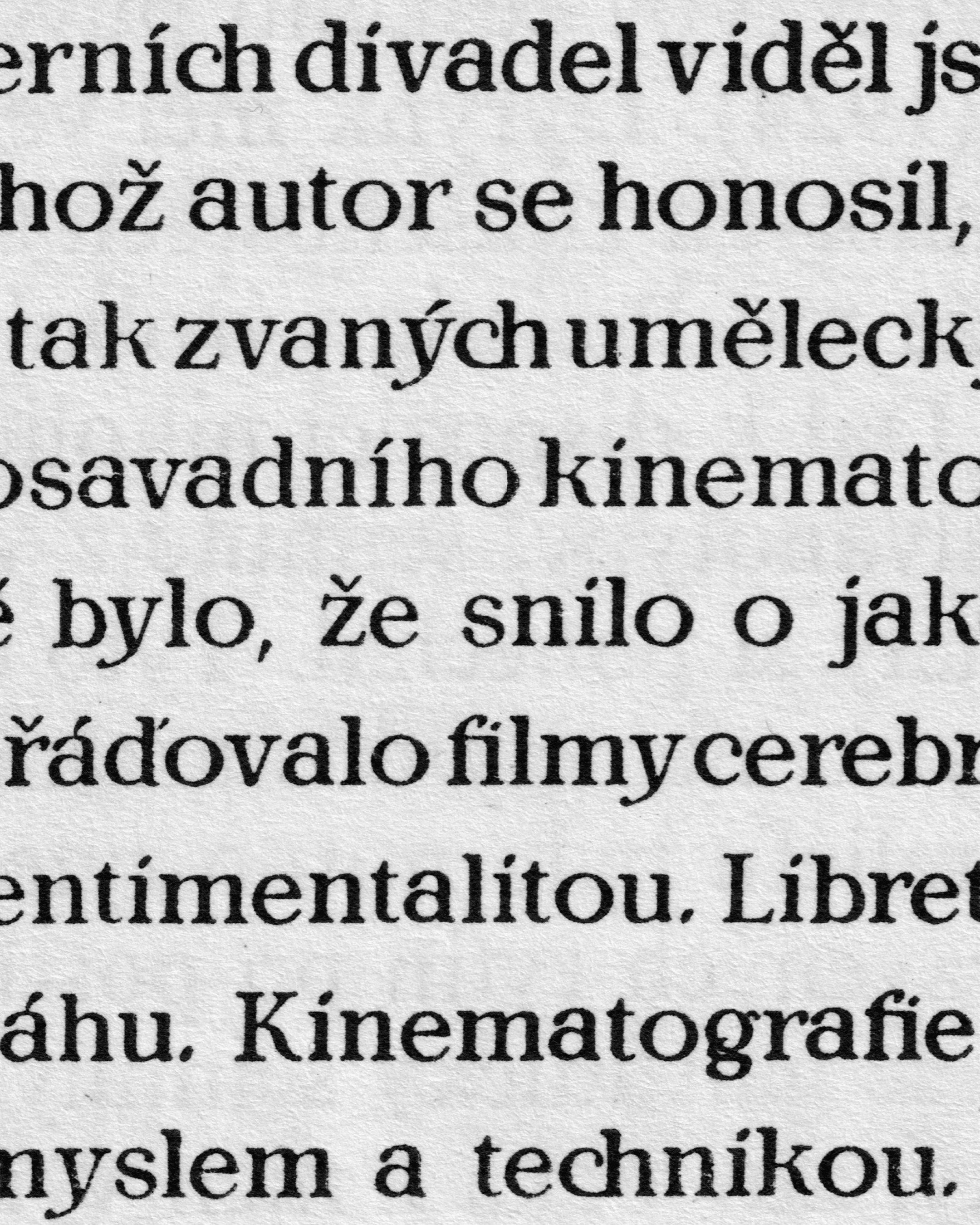
Slavoboj Tusar, roman typeface used for the Paris exhibition, 1924, Průmyslová tiskárna. A few distinctive touches that Tusar used in his typeface designs. Notice that charming “g”!
Krabat’s Specimen
The first part of the specimen contains 41 roman styles and 33 Fraktur and Schwabacher styles. The second presents 21 Greek and Hebrew typefaces, while the third offers 130 variations of book ornament and eight groups of calendar symbols. Krabat employed no calligraphers or punchcutters, and his workshop cast type from matrices purchased abroad. Buying and subsequently reselling matrices was common practice among type foundries of the period. The matrices he used therefore most likely came from Frankfurt, Leipzig, Nuremberg, or Vienna, although the extensive circulation of matrices and punches means that they may originally have traveled from almost anywhere in Europe. Krabat’s specimen is therefore essentially an international inventory of type and a catalog of book typefaces available in Prague at the time.
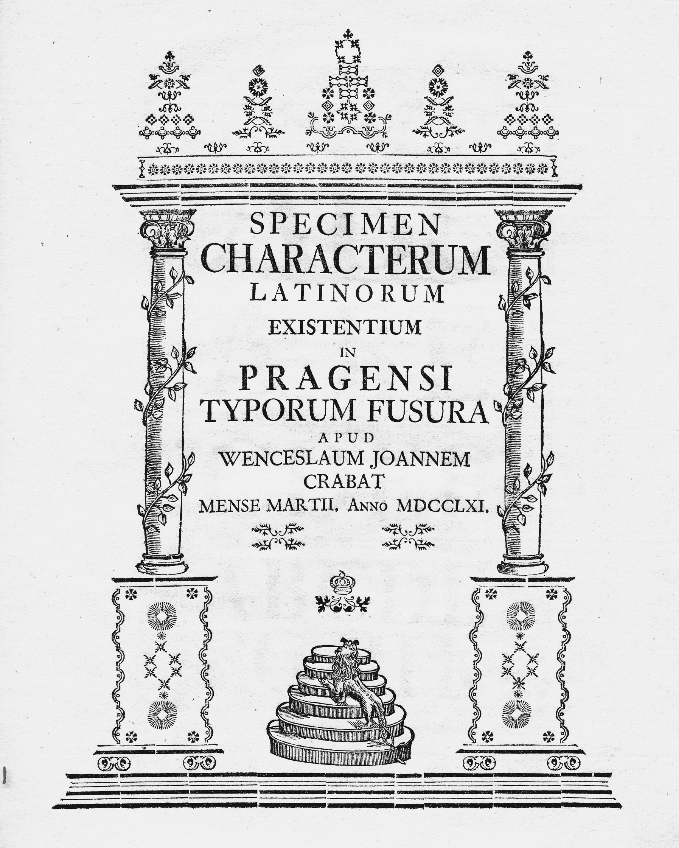
The title page of the first edition reads: “Specimen of Latin characters available at the Prague type foundry of Václav Jan Krabat in March 1761.”
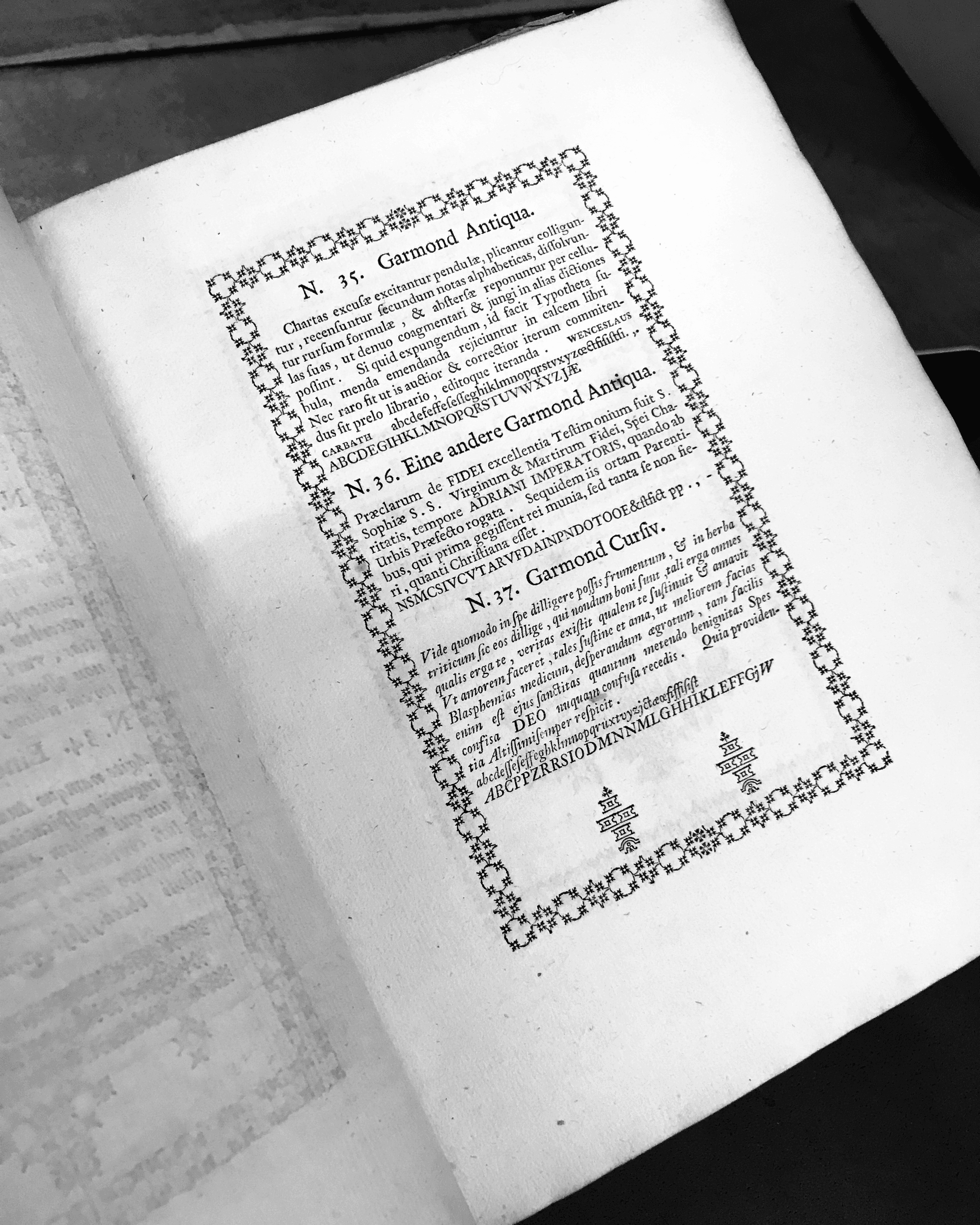
A page showing impressions of type in the Garmond size. At first glance, the romans appear very similar, but they are two entirely different typefaces, most easily distinguished by certain capital letters.
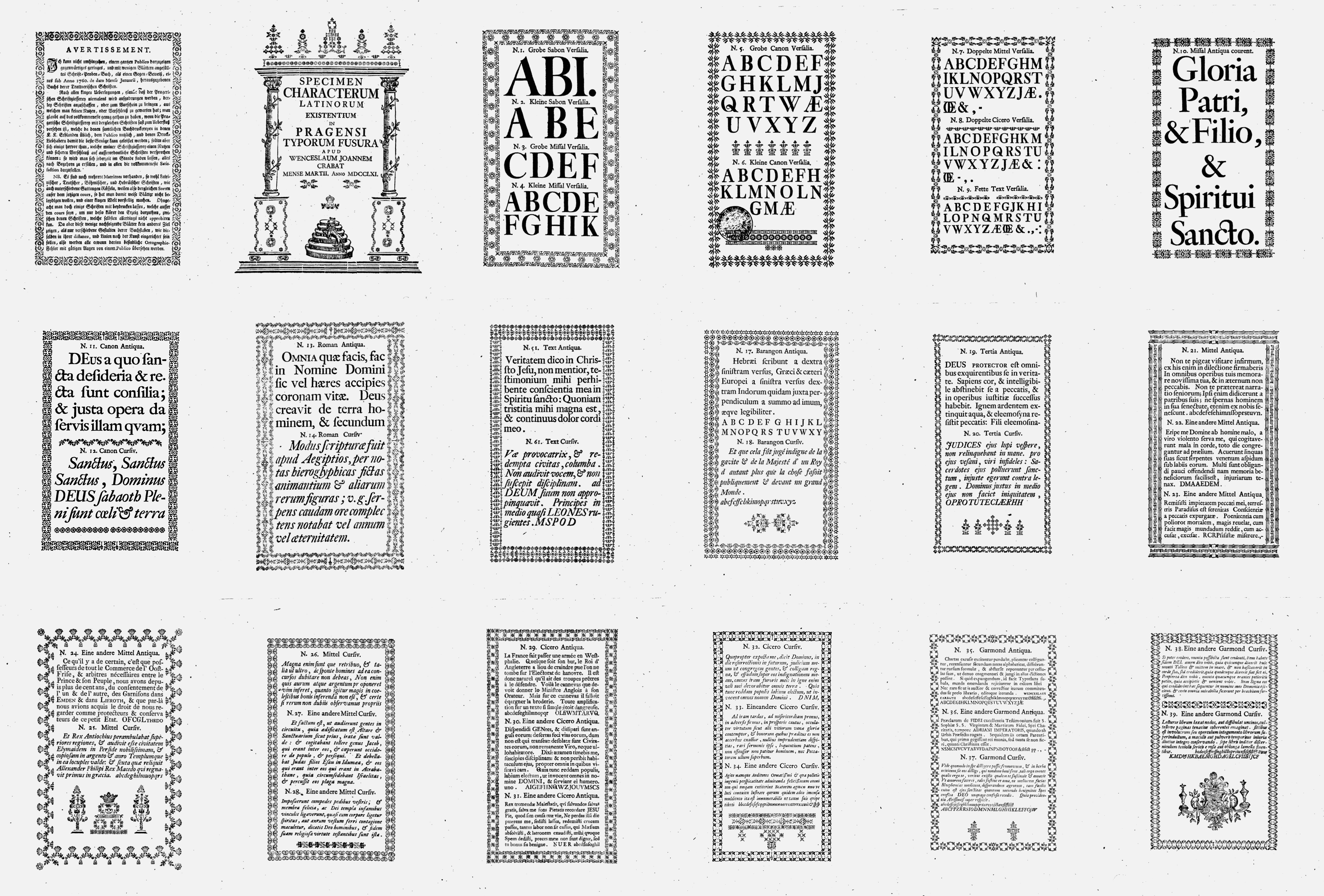
The first part of the specimen, devoted to Latin type, presents sizes ranging from Grobe Sabon (66 pt) down to Petit (8 pt). In the preface, Krabat explains that his workshop had additional matrices that were not included in the specimen. It is therefore a selection of the typefaces most commonly used at the time, reflecting current demand from printers.
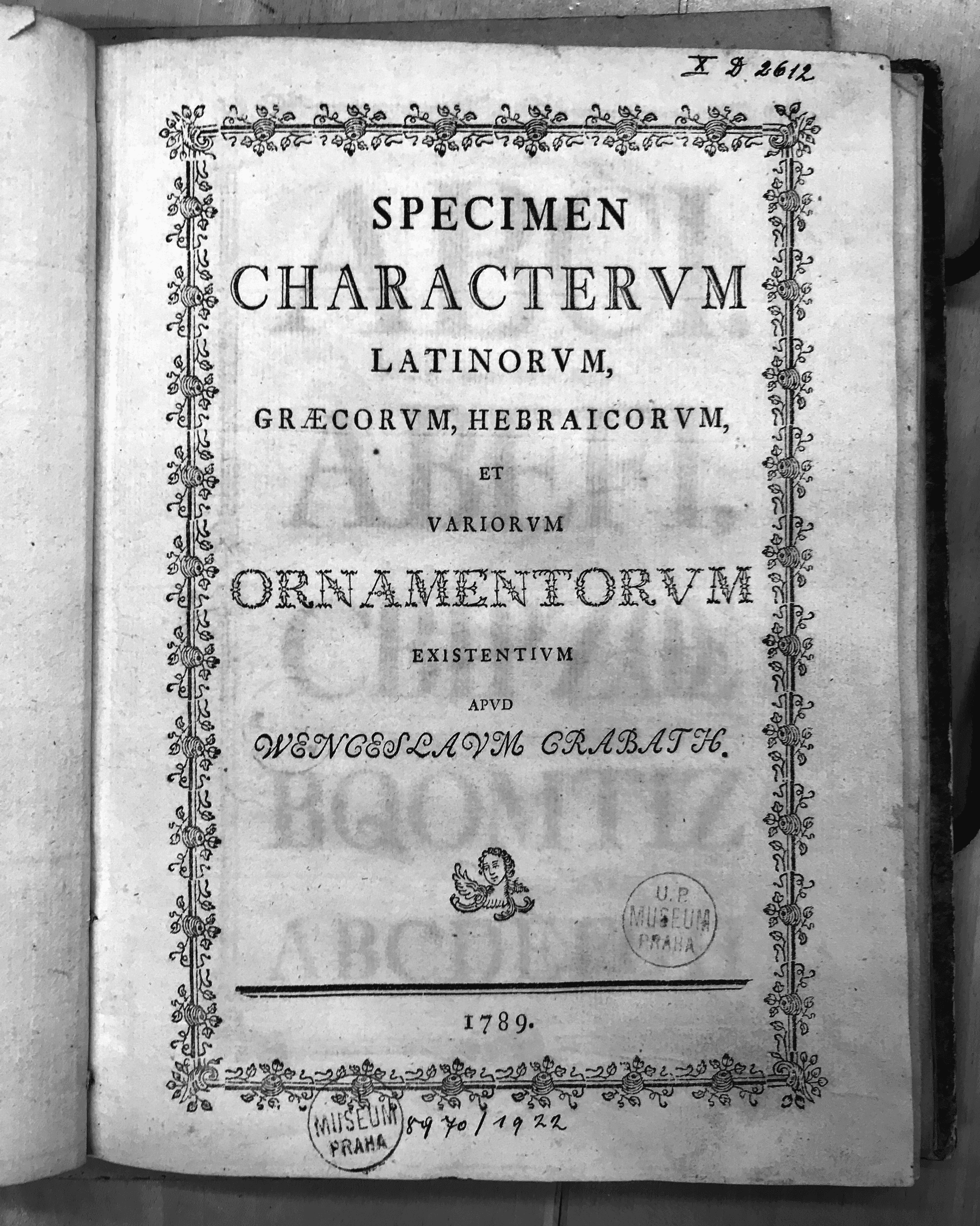
An example from the second edition of 1789, whose page size is considerably smaller, probably as a result of later trimming, since the type area is identical to that of the first edition.
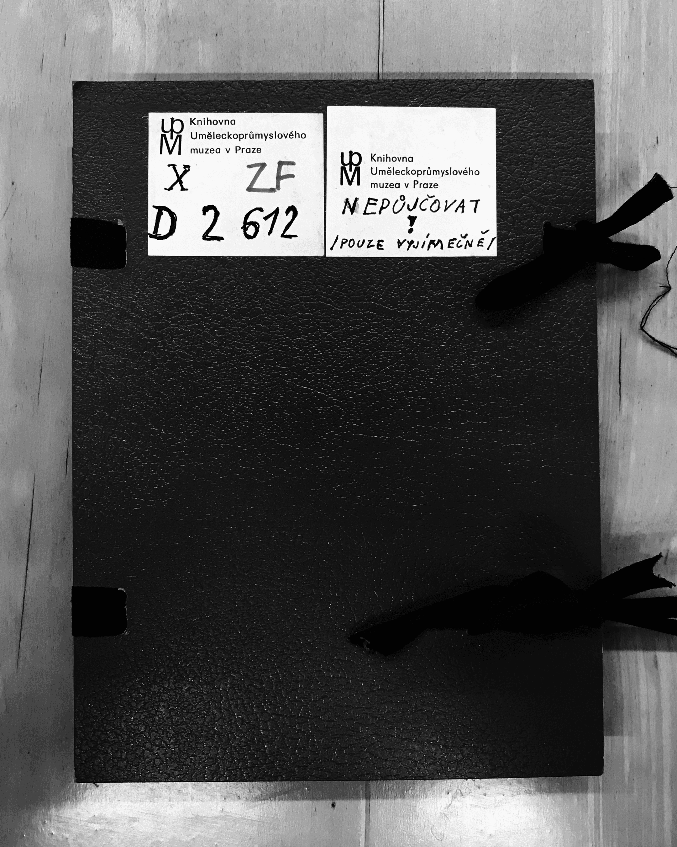
This copy is carefully preserved in the Library of the Museum of Decorative Arts in Prague. A label on the cover bears the strict warning: “Do not lend! /Only in exceptional cases/.”
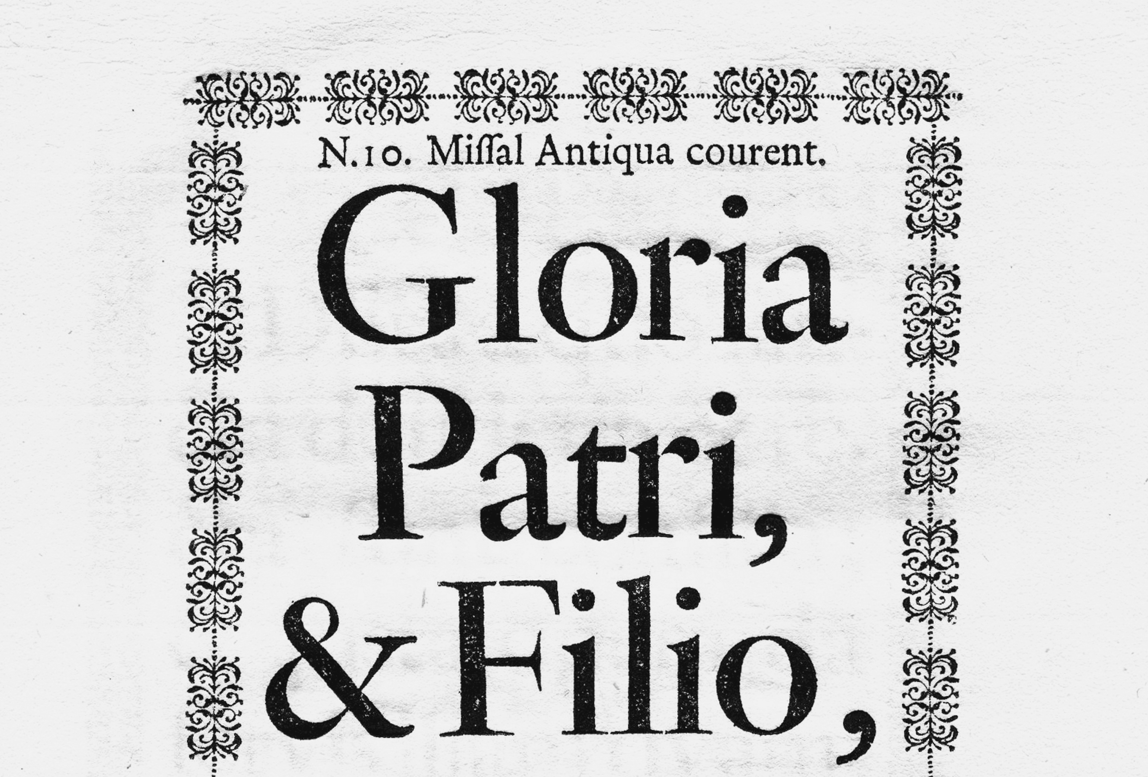
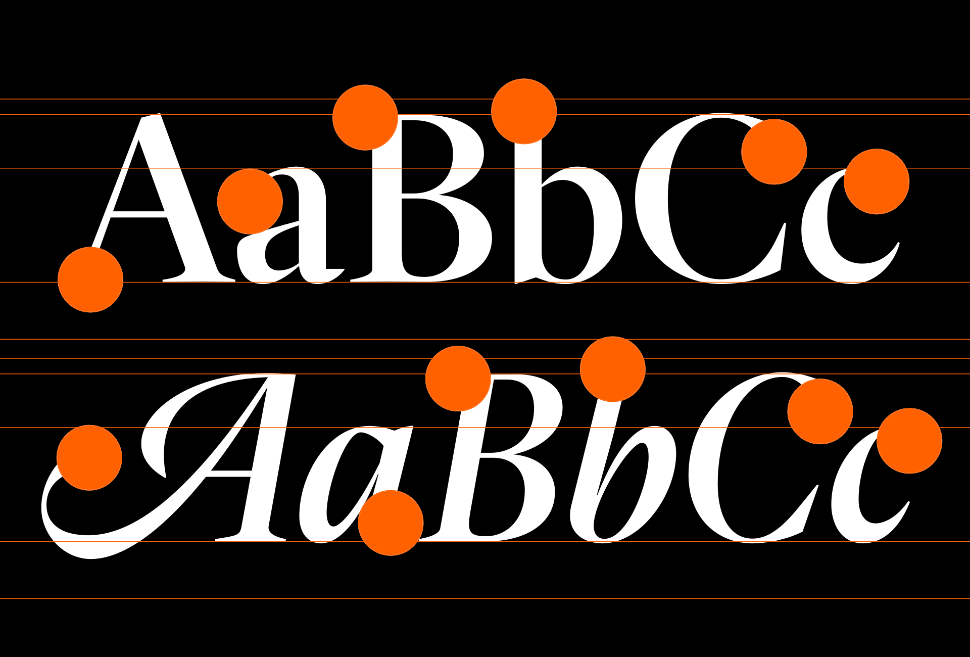
Clearly articulated details that helped define the character of the digital typeface — in the lowercase, for example, the beak-like terminal of “r” and the distinctive angular construction of the bowl and upper curve of “a”; in the capitals, the open form of “P” and the elegant serif transitions into the stem at the foot and arms of “F.”
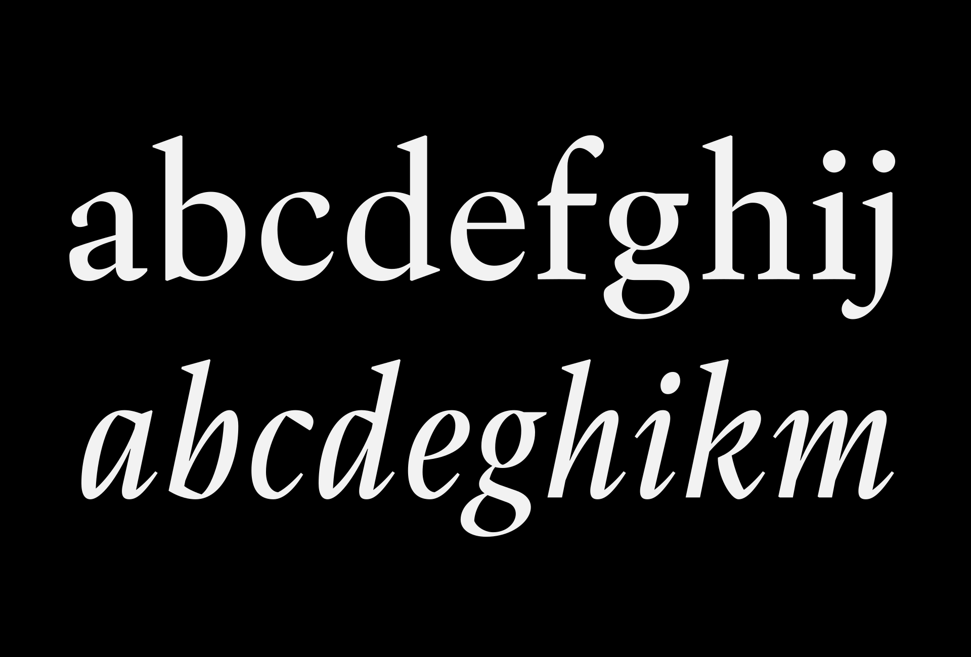
The first more complete draft of the Crabath roman and italic lowercase. Version 1.2.
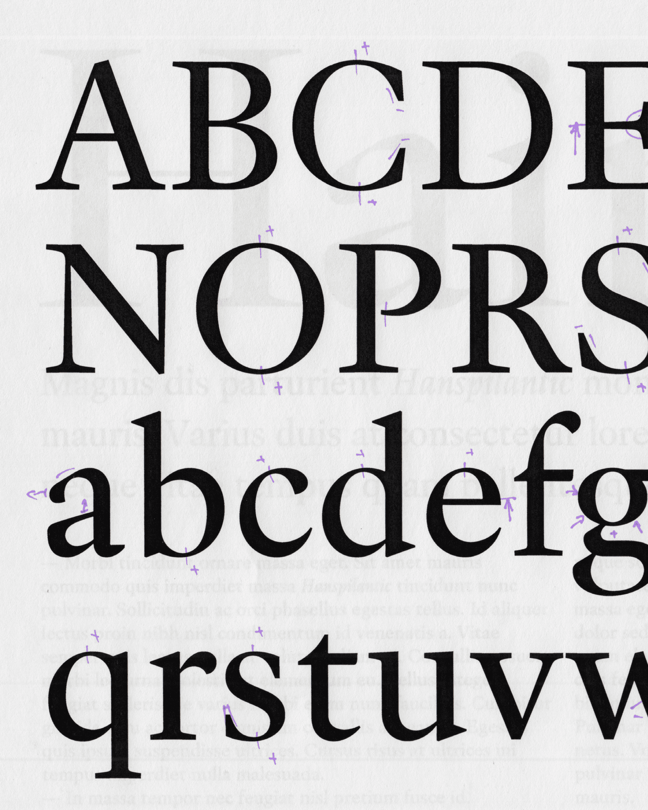
Corrections to roman version 1.2.
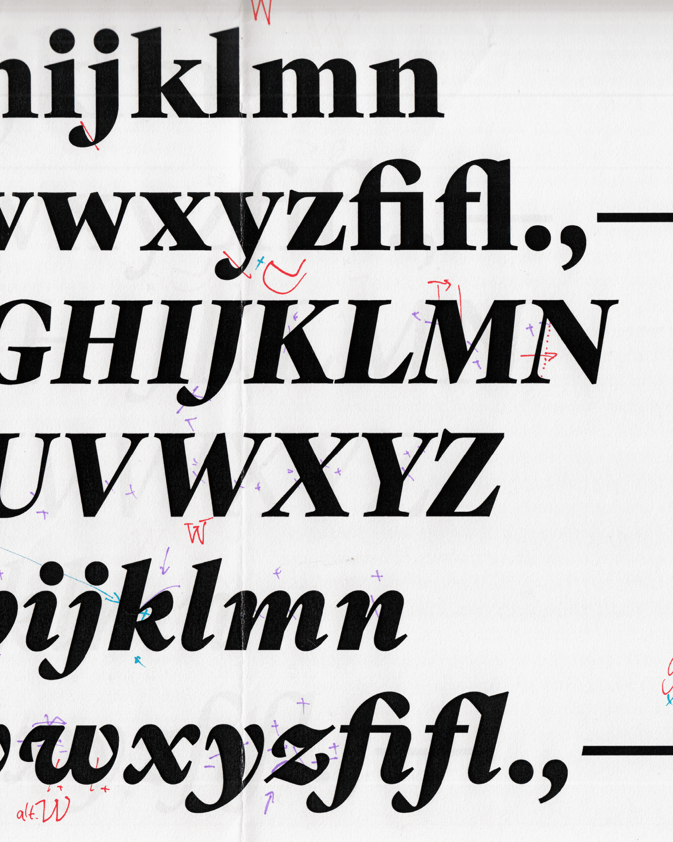
Corrections to the roman and italic.
Development, Testing, and Refinement
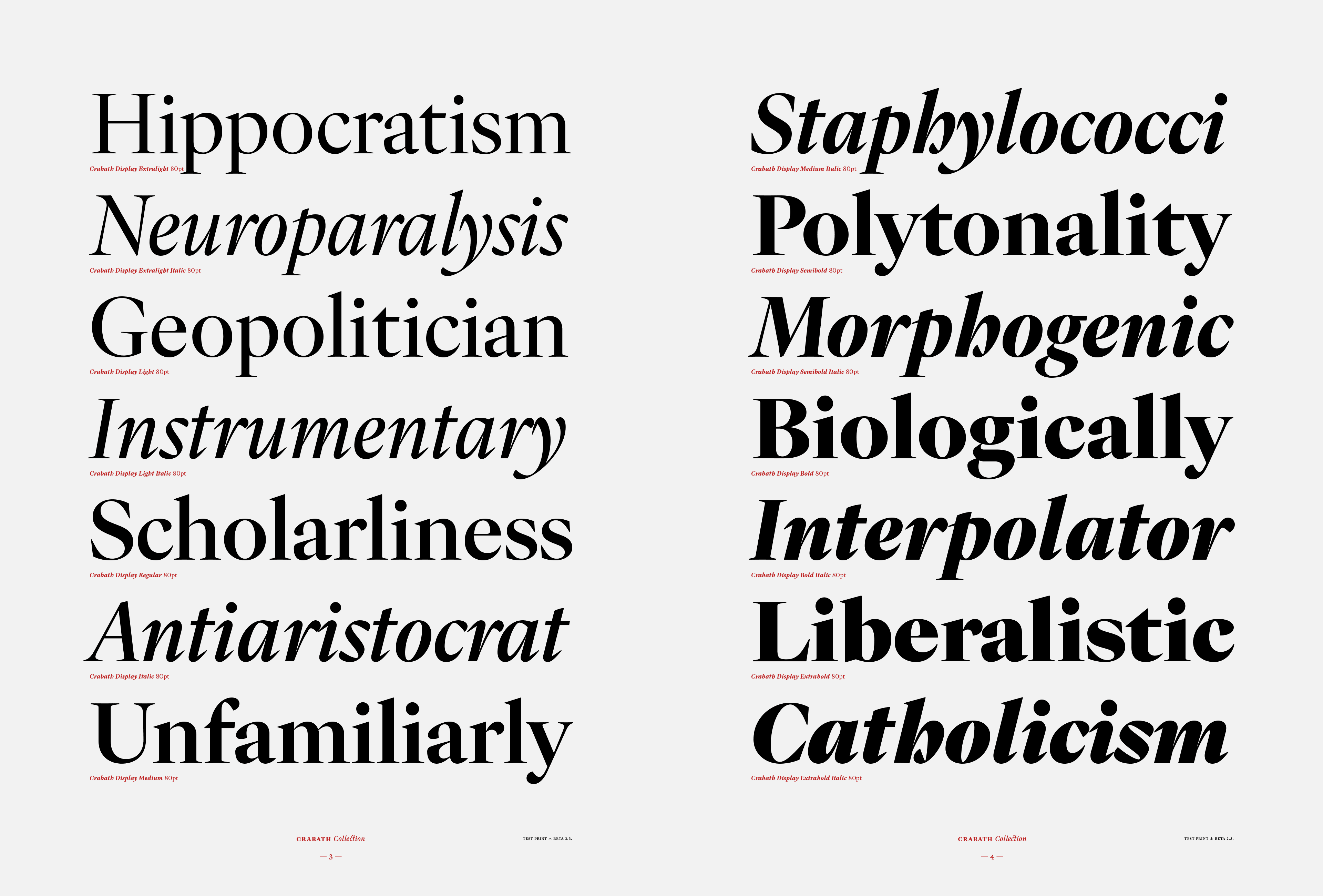
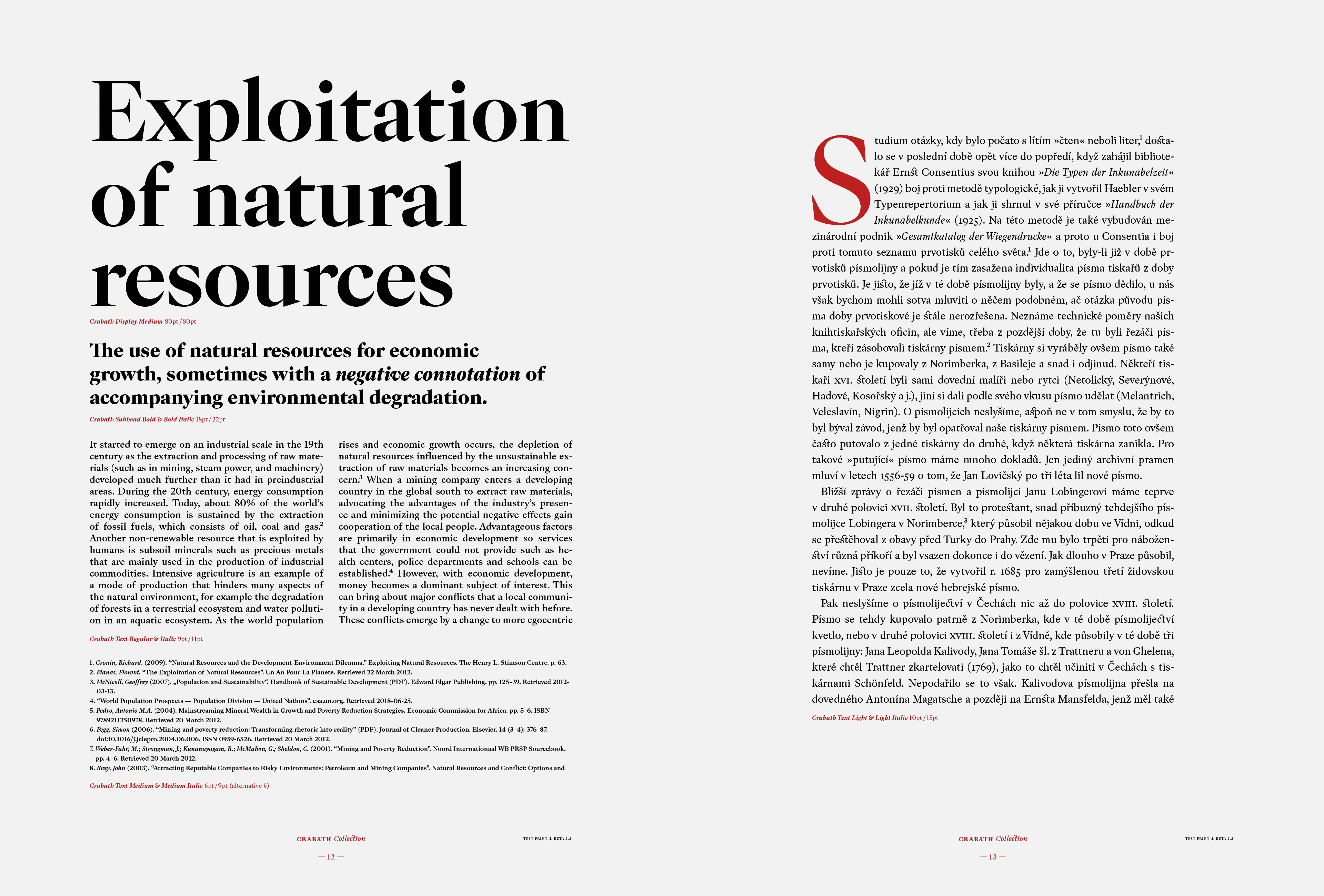
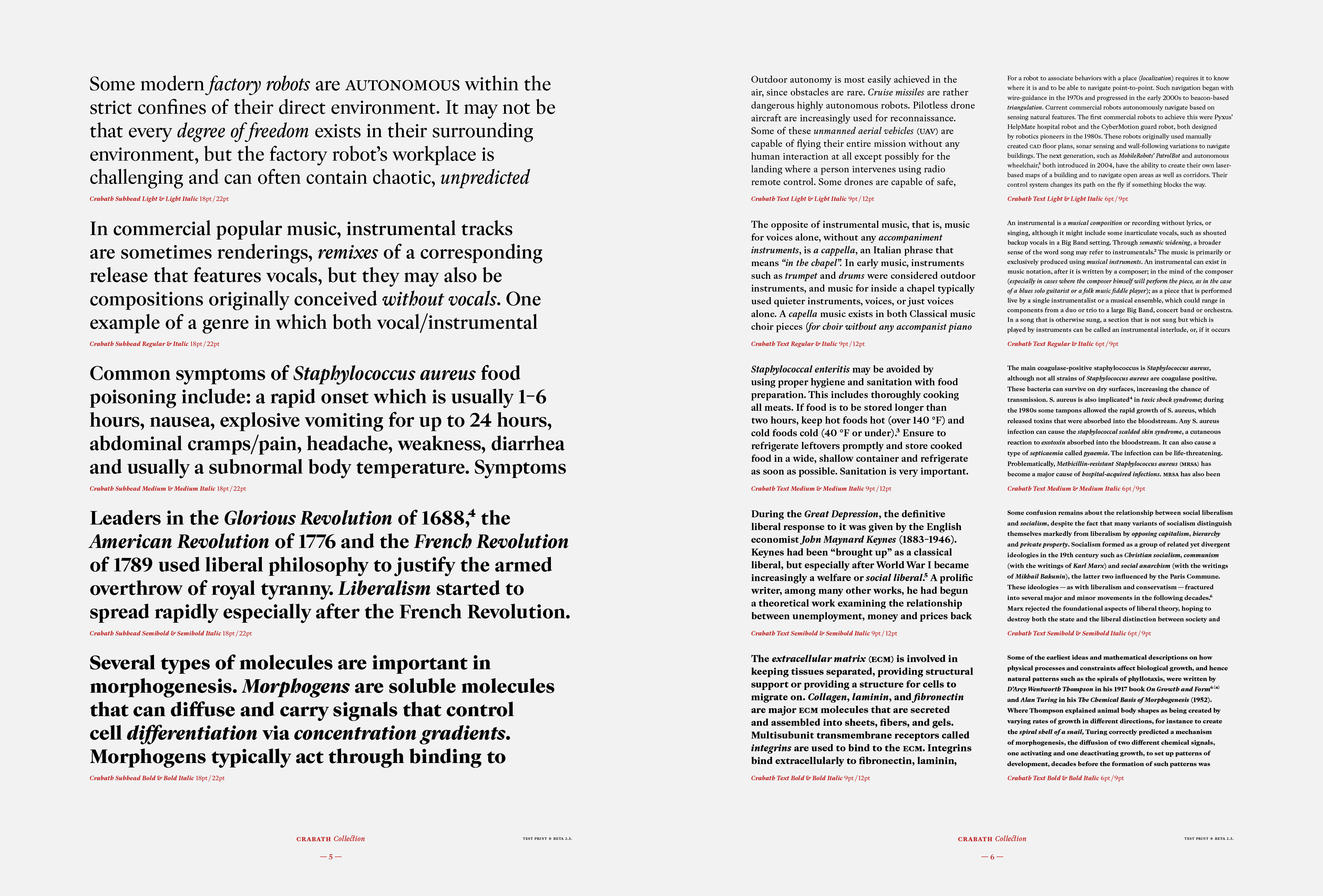
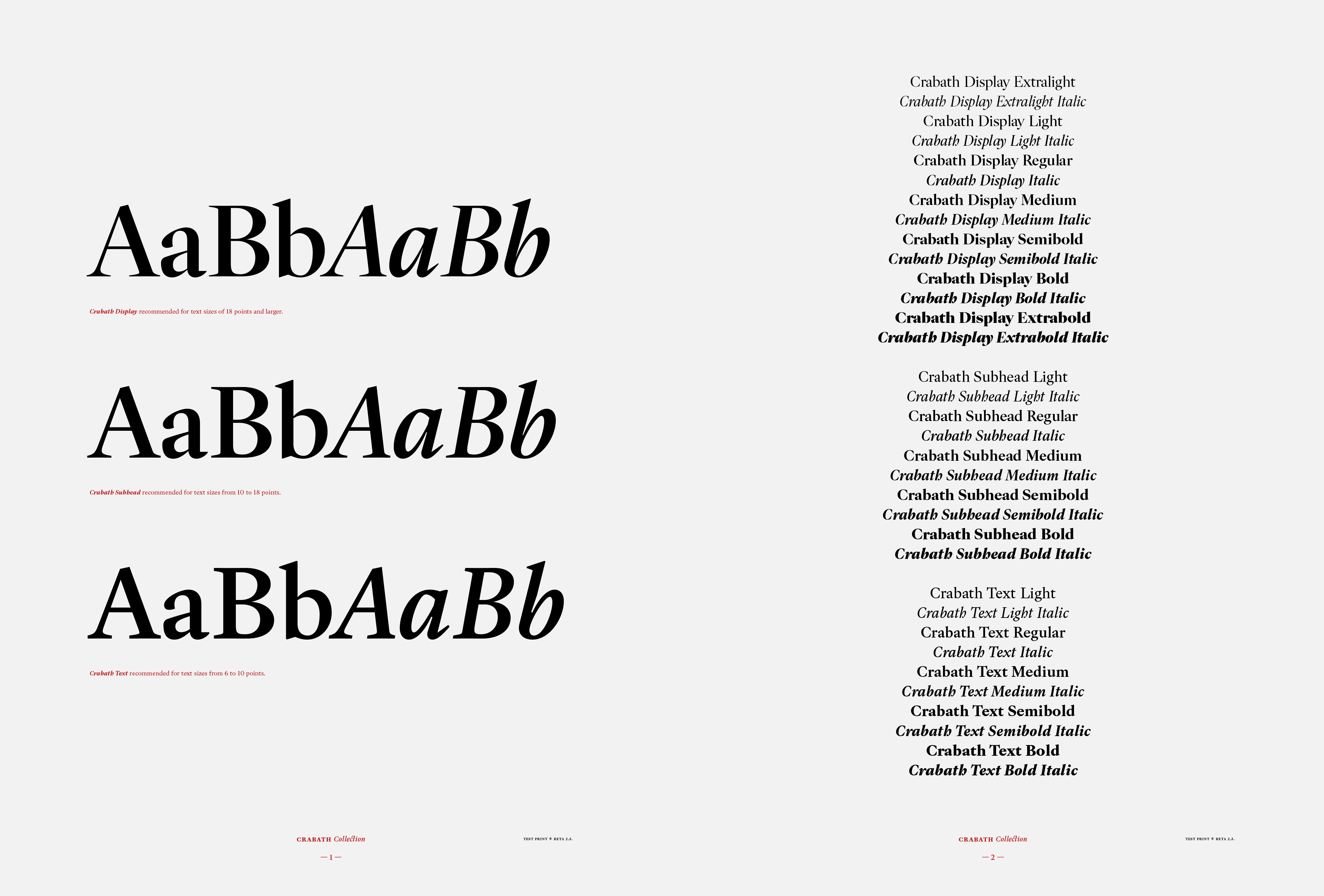
Pages from the document prepared for test printing of the beta version.
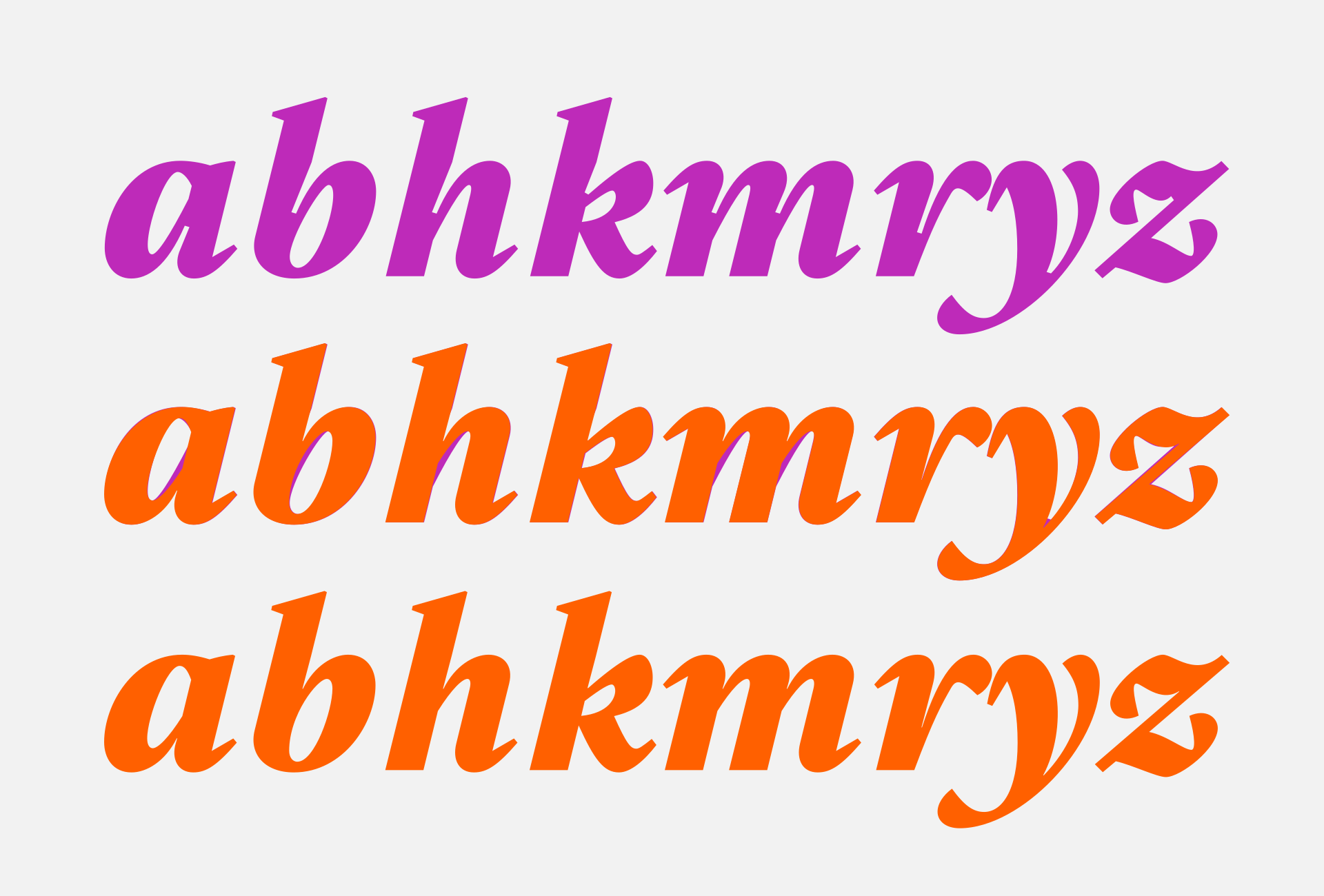
Differences in the joins to the stems in the beta version (top) and the final version (bottom).
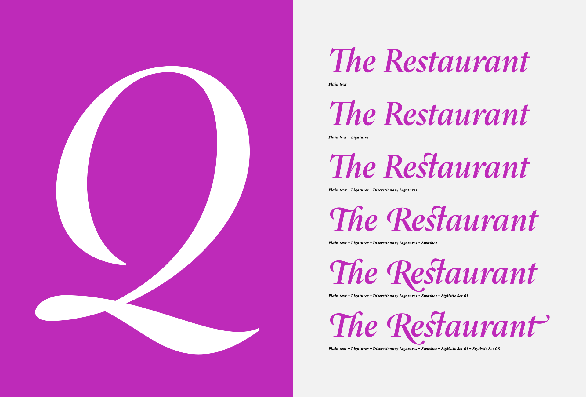
Using combinations of OpenType features, the final form of the entire text can be changed quite significantly. As to whether all of the possibilities offered can be sustained to a reasonable extent, adequate to the scope and size of the typography used, that’s up to the user’s taste and experience.
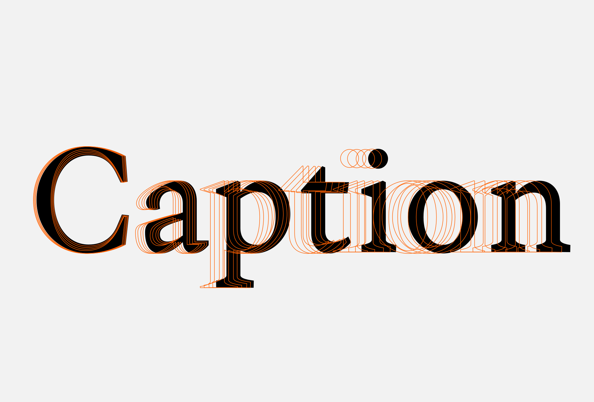
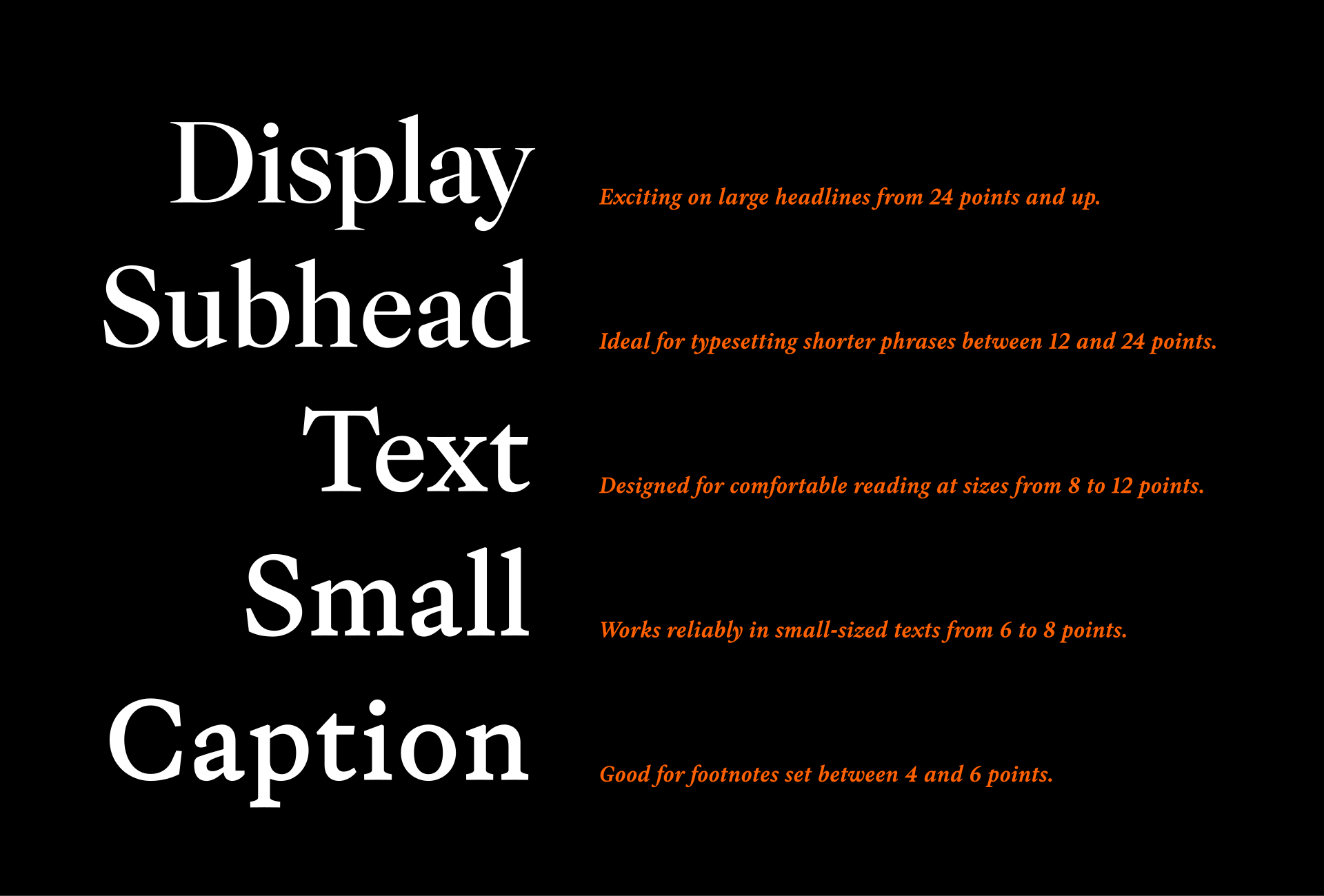
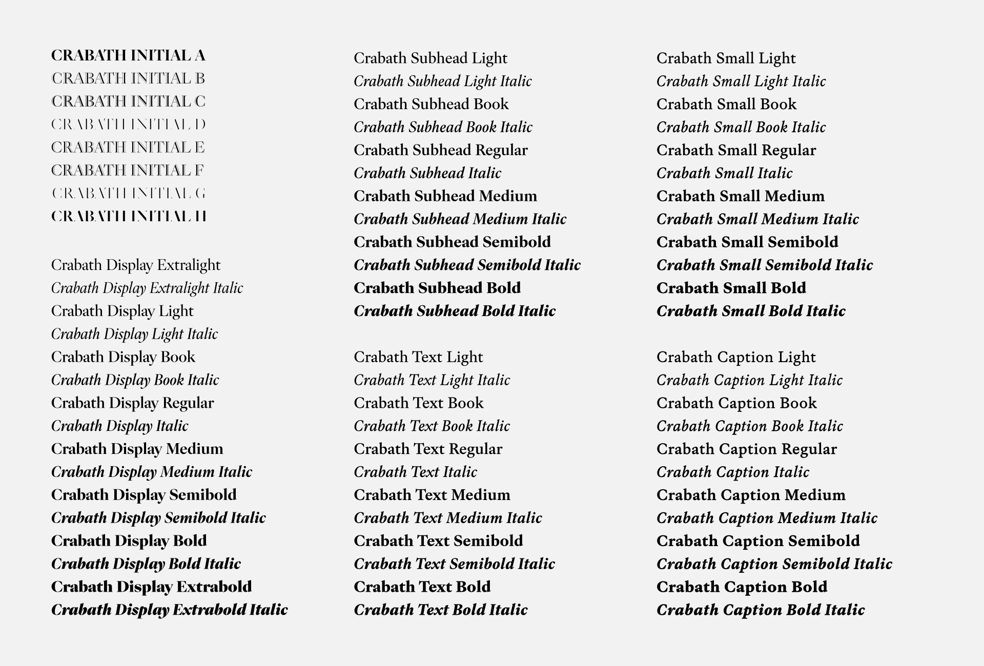
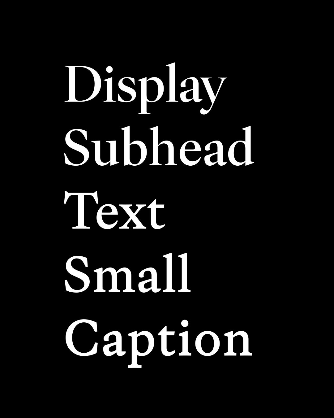
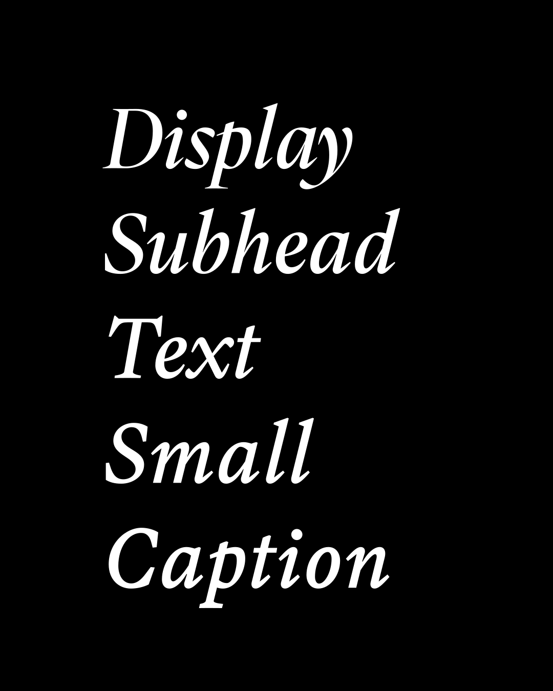
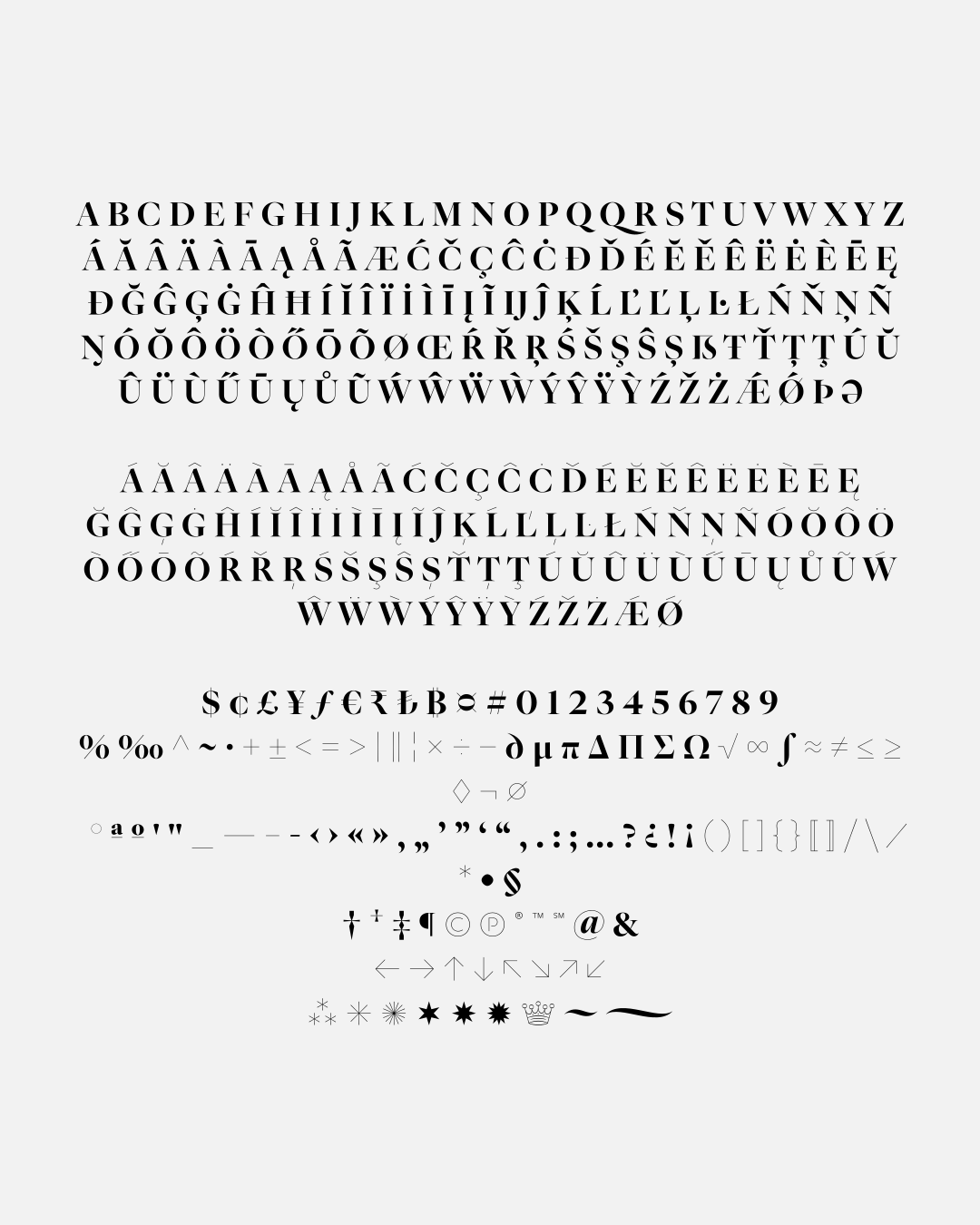
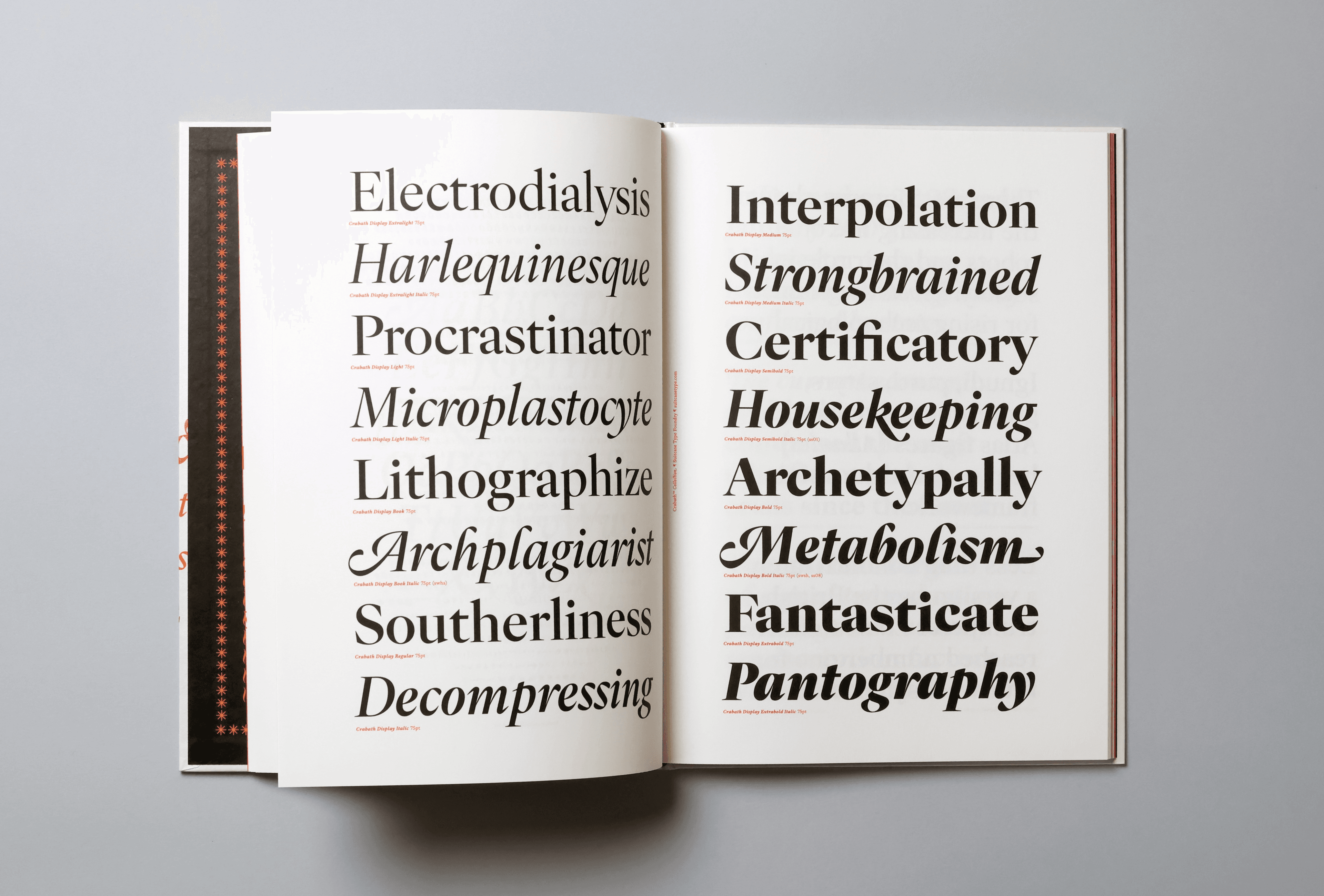
To make it easier to understand optical sizes, one must look to the history of letterpress printing. In order to cast all sizes of a metal typeface, it was necessary to create individual matrices for each letter. This is why the engraver made slight alterations to the punch. A given letter hence differed slightly from size to size – in terms of contrast, boldness, and proportion, so that it was either perfectly legible in a Diamond¹ size, or that it charmed with its elegance at Two-Cicero². This natural characteristic of printed type was lost, however, with the onset of phototypesetting technology. The possibilities provided by the mechanical “scalability” of a single typeface design meant that the result was the same at all sizes used. It was no longer able to address differing practical and aesthetic needs, something the previous handwork could provide.Digital typesetting inherited the same problem: a single font can be scaled to any conceivable size. As a result, display designs can appear too decorative or delicate at small sizes, while text designs can look clumsy and heavy when enlarged. Optical sizes restore the centuries-old principle of adapting a typeface to its intended scale.The Crabath family therefore includes five optical sizes across its roman and italic styles and corresponding weights, each tuned to a specific range of type sizes. They differ in ductus, contrast, counter openness, and spacing. Display has a tighter construction and higher contrast, Text balances the qualities needed for comfortable novel-length reading, and Caption is robust and open enough for small annotations.
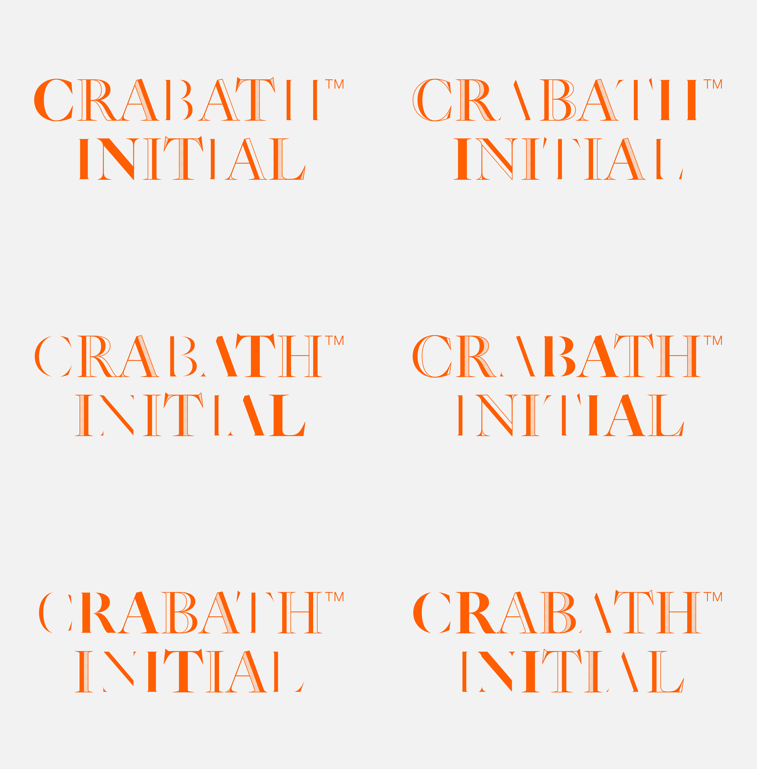
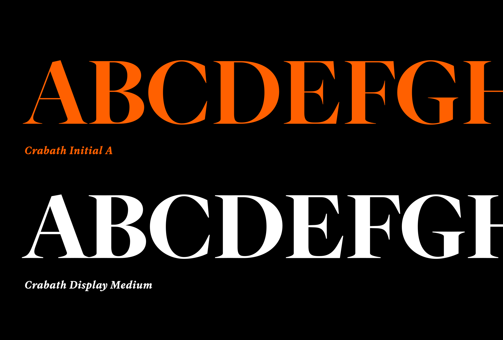
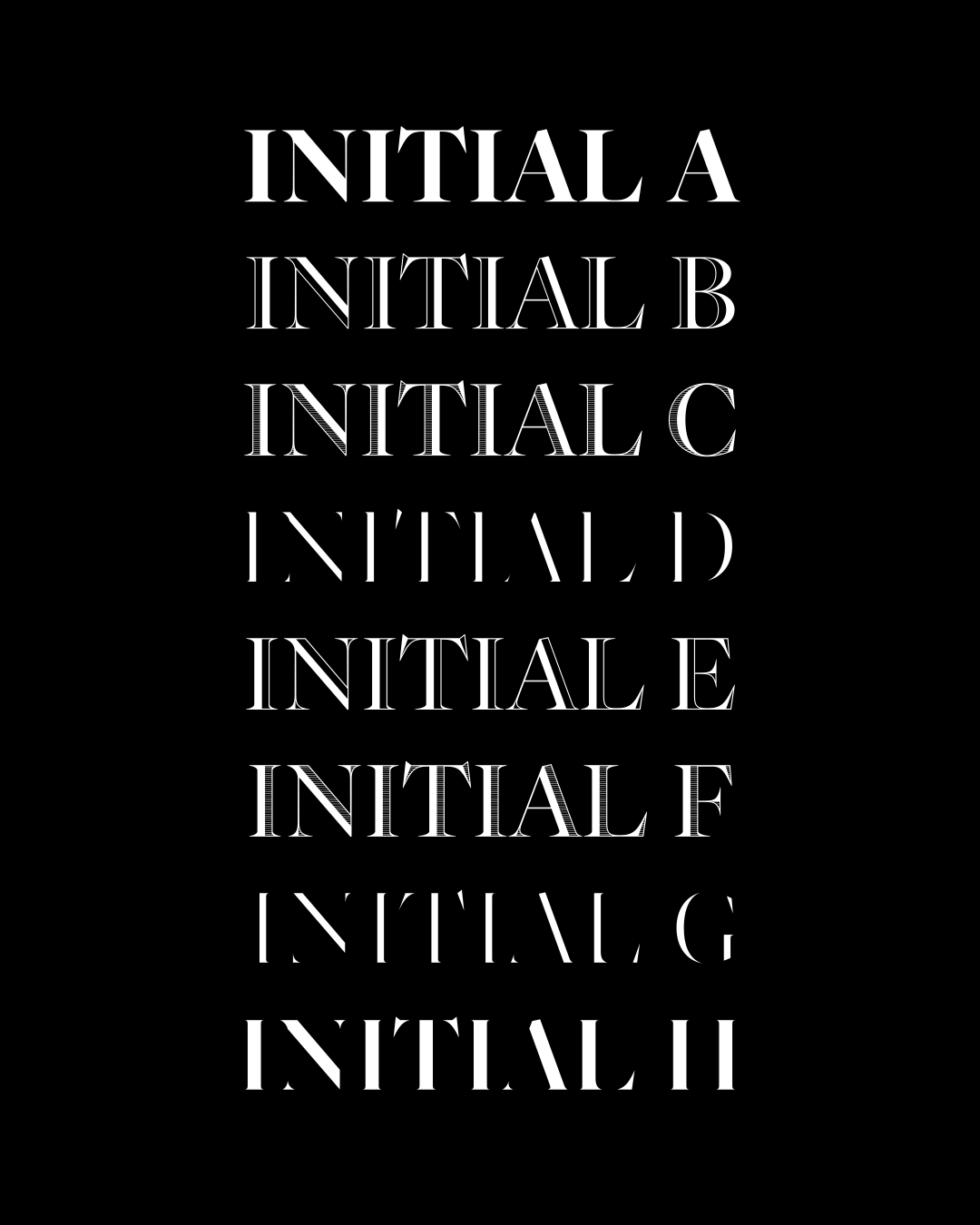
An initial (from the Latin initialis = beginning) uses size, style, color, or decoration to highlight the beginning letter of a word, chapter, or paragraph. Simple enlarged initial letters in paragraphs have been found in ancient manuscripts as early as the 5th century. In the following centuries the intensity of the initials’ decoration varied. Medieval codices and manuscripts often had initials so richly decorated that they frequently occupied the entire page. As a traditional element of book design, initials were also carried over into printed books, but at the beginning they were not part of the typefaces. Empty space left for initials was painted in by hand, affixed from separately printed clippings, or stamped. From the 15th century, printers had draftsmen and engravers design sets of initials corresponding in style both to typefaces and to ornaments and illustrations. Less wealthy printing houses bought ready-made sets which had nothing to do with the text typeface (and often even with the text). By the end of the 18th century, Giambattista Bodoni had already discarded the artistic component of the initials and concentrated only on the construction of the letter and on its visual harmony with the text typeface.³

From Krabat to Crabath
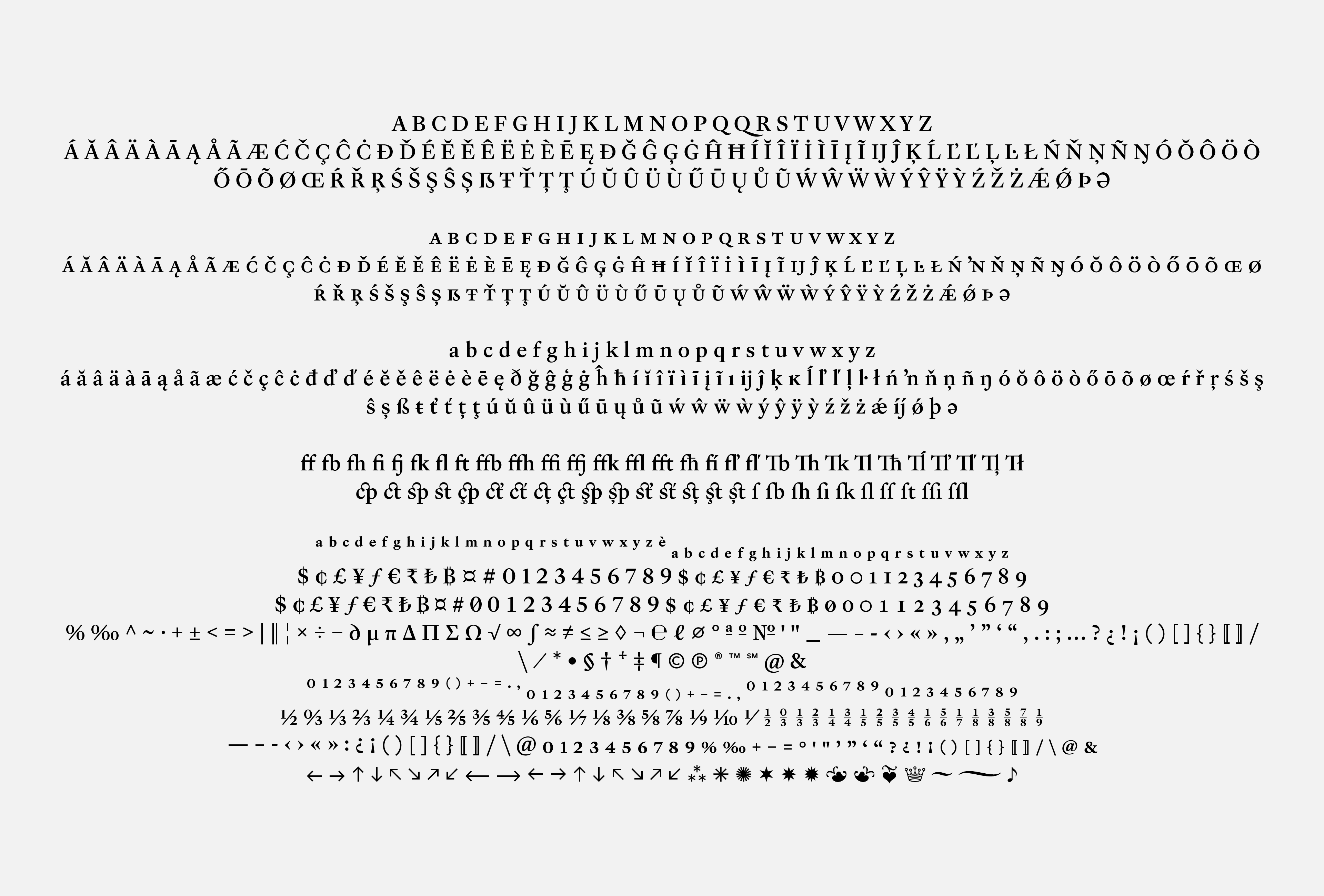
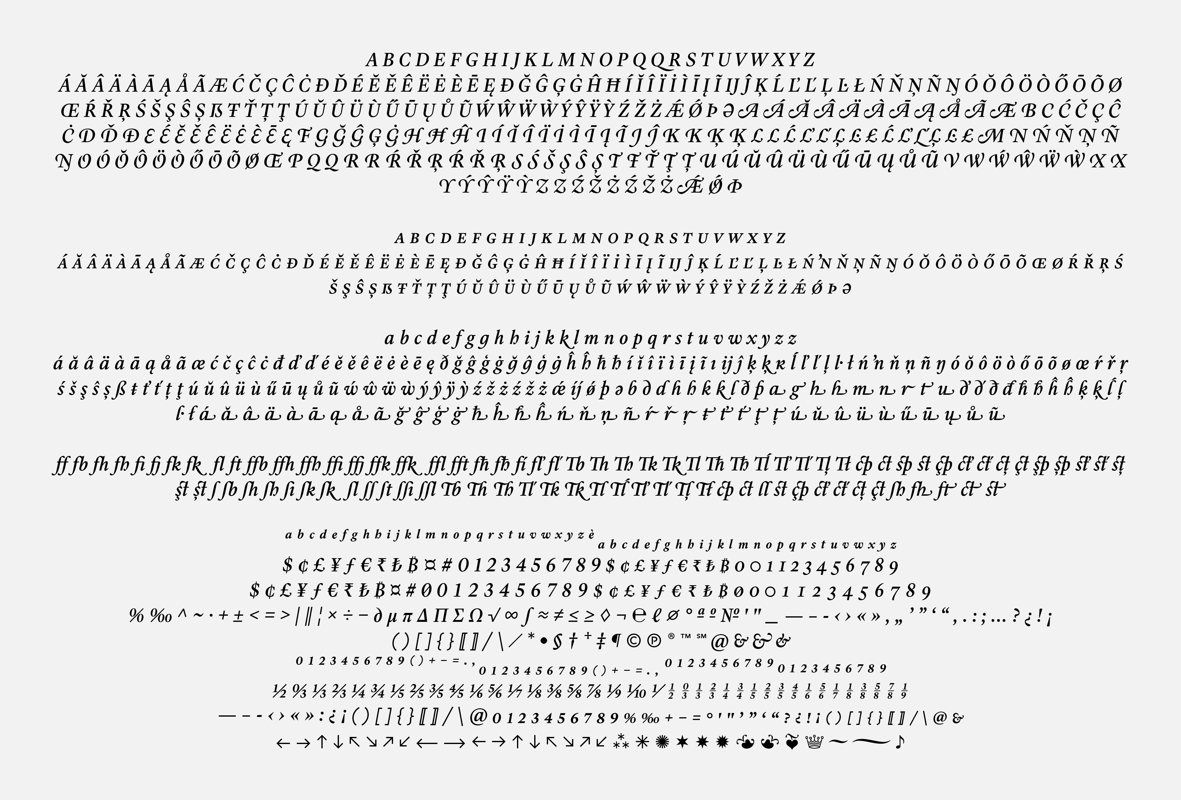
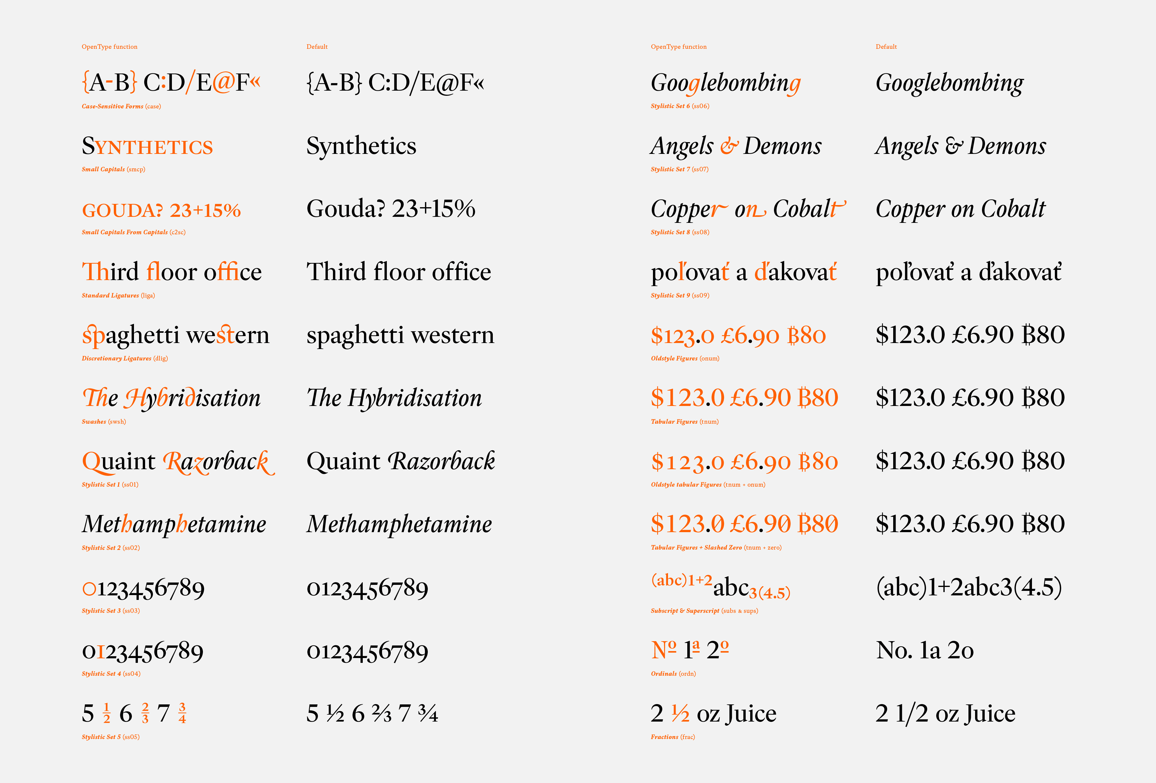
Overview of OpenType features.
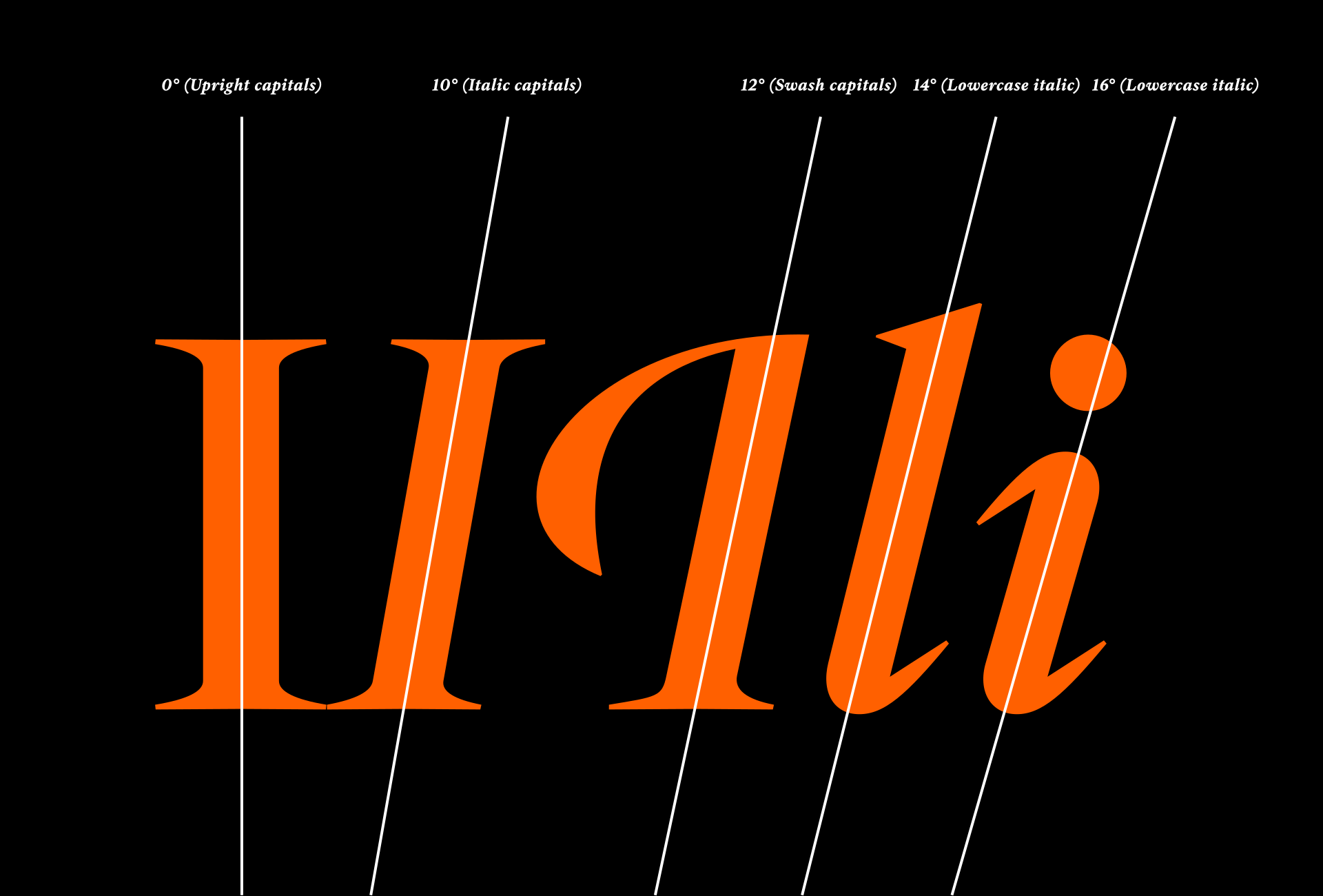
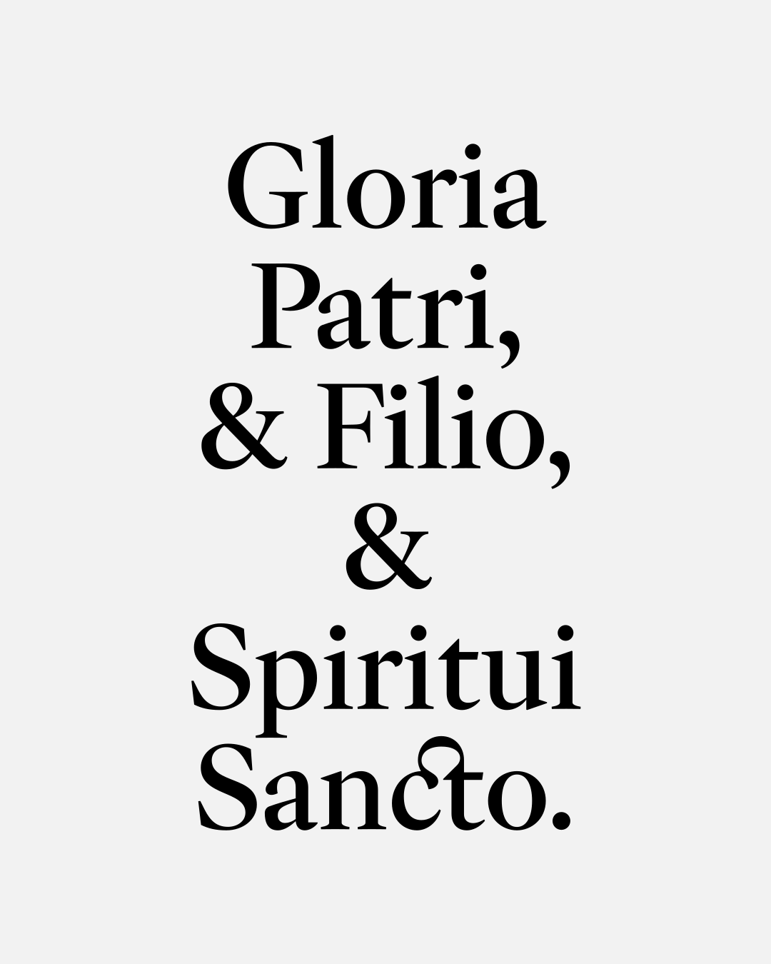
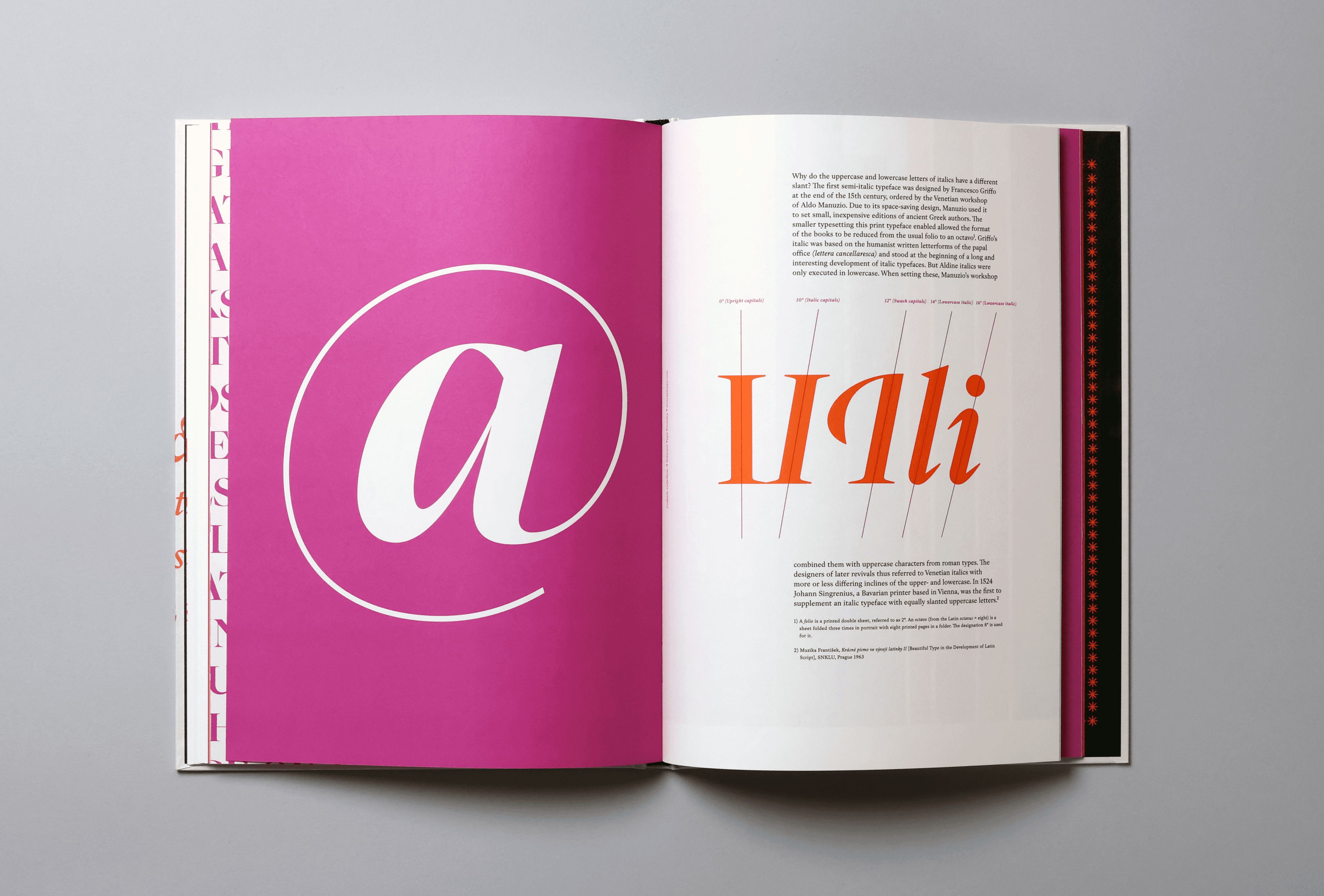
Why do the uppercase and lowercase letters of italics have a different slant? The first semi-italic typeface was designed by Francesco Griffo at the end of the 15th century, commissioned by the Venetian workshop of Aldo Manuzio. Due to its space-saving design, Manuzio used it to set small, inexpensive editions of ancient Greek authors. The smaller typesetting this print typeface enabled allowed the format of the books to be reduced from the usual folio to an octavo⁴. Griffo’s italic was based on the humanist written letterforms of the papal office (lettera cancellaresca) and stood at the beginning of a long and interesting development of italic typefaces. But Aldine italics were only executed in lowercase. When setting these, Manuzio’s workshop combined them with uppercase characters from roman types. The designers of later revivals thus referred to Venetian italics with more or less differing inclines of the upper- and lowercase. In 1524, Johann Singrenius, a Bavarian printer based in Vienna, was the first to supplement an italic typeface with equally slanted uppercase letters.⁵
Back to Print
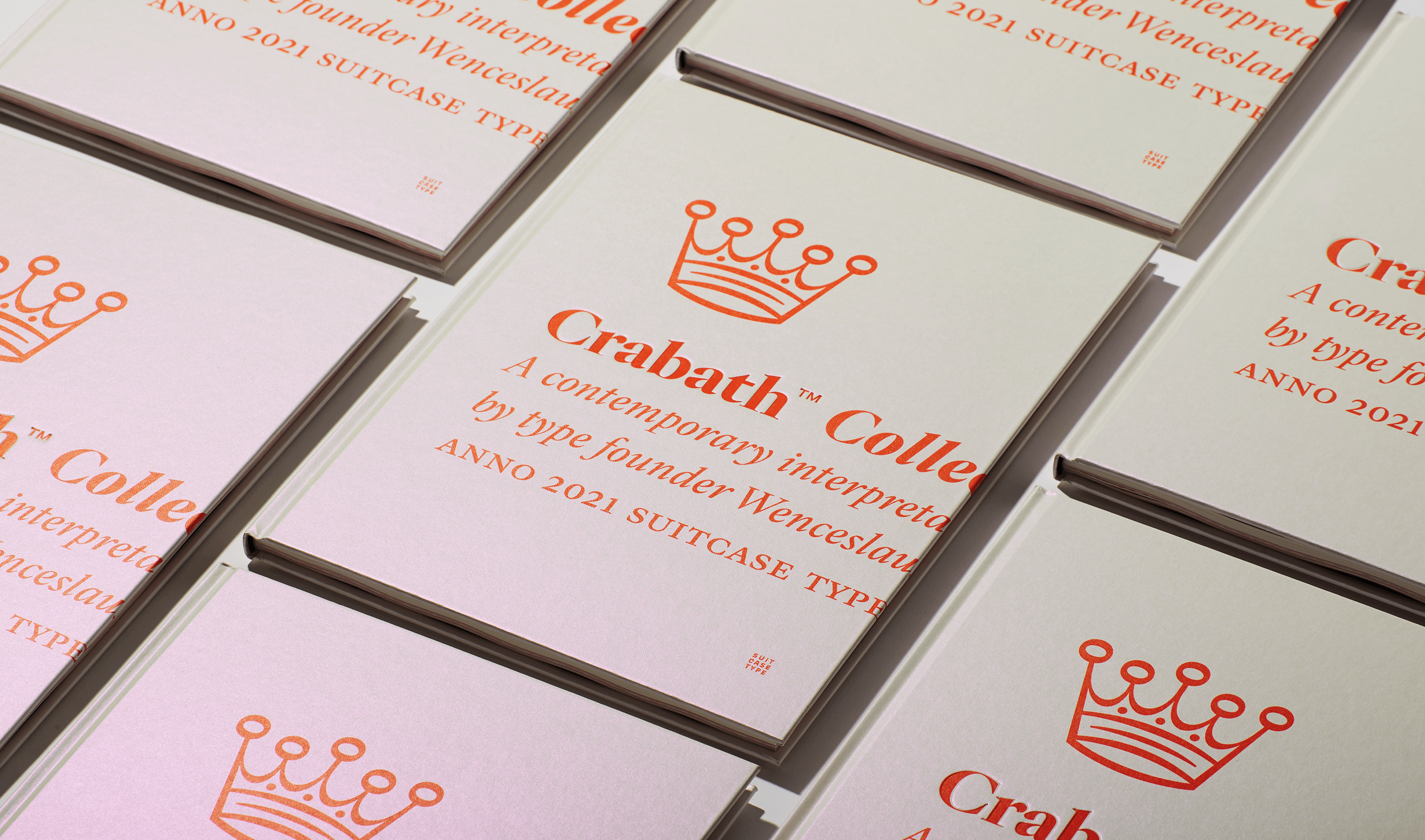
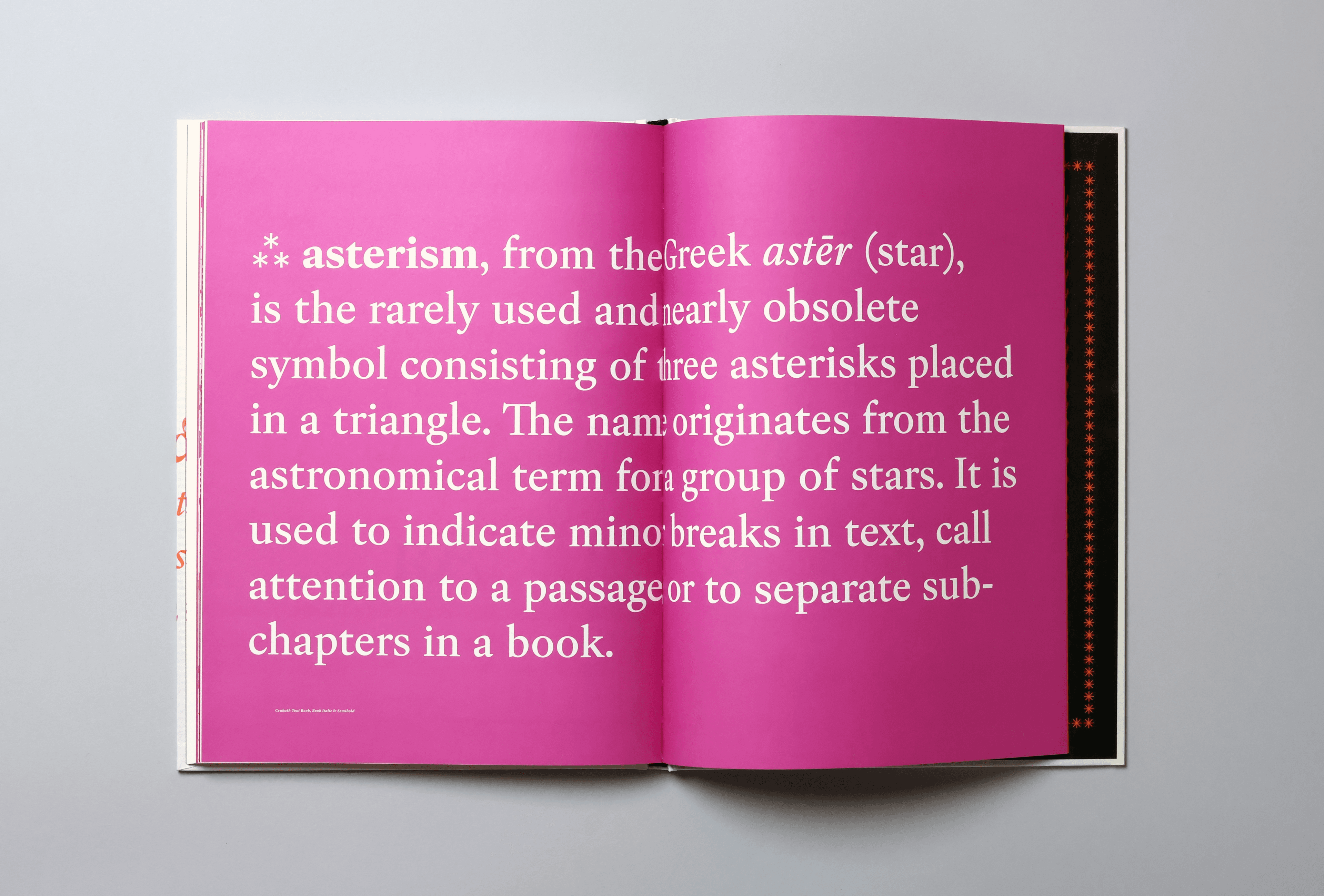
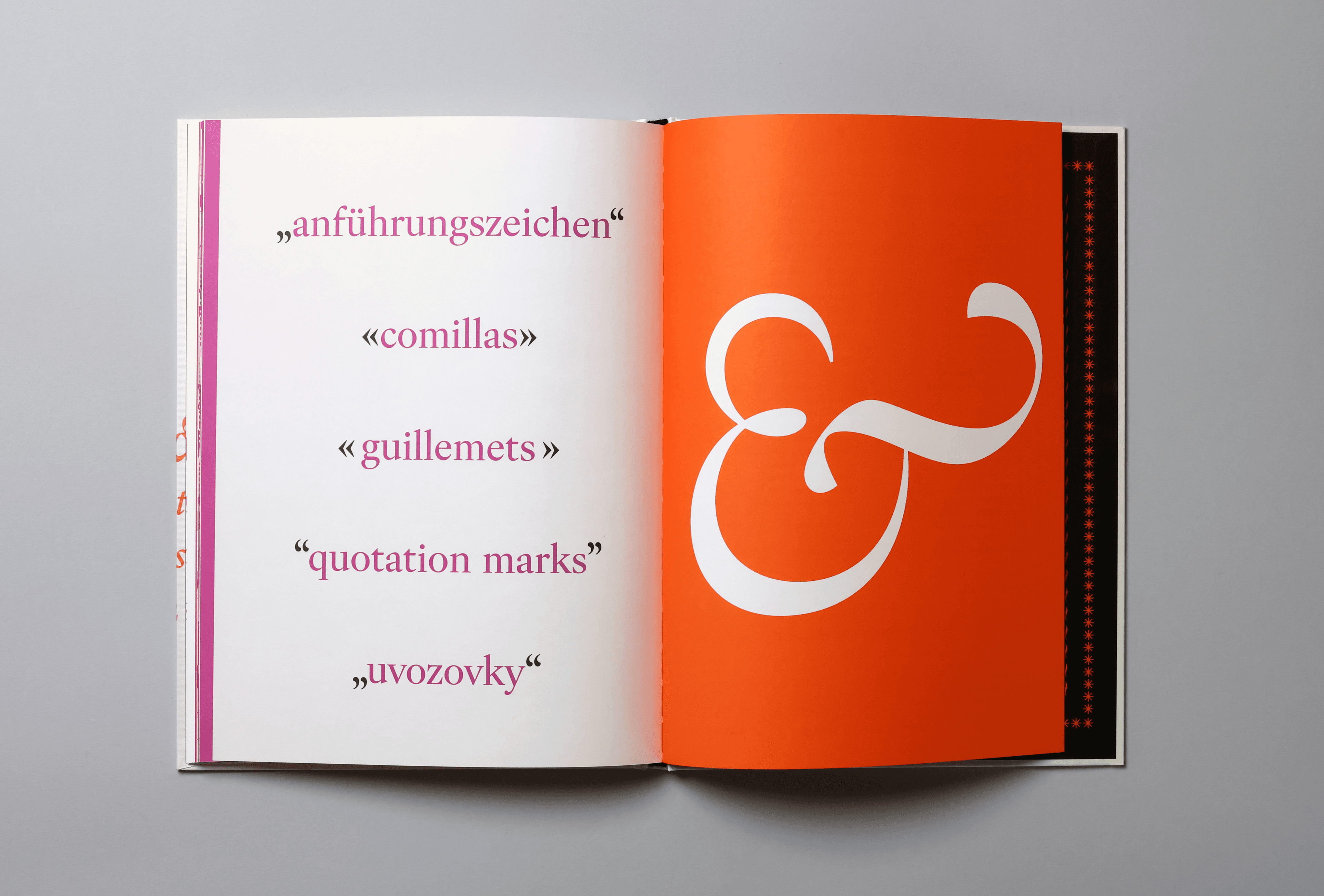
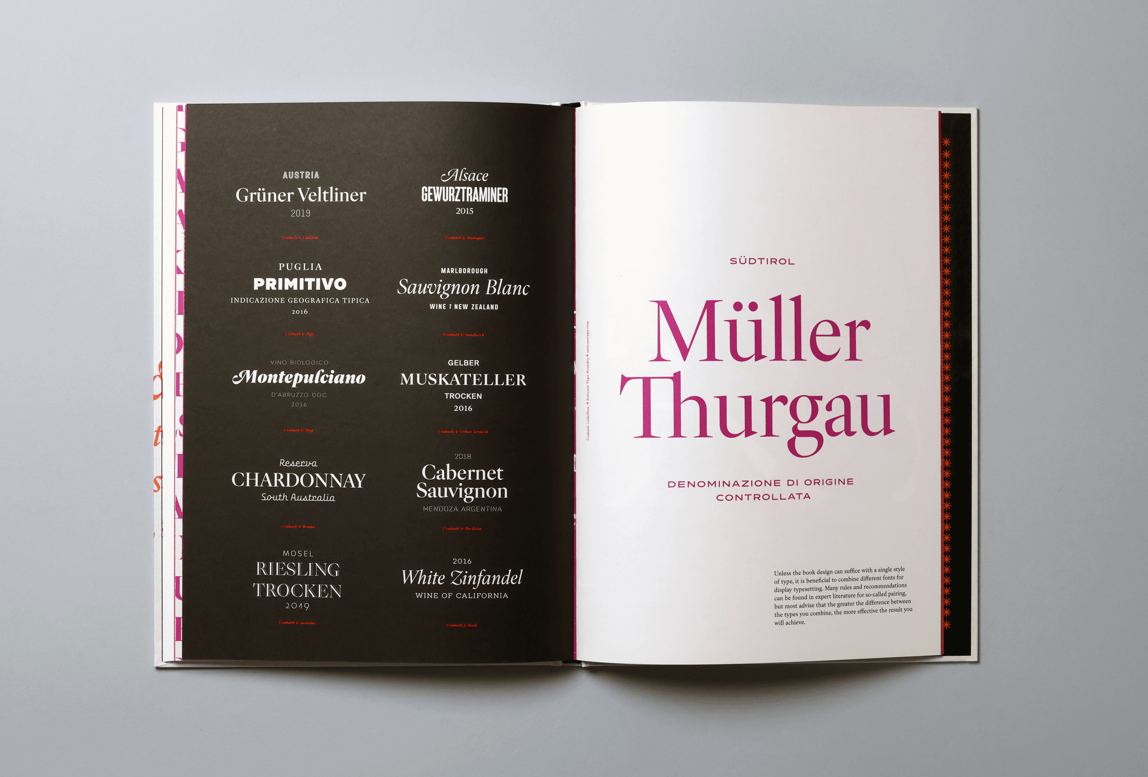
The Crabath Collection specimen was produced in a very limited edition. It is offset printed in three spot colors on Fedrigoni Arena Natural Rough 140 g/m² and casebound in covers wrapped in pearlescent paper with blind embossing.
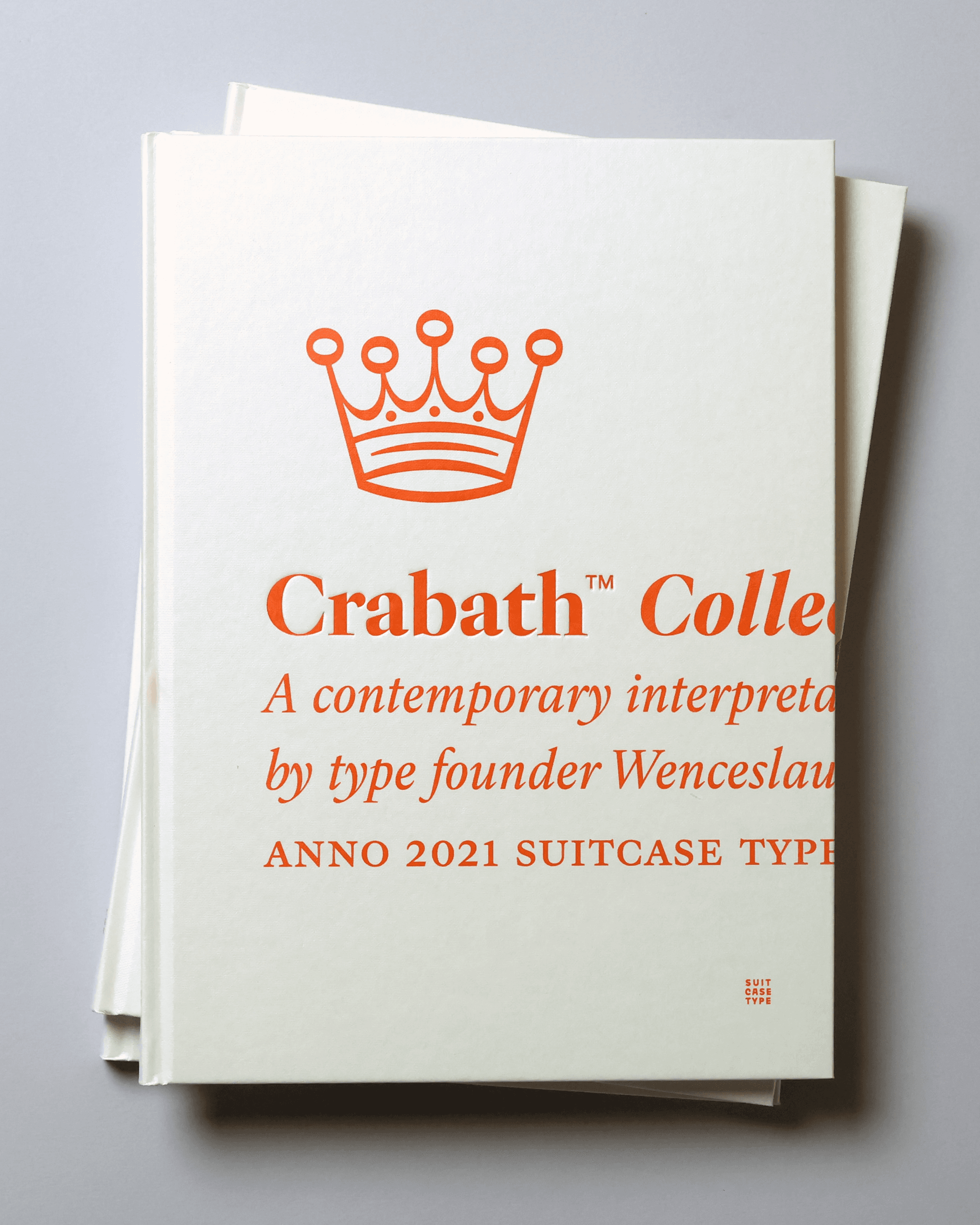
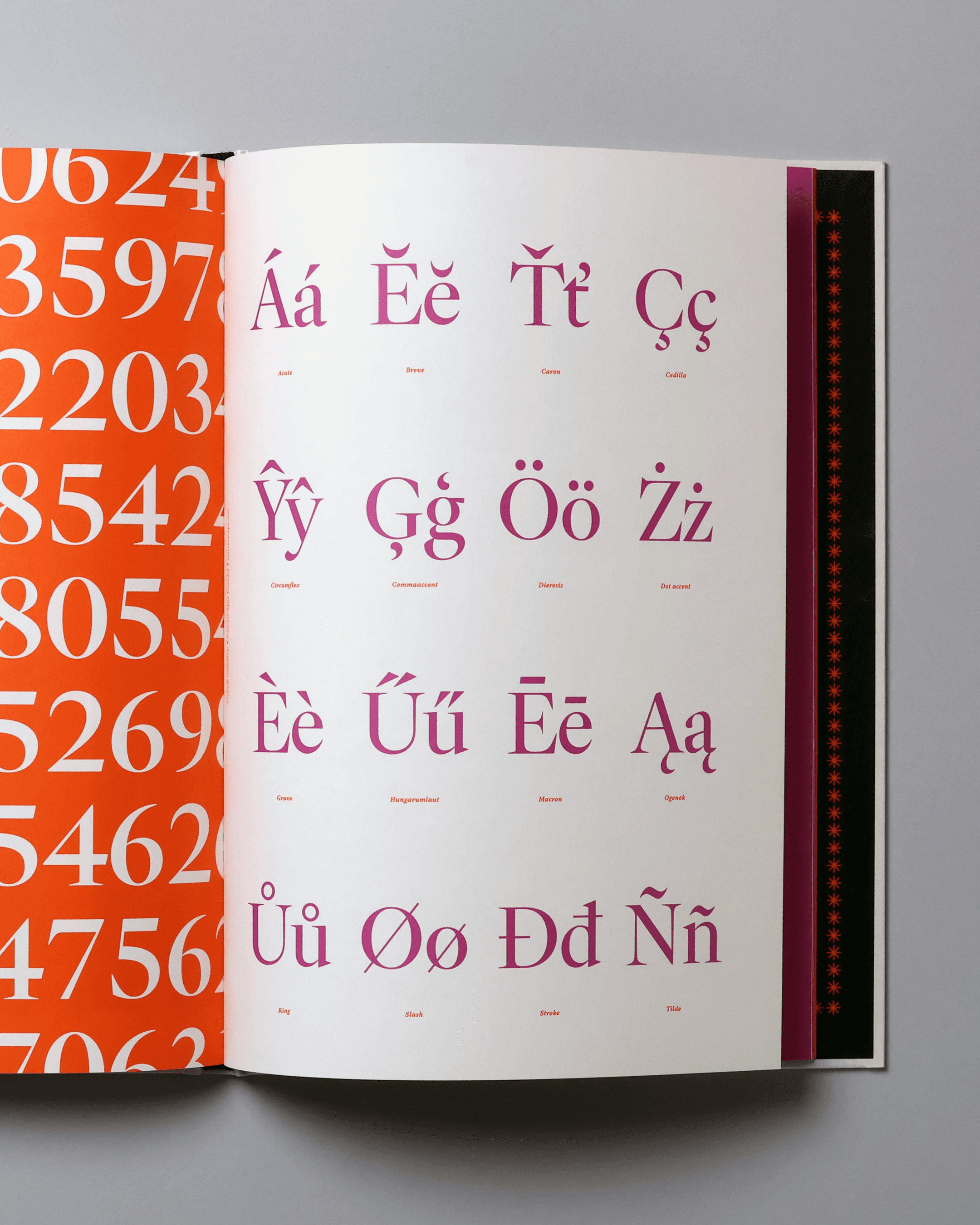
The second part uses the typeface as a tool for explaining practical principles of book typography — from the fundamentals to details that readers may barely notice, but that make a decisive difference to the quality of the final typesetting.
The specimen is not available for sale. However, while supplies last, we are sending 50 copies on request to customers who purchase one of the families in the collection.
Colophon
1) Specific terminology has been used for individual sizes of print typefaces since around the 17th century. It has varied somewhat across countries, among different printers, and over time. In the Czech lands, the continental German system based on the Didot point was used, so Diamond corresponded to a size of four points, while it has a size of 4.5 points in the American system and of only 3 points in the French.
2) Two-Cicero is equivalent to a size of 24 points (German Doppelcicero, French Palestine, Dutch Dubbele mediaan).
3) Petr Voit, Encyklopedie knihy: starší knihtisk a příbuzné obory mezi polovinou 15. a počátkem 19. století [Encyclopedia of the Book: Older Letterpress and Related Fields Between the Middle of the 15th and Beginning of the 19th Centuries], Libri, Prague 2006.
4) A folio is a printed double sheet, referred to as 2°. An octavo (from the Latin octavus = eight) is a sheet folded three times in portrait with eight printed pages in a folder. The designation 8° is used for it.
5) František Muzika, Krásné písmo ve vývoji latinky II [Beautiful Type in the Development of Latin Script], SNKLU, Prague 1963.
Bibliography
Horák, František, Česká kniha v minulosti a její výzdoba [Czech Book of the Past and Its Decoration], F. Novák, Prague 1948
A. F. Johnson, Decorative Initial Letters, The Cresset Press, London, 1931
Kiermeier-Debre, Joseph & Fritz Franz Vogel, Das Alphabet. Die Bildwelt der Buchstaben von A bis Z [The Alphabet: The Image of the Letters from A to Z], Ravensburg, Ravensburger Buchverlag, 1995