Editorial
Building a Visual Identity Around a Typeface
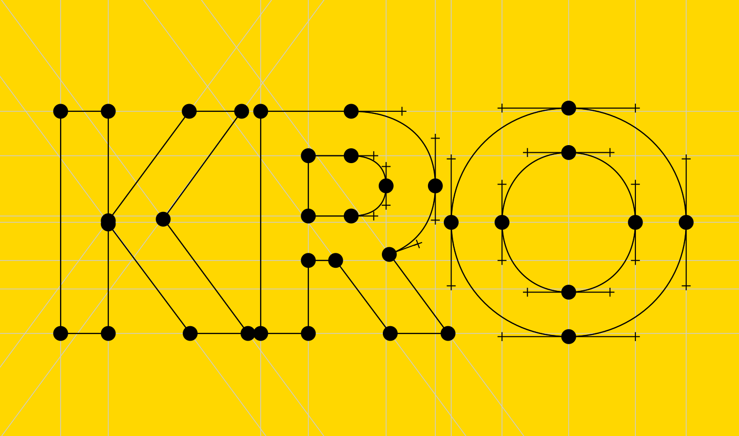
Whenever the opportunity arises to work with our own typefaces, it is worth taking: even the most meticulous simulations in type specimens cannot replace testing their characteristics in real-world use.
The redesign of the KRO logotype and the subsequent development of a visual system for its network of hospitality venues therefore resulted in a set of modified and specially designed styles based on the reliable Yolo family.
22 August 2026
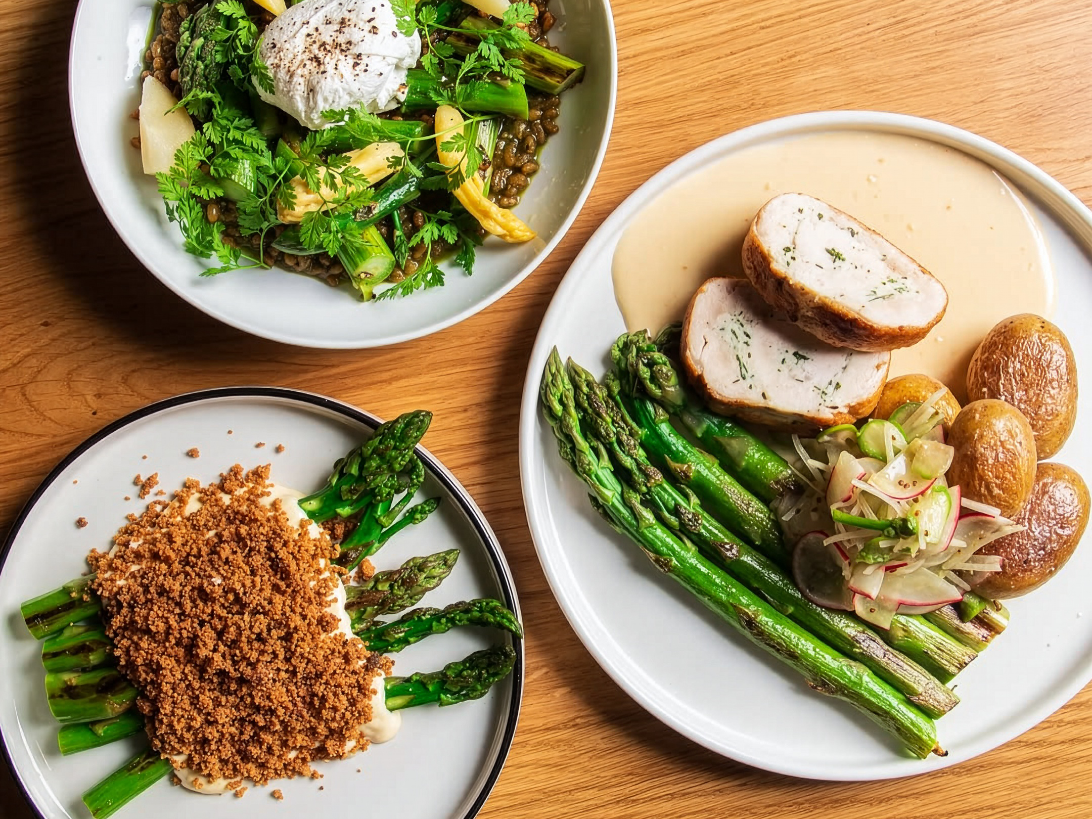
Asparagus season at KRO.
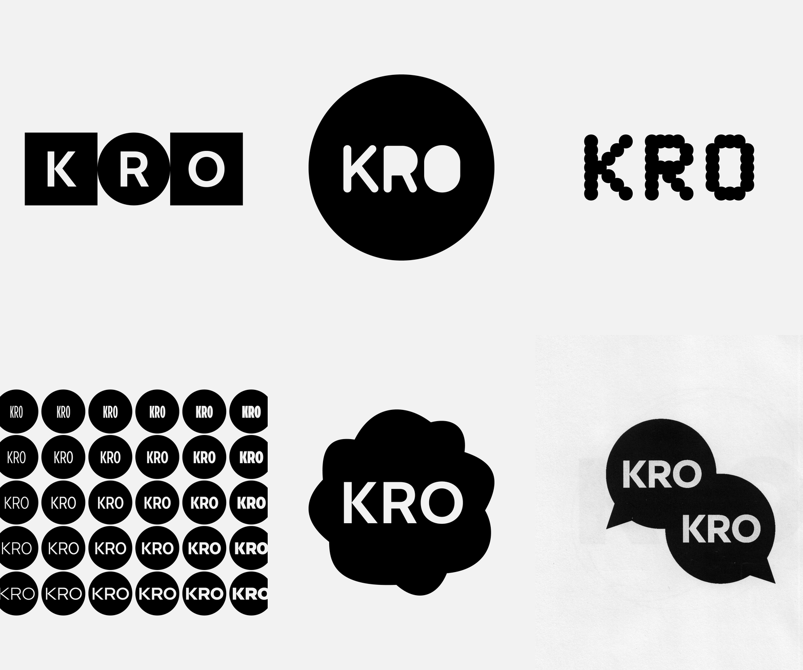
The many varied proposals that preceded the final form of the logotype provided an ideal opportunity to test retail typefaces alongside unrealized and still-in-development ones.
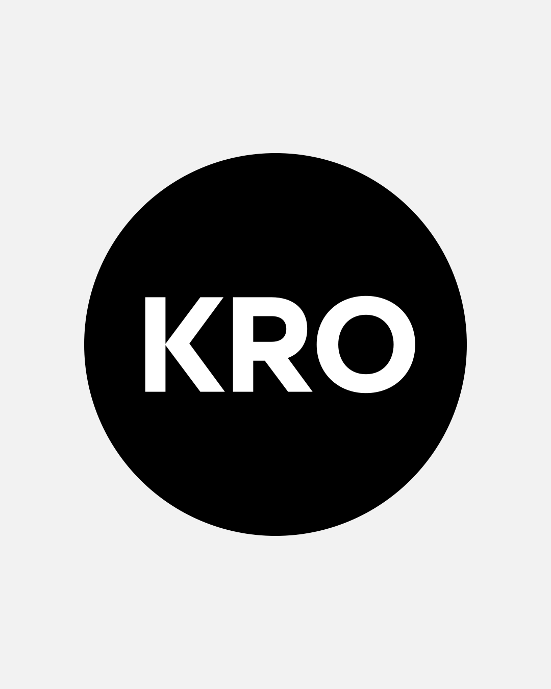
The primary form of the mark. A simple application rule: the type size in points corresponds to the size of the circular device in millimeters (for example, 100 pt = 100 mm).
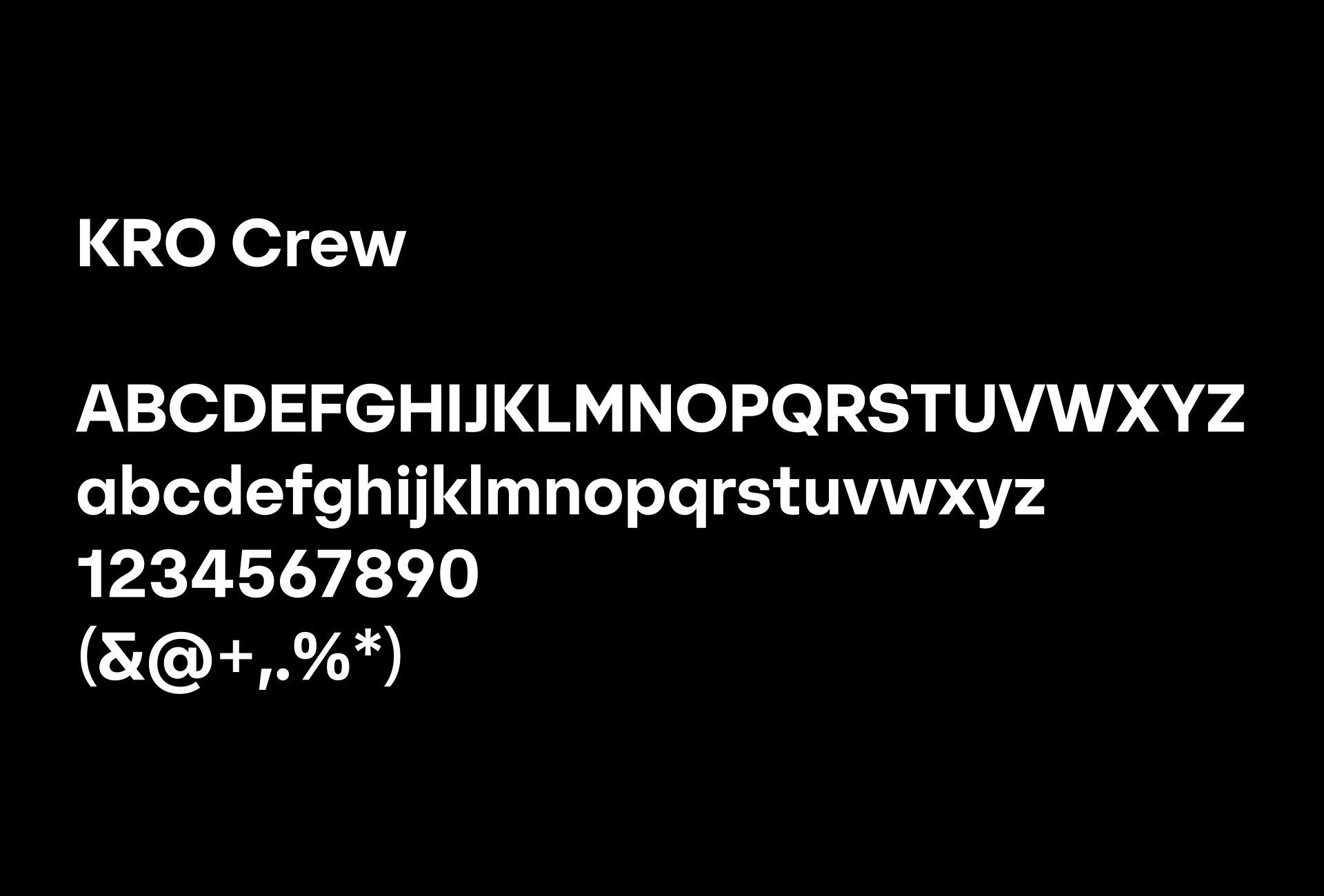
KRO Crew
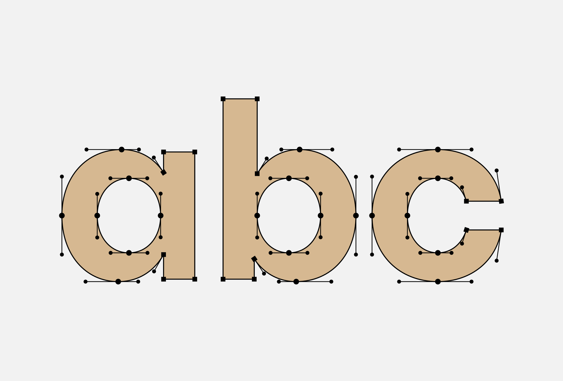
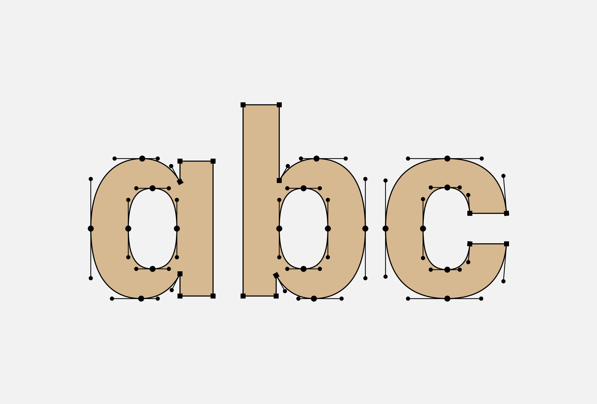
Further changes were small in scale but significant in character and concerned the forms of individual glyphs. In response to the circular motif, a less conspicuous single-story lowercase “a” and a more conservative, symmetrical “Y” were selected. A more decorative form of the numeral “1” from Yolo Display was added as well.
In addition to the logotype itself, the typeface is used in headlines, introductory text, and other supporting elements. Within the typographic system, it provides emphasis and helps define the overall character.
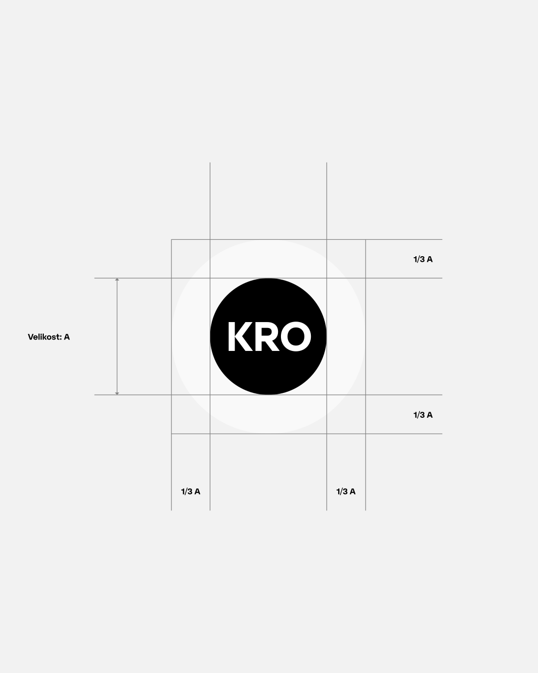
The primary mark within its circular device and its clear-space rules.
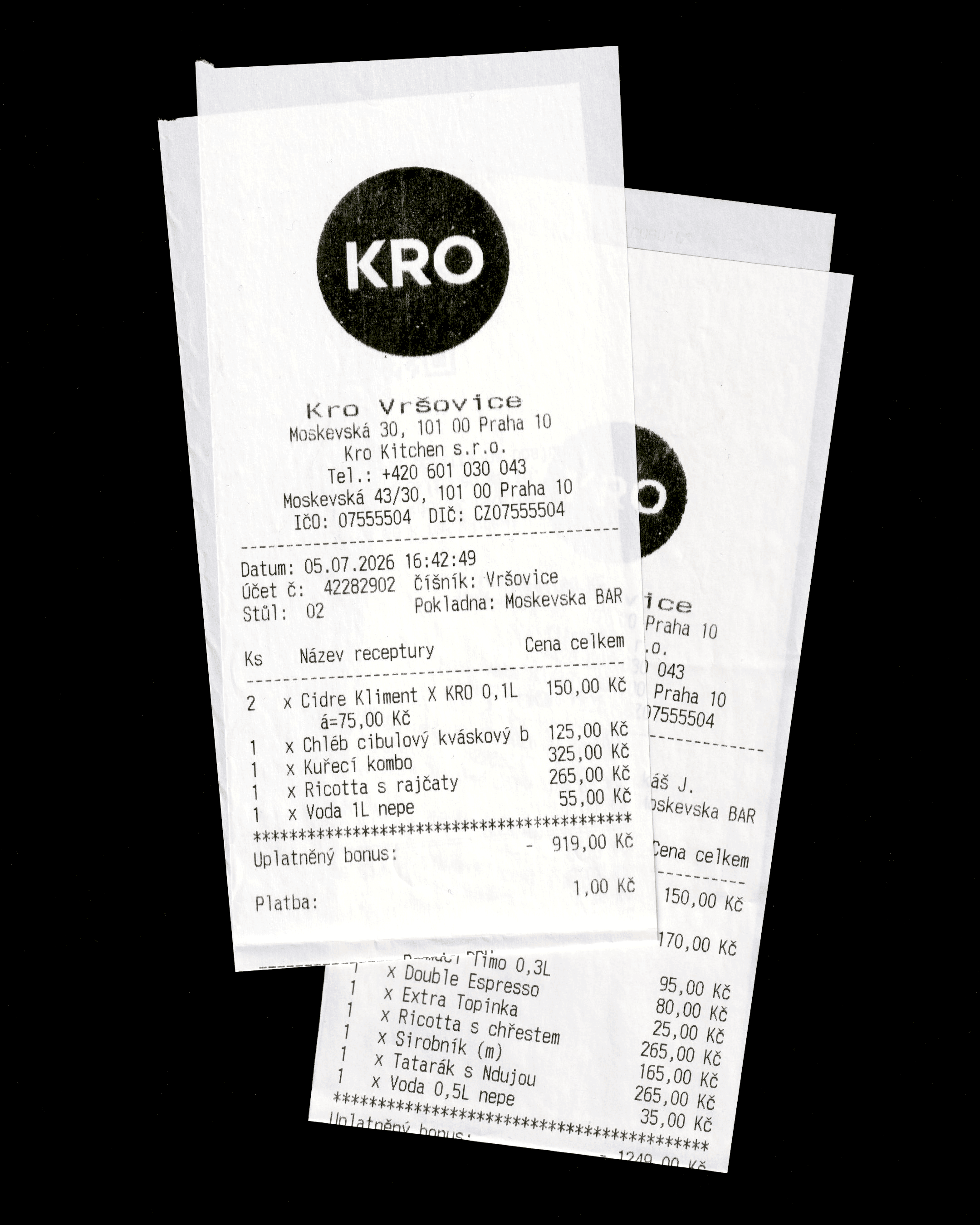
The logotype’s typography must hold up at different sizes and across a wide range of production methods.
The core location-based venues take the name of the Prague neighborhood in which they are located. The location name is simply set after the wordmark, making it easy to create additional location-based variants as the network of venues expands.
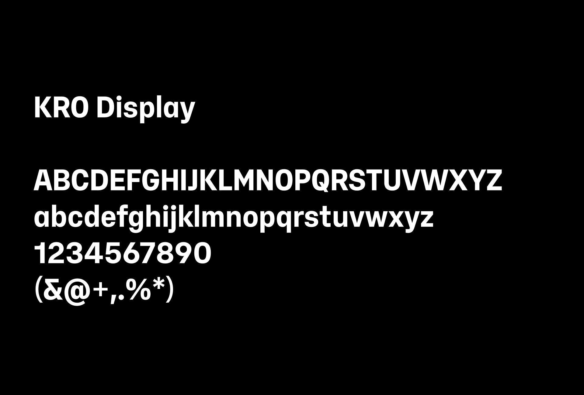
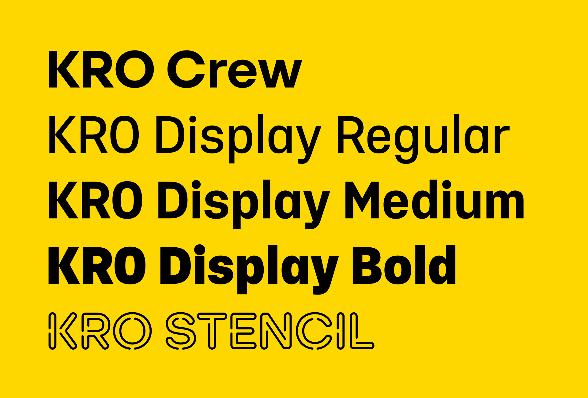
KRO Display
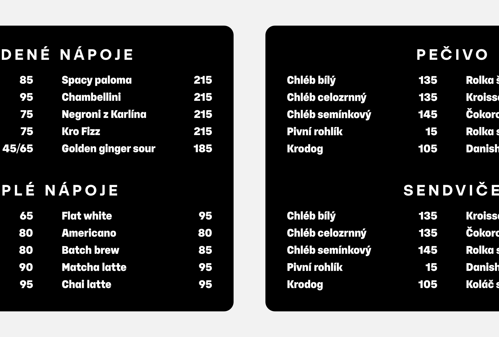
These demands could be divided among several type families with different characteristics. At KRO, however, the aim was to keep the typography as simple as possible. Menus are updated at least once a week, and managers at each venue handle the updates in online editors. They do so without a designer looking over their shoulders.
KRO Display therefore took on the role of a universal workhorse typeface. It is based on Yolo Info, whose condensed construction proved best suited to this purpose. Testing showed that the Medium style needed slightly more weight to distinguish it clearly from Regular and Bold. All styles include the same alternate glyphs as KRO Crew.
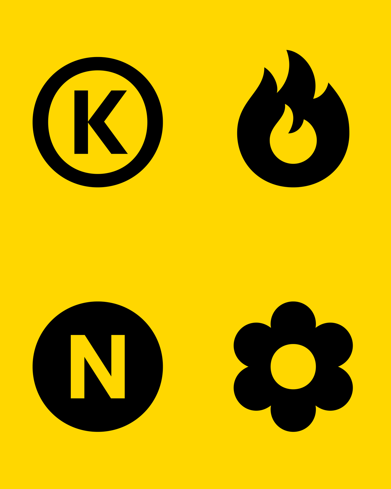
The character set also includes symbols that make it easier to navigate the items on the menu. The four core symbols identify spicy dishes, new items, signature dishes, and vegetarian options.
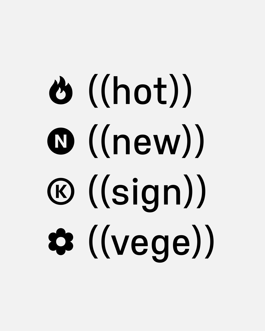
The symbols are implemented as contextual alternates, allowing them to be entered consistently across supported applications. Users simply type the relevant abbreviation in double parentheses, and the font automatically replaces it with the corresponding symbol.

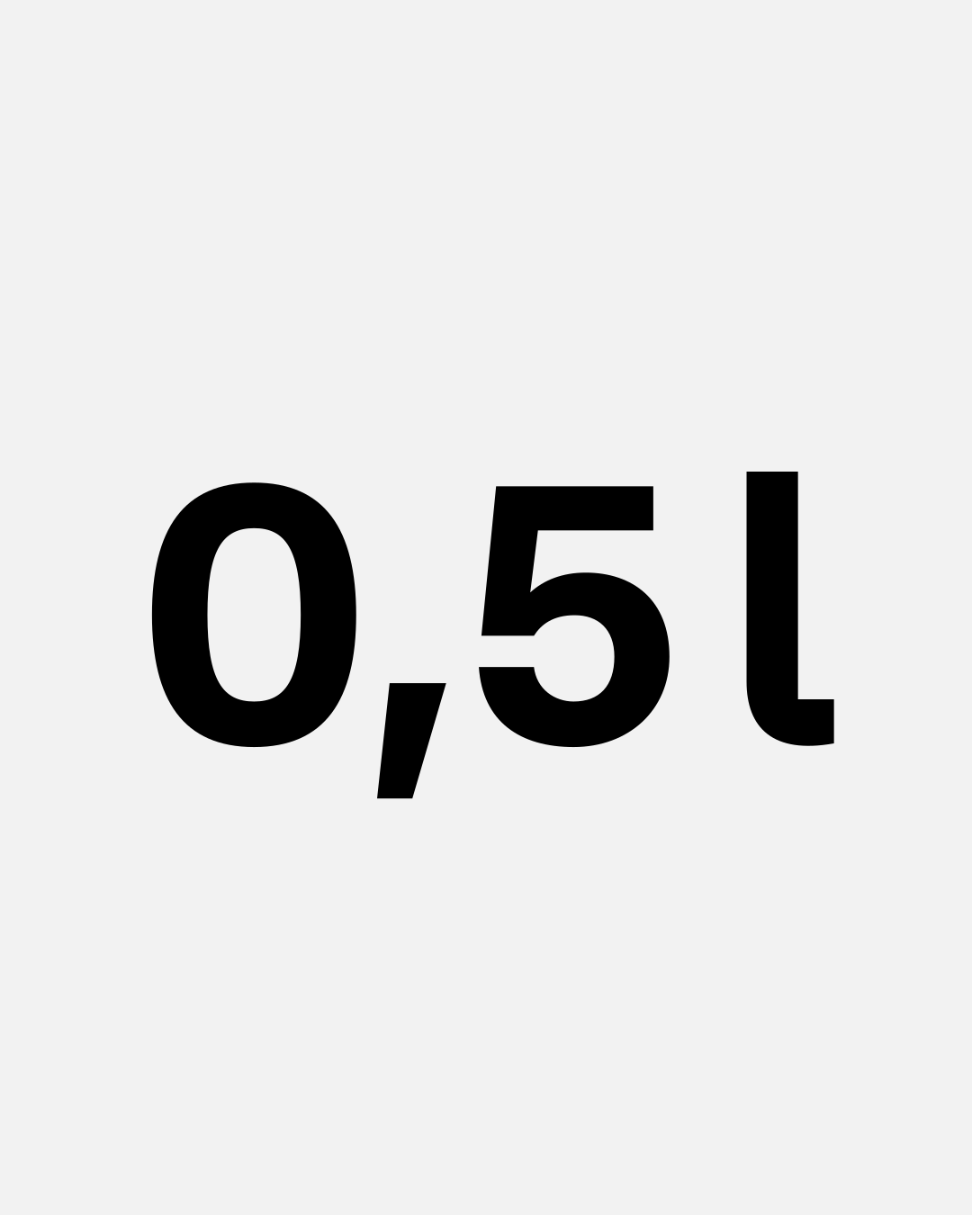
The glyph set also includes a dedicated liter symbol because the simple form of the lowercase “l” could be confused with the numeral one. Such confusion could cause some disappointment, particularly in the case of alcoholic drinks.
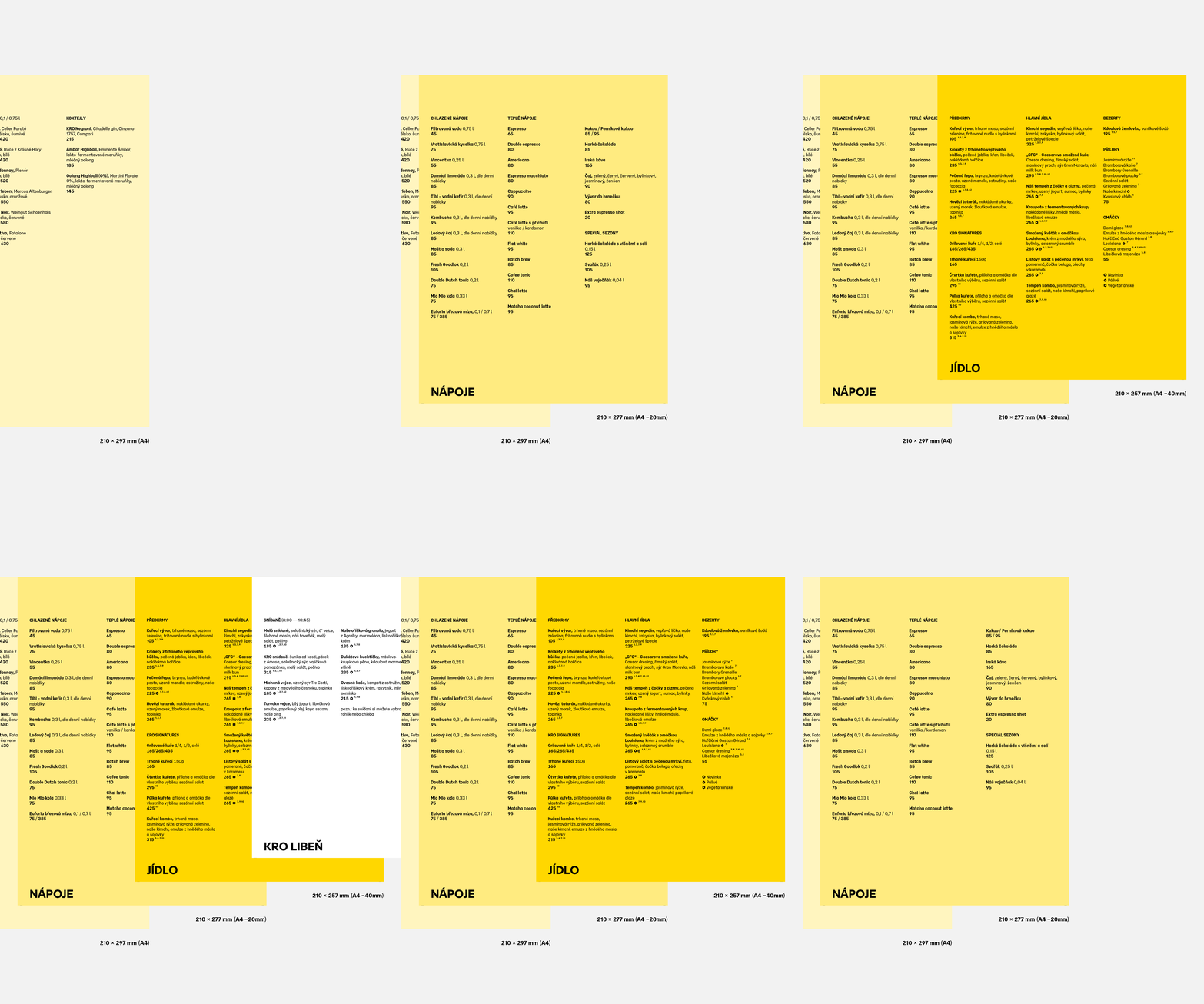
The tabletop menu is divided into categories distinguished by color and sheet size. To keep editing simple, the text is arranged in two- or three-column layouts and set flush left.
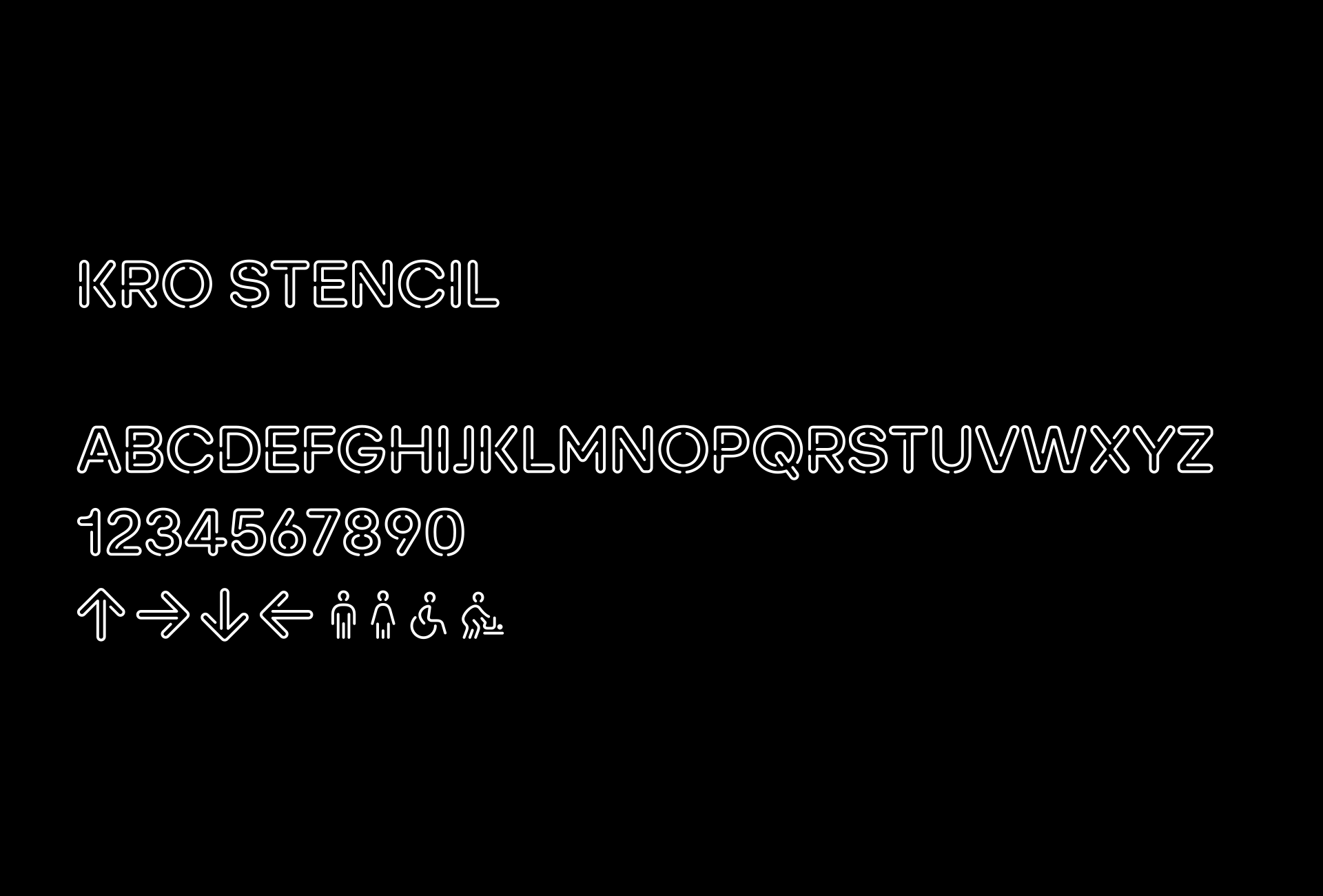
KRO Stencil
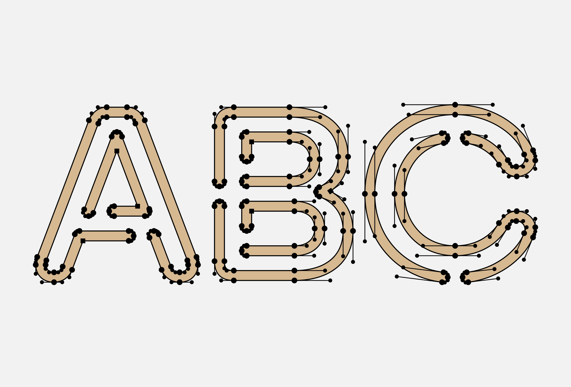
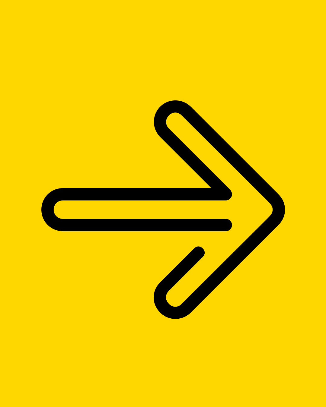
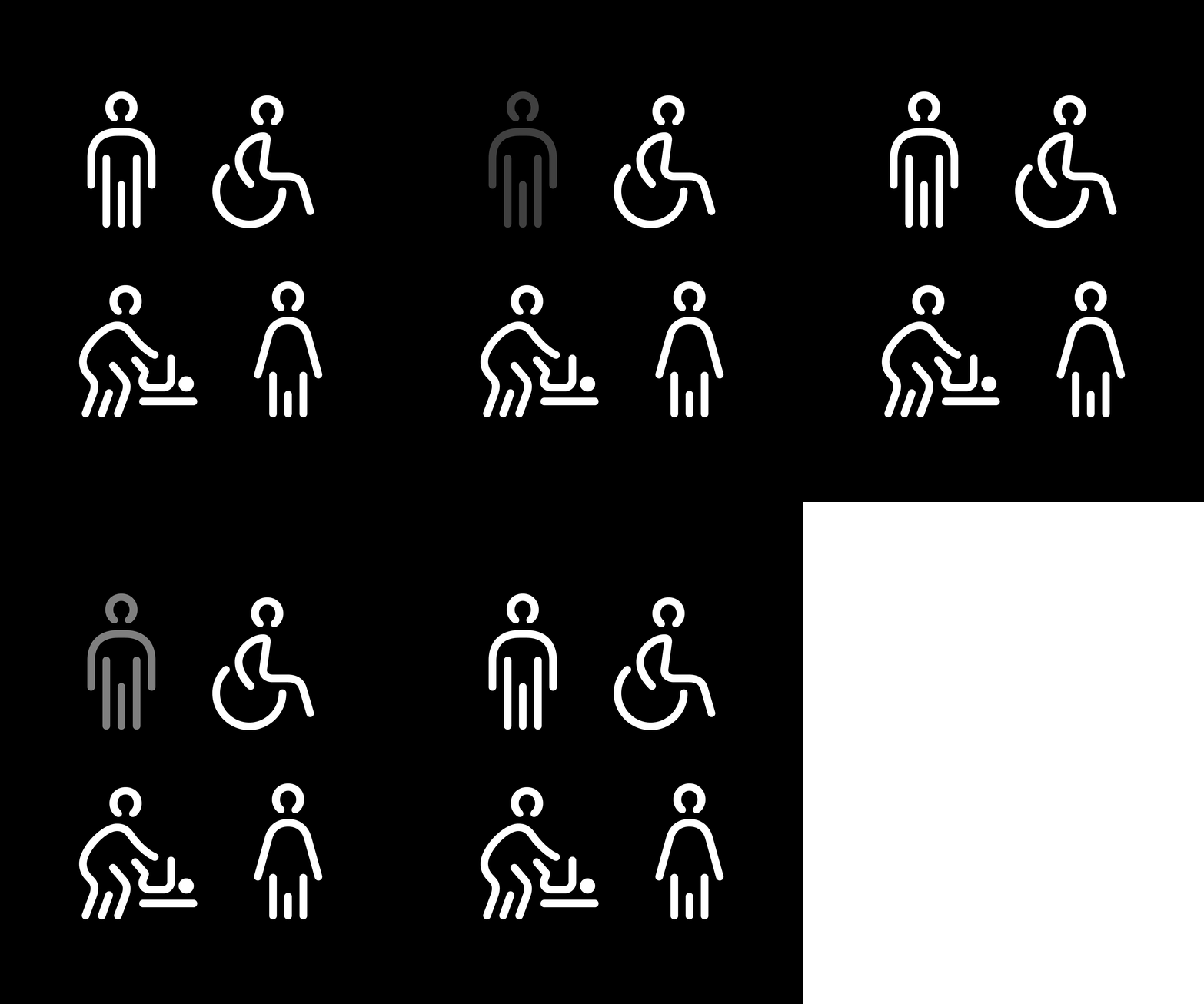
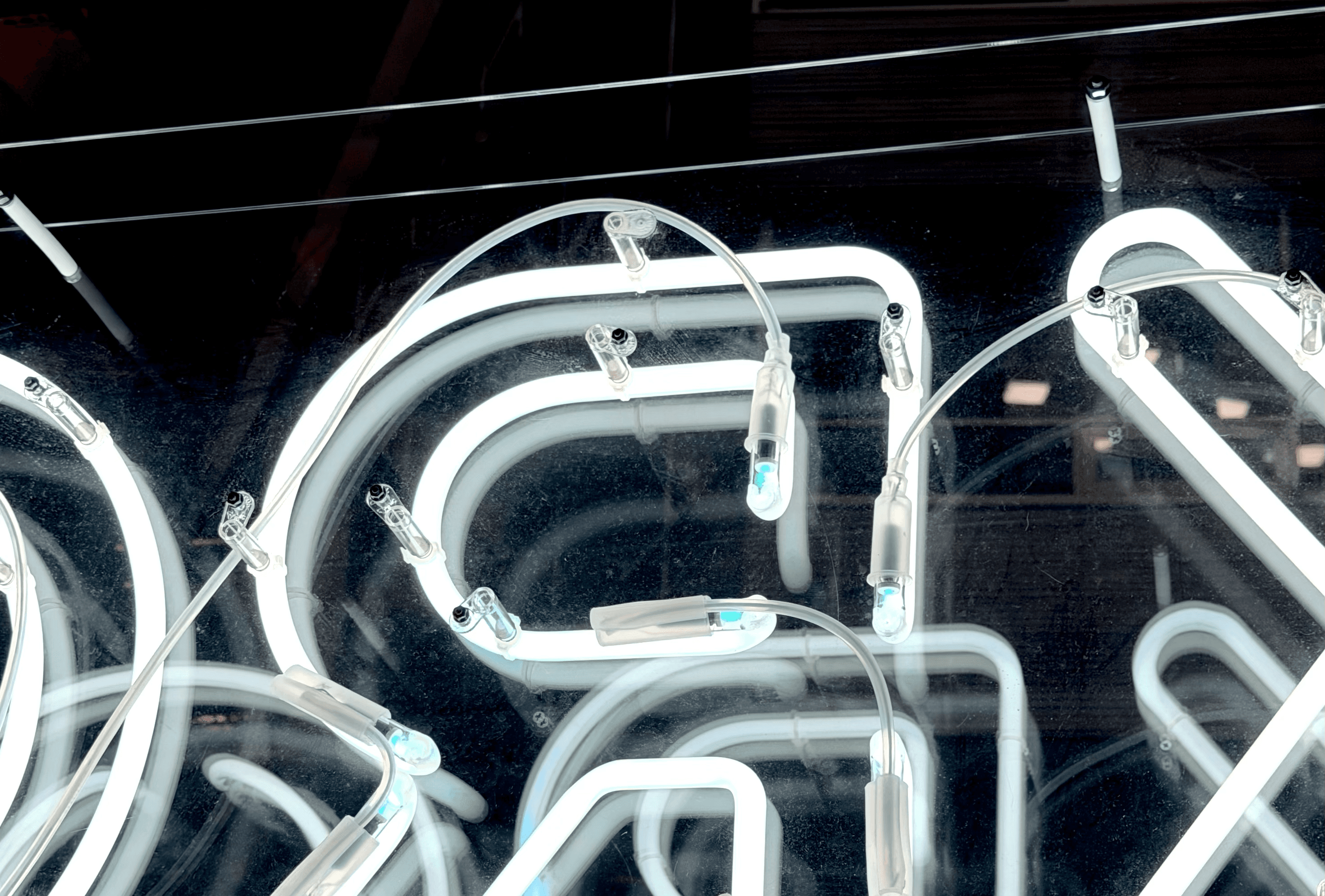
The visual principle, however, proved distinctive and strong enough to work beyond its original application. The outline design was then expanded to include a full set of uppercase letters and numerals, followed later by arrows and a basic collection of pictograms for the wayfinding system. A one-off technical solution thus developed into a fully fledged display style that extended KRO’s typographic language into physical space.
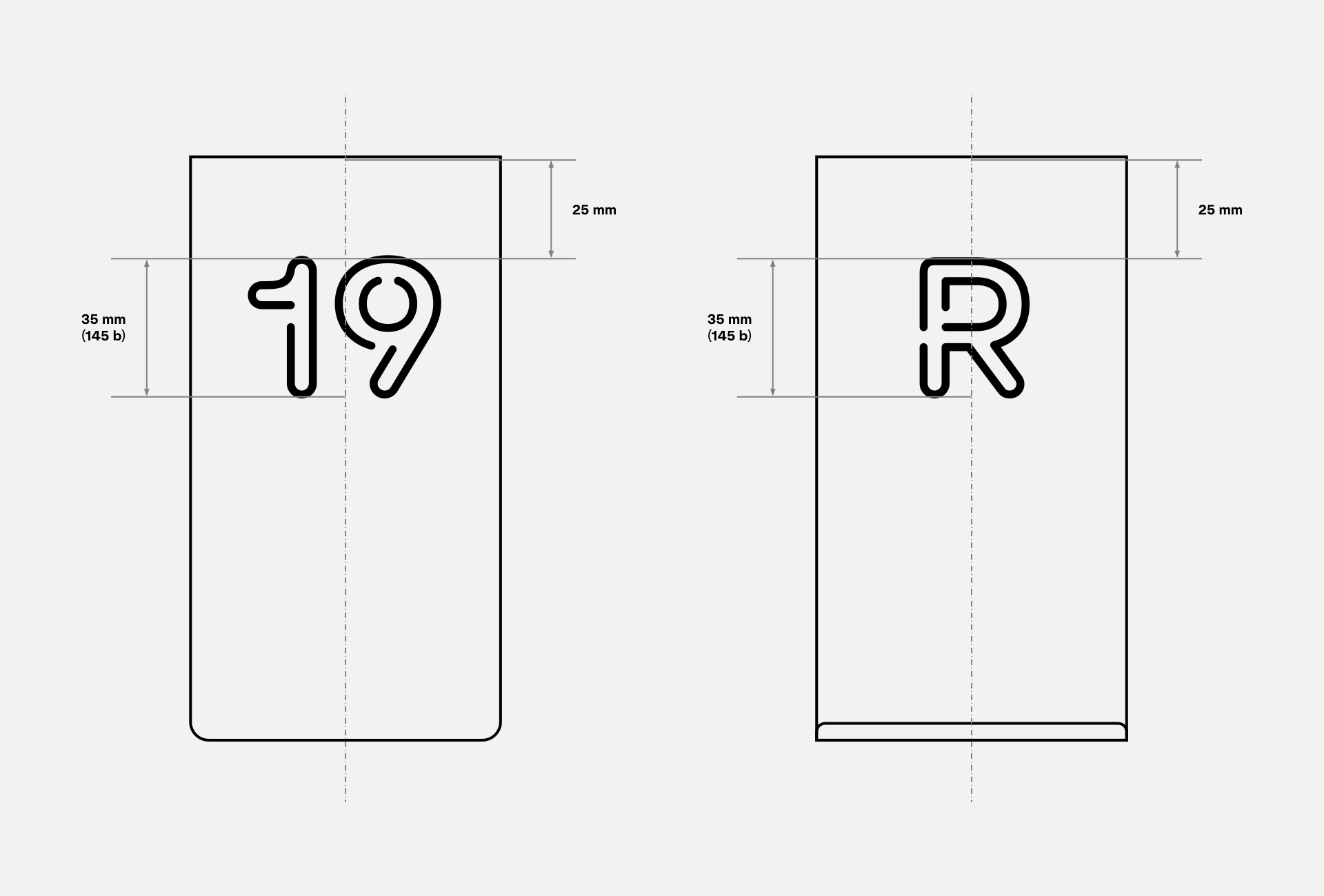
Its construction is also suitable for cutting from sheet metal and is therefore used, for example, on reservation signs and order-number stands. KRO Stencil thus combines an expressive character with the practical fabrication logic from which it originally grew.
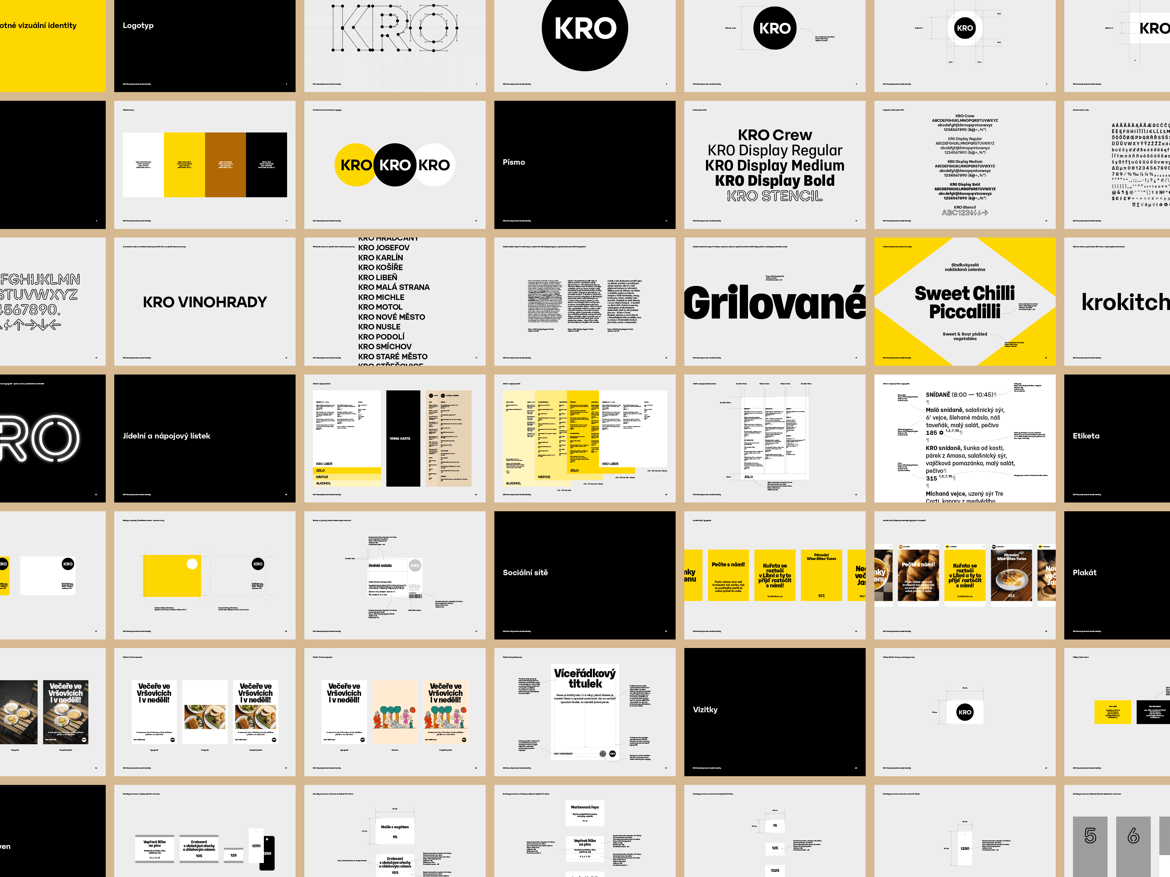
The visual identity guidelines cover every area in which the identity is applied. Developing the guidelines alongside implementation allowed the system to respond continuously to real-world requirements.
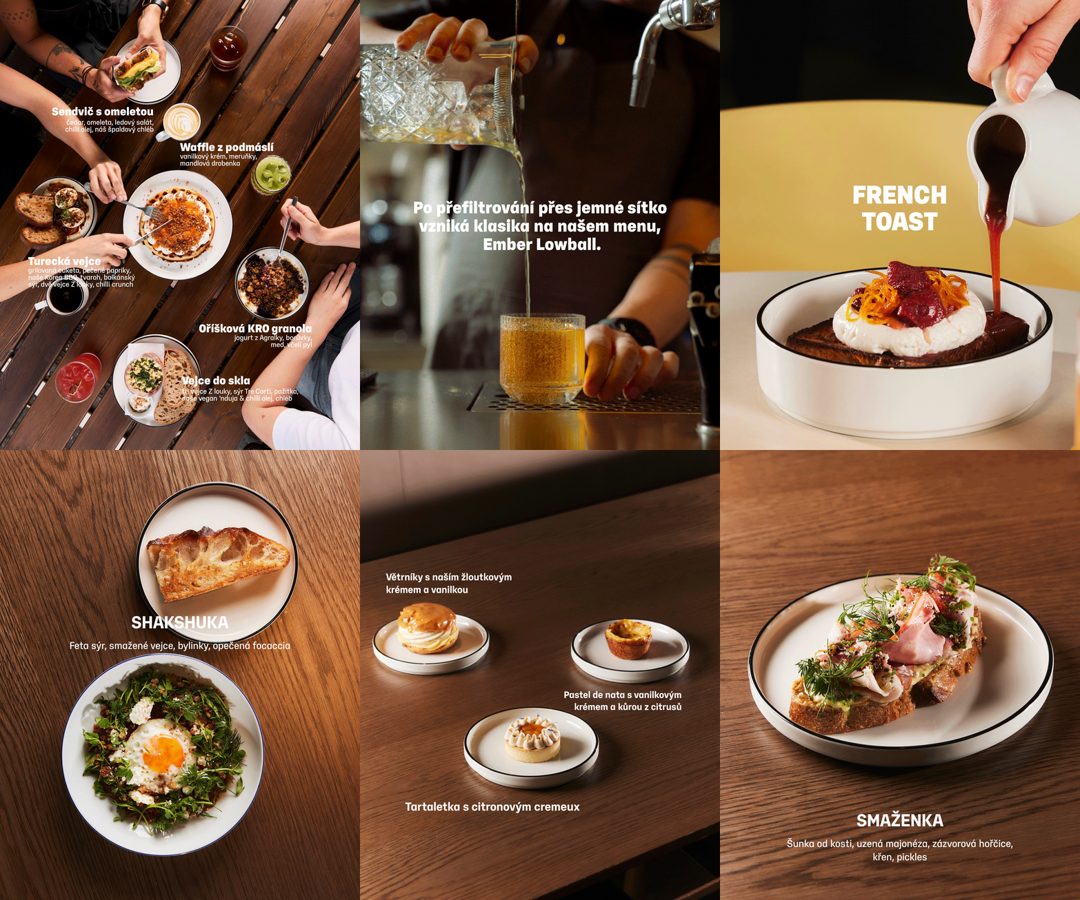
The result is a set of related typographic tools with a common foundation and clearly defined roles. Together, they keep the identity coherent while responding to the different needs of the individual venues.
The visual identity thus grew around the typeface, while lessons from day-to-day operations feed back into the typeface’s continued development. This feedback loop symbolically closes the circle at the heart of KRO’s visual identity.