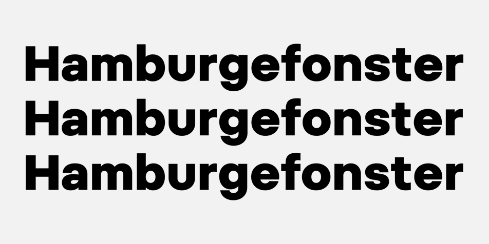
From top: 1st (2012), 2nd (2014) and 3rd (2017) version of Pepi.
Work on the Pepi and Rudi began at the beginning of 2012. The aim was to build a universal typeface construction based on a square and a circle — two elementary shapes whose proportions determine the character of linear geometric typefaces. Both typeface families were completed in short time and prepared for distribution, only to be completely redrawn several times — first at the end of 2012, then again two years later. The third, definitive version, differs from the preceding ones in having reworked joints of rounded strokes to the stem, modified proportions, an extended range of weights and a modified x-height and metrics. These are seemingly small details at first glance, but in expression-neutral typefaces, often the only factors determining a typeface’s recognisable and characteristic attributes.
The original italics of the Rudi typeface had — in direct contrast to the practically emotionless regular styles — very distinctive shapes with rounded instrokes and outstrokes of the majority of lowercase letters. Such a large difference in shapes is generally characteristic of purely text typefaces. As the Pepi and Rudi double family evolved into a primarily occasional typeface during development, these stylistically differing italics were replaced with slanted styles.
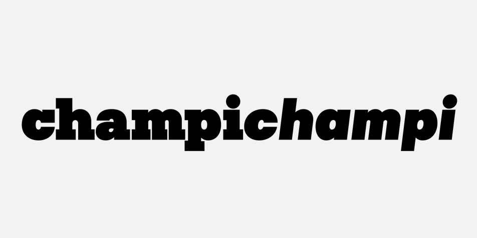
It is common for the stroke thickness of italics in text typefaces to be generally somewhat thinner than that of the regular styles; this is in order to compensate for the shape richness of the slanted letters. The headline versions of Pepi and Rudi however maintain the same weight for both the italic and regular versions — due to identical shapes of both, a reduction in weight would be ineffective. Conversely, the identical shapes of Regular and Italic typefaces aids in creating harmonic combinations in this particular case.
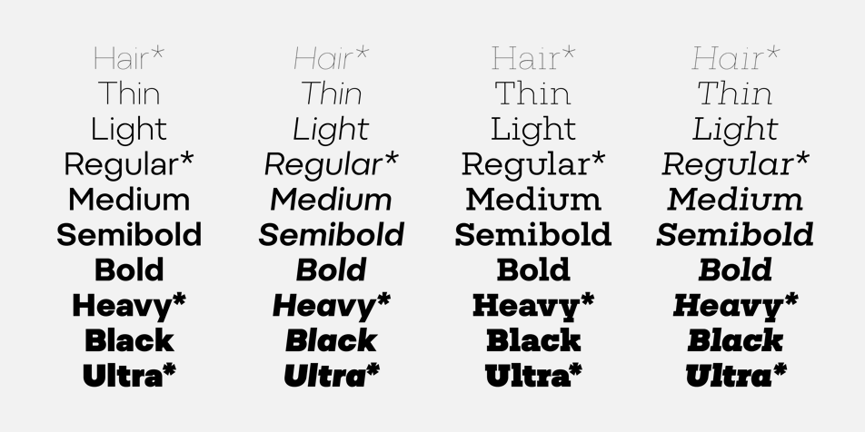
For each style (Pepi Plain, Pepi Italic, Rudi Plain, Rudi Italic), four basic masters were designed — Hair, Regular, Heavy and Ultra. This allowed for a naturally smooth (and necessary, in the context of the wide wight range) interpolation process for all other styles.
Because both typefaces — the geometric sans serif and the slab serif faces — were created at the same time and on the same construction basis, it makes sense to offer them together as a superfamily.
Pepi (2017)
The in-process versions of Pepi incidentally gave birth to two custom fonts — the Umprum (2012) for the Academy of Arts, Architecture and Design in Prague, and the Organica (2015) for the Nova television station — the requirements for both typefaces were that they contain identical style categories.
Umprum (2012)
Organica (2015)
And yeah, the fonts are also named after my two cute daughters.